Documentation Feedback Form
 Preview
 Code
Code
HTML
 Copy
Copy
<form action="https://formspree.io/f/{FORM_ID}" class="fs-form" target="_top" method="POST">
<fieldset>
<legend class="fs-fieldset-title">Documentation Feedback</legend>
<div class="fs-field">
<label class="fs-label" for="detailed-feedback">
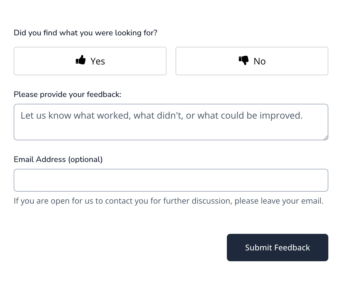
Did you find what you were looking for?
</label>
<div>
<section class="control-group question thumbs-group thumbs-group-1" tabindex="-1">
<div class="button-container thumbs-container" role="radiogroup">
<div class="thumbs-wrapper button ">
<input data-testid="selectable" selectableindex="0" type="radio" name="found_what_looking_for"
id="thumbs-2797_0" value="positive">
<label for="thumbs-2797_0" class="label_thumbs_positive" aria-label="Yes">
<i class="mopicon mopicon-thumbs-up" role="none" alt="icon" style="vertical-align: middle;">
<svg viewBox="0 0 25 28" role="img">
<title>icon</title>
<path
d="M4 21c0-0.547-0.453-1-1-1-0.562 0-1 0.453-1 1 0 0.562 0.438 1 1 1 0.547 0 1-0.438 1-1zM6.5 13v10c0 0.547-0.453 1-1 1h-4.5c-0.547 0-1-0.453-1-1v-10c0-0.547 0.453-1 1-1h4.5c0.547 0 1 0.453 1 1zM25 13c0 0.828-0.328 1.719-0.859 2.328 0.172 0.5 0.234 0.969 0.234 1.188 0.031 0.781-0.203 1.516-0.672 2.141 0.172 0.578 0.172 1.203 0 1.828-0.156 0.578-0.453 1.094-0.844 1.469 0.094 1.172-0.172 2.125-0.766 2.828-0.672 0.797-1.703 1.203-3.078 1.219h-2.016c-2.234 0-4.344-0.734-6.031-1.313-0.984-0.344-1.922-0.672-2.469-0.688-0.531-0.016-1-0.453-1-1v-10.016c0-0.516 0.438-0.953 0.953-1 0.578-0.047 2.078-1.906 2.766-2.812 0.562-0.719 1.094-1.391 1.578-1.875 0.609-0.609 0.781-1.547 0.969-2.453 0.172-0.922 0.359-1.891 1.031-2.547 0.187-0.187 0.438-0.297 0.703-0.297 3.5 0 3.5 2.797 3.5 4 0 1.281-0.453 2.188-0.875 3-0.172 0.344-0.328 0.5-0.453 1h4.328c1.625 0 3 1.375 3 3z"
fill="currentColor"></path>
</svg>
</i>
<span style="vertical-align: middle;"> Yes</span></label>
</div>
<div class="thumbs-wrapper button ">
<input data-testid="selectable" selectableindex="1" type="radio" name="found_what_looking_for"
id="thumbs-2797_1" value="negative">
<label for="thumbs-2797_1" class="label_thumbs_negative" aria-label="No">
<i class="mopicon mopicon-thumbs-down " role="none" alt="icon" style="vertical-align: middle;">
<svg viewBox="0 0 25 28" role="img">
<title>icon</title>
<path
d="M4 9c0 0.547-0.453 1-1 1-0.562 0-1-0.453-1-1 0-0.562 0.438-1 1-1 0.547 0 1 0.438 1 1zM6.5 17v-10c0-0.547-0.453-1-1-1h-4.5c-0.547 0-1 0.453-1 1v10c0 0.547 0.453 1 1 1h4.5c0.547 0 1-0.453 1-1zM24.141 14.672c0.531 0.594 0.859 1.5 0.859 2.328-0.016 1.625-1.375 3-3 3h-4.328c0.125 0.5 0.281 0.656 0.453 1 0.406 0.812 0.875 1.719 0.875 3 0 1.203 0 4-3.5 4-0.266 0-0.516-0.109-0.703-0.297-0.672-0.656-0.859-1.625-1.031-2.547-0.187-0.906-0.359-1.844-0.969-2.453-0.484-0.484-1.016-1.156-1.578-1.875-0.688-0.906-2.188-2.766-2.766-2.812-0.516-0.047-0.953-0.484-0.953-1v-10.016c0-0.547 0.469-0.984 1-1 0.547-0.016 1.484-0.344 2.469-0.688 1.687-0.578 3.797-1.313 6.031-1.313h2.016c1.375 0.016 2.406 0.422 3.078 1.219 0.594 0.703 0.859 1.656 0.766 2.828 0.391 0.375 0.688 0.891 0.844 1.469 0.172 0.625 0.172 1.25 0 1.828 0.469 0.625 0.703 1.359 0.672 2.141 0 0.219-0.063 0.688-0.234 1.188z"
fill="currentColor">
</path>
</svg>
</i>
<span style="vertical-align: middle;"> No</span></label>
</div>
</div>
</section>
</div>
</div>
<div class="fs-field">
<label class="fs-label" for="detailed-feedback">
Please provide your feedback:
</label>
<textarea class="fs-textarea" id="detailed-feedback" name="detailed-feedback"
placeholder="Let us know what worked, what didn't, or what could be improved." required></textarea>
</div>
<div class="fs-field">
<label class="fs-label" for="email-address">
Email Address (optional)
</label>
<input class="fs-input" id="email-address" name="email-address" />
<p class="fs-description">
If you are open for us to contact you for further discussion, please
leave your email.
</p>
</div>
</fieldset>
<div class="fs-button-group">
<button class="fs-button" type="submit">Submit Feedback</button>
</div>
</form>
Show more
 CSS
Copy
CSS
Copy
@import url("https://fonts.googleapis.com/css2?family=Nunito+Sans:ital,opsz,wght@0,6..12,200..1000;1,6..12,200..1000&family=Open+Sans:ital,wght@0,300..800;1,300..800&display=swap");
/** Variables **/
:root {
--color-background: #cbd5e1;
--color-background-alt: #64748b;
--color-border-active: #64748b;
--color-border-default: #94a3b8;
--color-highlight: #cbd5e1;
--color-primary: #1e293b;
--color-primary-active: #090f1d;
--color-text-default: #0f172a;
--color-text-muted: #475569;
--font-family-body: "Open Sans", sans-serif;
--font-family-display: "Nunito Sans", sans-serif;
}
/** Base **/
*,
::before,
::after {
box-sizing: border-box;
}
* {
border: 0;
margin: 0;
padding: 0;
}
body {
-webkit-font-smoothing: antialiased;
font-family: var(--font-family-body);
font-optical-sizing: auto;
font-style: normal;
}
button,
input,
optgroup,
select,
textarea {
font-family: inherit;
font-feature-settings: inherit;
font-variation-settings: inherit;
font-size: 100%;
font-weight: inherit;
line-height: inherit;
color: inherit;
margin: 0;
padding: 0;
}
[type="checkbox"],
[type="radio"],
[type="range"] {
appearance: none;
flex-shrink: 0;
padding: 0;
user-select: none;
}
[type="checkbox"]:focus,
[type="radio"]:focus,
[type="range"]:focus {
outline: none;
}
/** Components **/
.fs-form {
display: grid;
row-gap: 1.5rem;
}
.fs-form:where(.fs-layout__2-column) {
column-gap: 1.5rem;
grid-template-columns: 1fr 1fr;
}
fieldset {
display: grid;
margin: 1.5rem 0;
row-gap: 1.5rem;
}
.fs-form:where(.fs-layout__2-column) fieldset {
column-gap: 1.5rem;
grid-template-columns: 1fr 1fr;
grid-column: 1 / -1;
}
.fs-fieldset-title {
color: var(--color-text-default);
font-family: var(--font-family-display);
font-size: 1.25rem;
font-weight: 500;
line-height: 1.75rem;
margin-bottom: 1.5rem;
grid-column: 1 / -1;
}
.fs-field {
display: flex;
flex-direction: column;
row-gap: 0.375rem;
}
.fs-label {
color: var(--color-text-default);
display: block;
font-family: var(--font-family-display);
font-size: 0.875rem;
font-weight: 500;
line-height: 1.25rem;
}
.fs-description {
color: var(--color-text-muted);
display: block;
font-size: 0.875rem;
line-height: 1.25rem;
}
.fs-button-group {
display: flex;
flex-direction: row-reverse;
column-gap: 1.5rem;
}
.fs-form:where(.fs-layout__2-column) .fs-button-group {
grid-column: 1 / -1;
}
.fs-button {
background-color: var(--color-primary);
border-radius: 0.375rem;
color: white;
cursor: pointer;
font-size: 0.875rem;
font-weight: 500;
line-height: 1rem;
padding: 1rem 2rem;
transition-duration: 200ms;
transition-property: background-color;
transition-timing-function: cubic-bezier(0.4, 0, 0.2, 1);
}
.fs-button:hover {
background-color: var(--color-primary-active);
}
.fs-button:focus-visible {
background-color: var(--color-primary-active);
outline: 3px solid var(--color-highlight);
}
.fs-input,
.fs-select {
appearance: none;
border-radius: 0.375rem;
border-width: 0;
box-shadow: var(--color-border-default) 0 0 0 1px inset;
color: var(--color-text-default);
font-size: 1rem;
height: 2.5rem;
line-height: 1.5rem;
outline: none;
padding-left: 0.75rem;
padding-right: 0.75rem;
}
.fs-input:focus-visible,
.fs-select:focus-visible {
box-shadow: var(--color-border-active) 0 0 0 1.5px inset;
outline: 3px solid var(--color-highlight);
outline-offset: 0;
}
.fs-input::placeholder {
color: var(--color-text-muted);
}
.fs-checkbox-group,
.fs-radio-group {
display: flex;
flex-direction: column;
row-gap: 0.5rem;
}
.fs-checkbox-field,
.fs-radio-field {
column-gap: 0.5rem;
display: flex;
}
:is(.fs-checkbox-field, .fs-radio-field) .fs-label + .fs-description {
margin-top: 0.125rem;
}
.fs-checkbox-wrapper,
.fs-radio-wrapper {
align-items: center;
display: flex;
height: 1.25rem;
}
.fs-checkbox,
.fs-radio {
background-color: #fff;
border: 1px solid var(--color-text-default);
height: 1rem;
width: 1rem;
}
.fs-checkbox {
border-radius: 0.25rem;
}
.fs-radio {
border-radius: 100%;
}
.fs-checkbox:checked,
.fs-radio:checked {
background-color: var(--color-primary);
background-position: center;
background-repeat: no-repeat;
background-size: 100% 100%;
border-color: transparent;
}
.fs-checkbox:checked {
background-image: url("data:image/svg+xml,%3csvg viewBox='0 0 16 16' fill='white' xmlns='http://www.w3.org/2000/svg'%3e%3cpath d='M12.207 4.793a1 1 0 010 1.414l-5 5a1 1 0 01-1.414 0l-2-2a1 1 0 011.414-1.414L6.5 9.086l4.293-4.293a1 1 0 011.414 0z'/%3e%3c/svg%3e");
}
.fs-radio:checked {
background-image: url("data:image/svg+xml,%3csvg viewBox='0 0 16 16' fill='white' xmlns='http://www.w3.org/2000/svg'%3e%3ccircle cx='8' cy='8' r='3'/%3e%3c/svg%3e");
}
.fs-checkbox:focus-visible,
.fs-radio:focus-visible {
outline: 3px solid var(--color-highlight);
outline-offset: 0;
}
.fs-select {
background-color: #fff;
background-image: url("data:image/svg+xml,%3csvg xmlns='http://www.w3.org/2000/svg' fill='none' viewBox='0 0 20 20'%3e%3cpath stroke='%236b7280' stroke-linecap='round' stroke-linejoin='round' stroke-width='1.5' d='M6 8l4 4 4-4'/%3e%3c/svg%3e");
background-position: right 0.5rem center;
background-repeat: no-repeat;
background-size: 1.5em 1.5em;
padding-right: 2.5rem;
}
.fs-slider {
background: transparent;
cursor: pointer;
height: 1.25rem;
width: 100%;
}
.fs-slider::-moz-range-track {
background-color: var(--color-background);
border-radius: 0.5rem;
height: 0.5rem;
}
.fs-slider::-webkit-slider-runnable-track {
background-color: var(--color-background);
border-radius: 0.5rem;
height: 0.5rem;
}
.fs-slider::-moz-range-thumb {
background-color: var(--color-primary);
border: none; /* Removes extra border that FF applies */
border-radius: 50%;
height: 1.25rem;
width: 1.25rem;
}
.fs-slider::-webkit-slider-thumb {
appearance: none;
background-color: var(--color-primary);
border-radius: 50%;
height: 1.25rem;
margin-top: -0.375rem; /* Centers thumb on the track */
width: 1.25rem;
}
.fs-slider:focus-visible::-moz-range-thumb {
outline: 2px solid var(--color-primary);
outline-offset: 2px;
}
.fs-slider:focus-visible::-webkit-slider-thumb {
outline: 2px solid var(--color-primary);
outline-offset: 2px;
}
.fs-switch {
background-color: var(--color-background-alt);
background-image: url("data:image/svg+xml,%3csvg xmlns='http://www.w3.org/2000/svg' viewBox='-4 -4 8 8'%3e%3ccircle r='3' fill='white'/%3e%3c/svg%3e");
background-position: left center;
background-repeat: no-repeat;
border-radius: 1.5rem;
cursor: pointer;
height: 1.5rem;
transition-duration: 200ms;
transition-property: background-color, background-position;
transition-timing-function: cubic-bezier(0.4, 0, 0.2, 1);
width: 2.75rem;
}
.fs-switch:checked {
background-color: var(--color-primary);
background-position: right center;
}
.fs-switch:focus-visible {
outline: 3px solid var(--color-highlight);
outline-offset: 0;
}
.fs-textarea {
appearance: none;
border-radius: 0.375rem;
border-width: 0;
box-shadow: var(--color-border-default) 0 0 0 1px inset;
color: var(--color-primary);
font-size: 1rem;
line-height: 1.5rem;
outline: none;
padding: 0.5rem 0.75rem;
resize: vertical;
}
.fs-textarea:focus-visible {
box-shadow: var(--color-border-active) 0 0 0 1.5px inset;
outline: 3px solid var(--color-highlight);
outline-offset: 0;
}
.fs-textarea::placeholder {
color: var(--color-text-muted);
}
/** Utilities **/
.col-span-full {
grid-column: 1 / -1;
}
.fs-textarea::placeholder {
color: var(--color-text-muted);
}
.slider-label-container {
display: flex;
justify-content: space-between;
width: 100%;
margin-top: 0.25rem;
}
.slider-label-text {
font-size: 0.75rem;
color: var(--color-text-muted);
text-align: center;
white-space: nowrap;
}
/* thumb group styling */
.thumbs-group .button-container {
display: flex;
gap: 1rem;
margin-top: 0.5rem;
}
.thumbs-group .thumbs-wrapper {
flex: 1;
}
.thumbs-group input[type="radio"] {
display: none;
}
.thumbs-group label {
display: flex;
align-items: center;
justify-content: center;
padding: 0.75rem 1rem;
border: 1px solid #ccc;
border-radius: 4px;
cursor: pointer;
transition: background-color 0.2s ease, border-color 0.2s ease;
text-align: center;
gap: 0.5rem;
}
.thumbs-group input[type="radio"]:checked + label {
background-color: #e0e0e0;
border-color: #adadad;
}
.thumbs-group .mopicon svg {
width: 1.2em;
height: 1.2em;
fill: currentColor;
}
Show more
HTML/Tailwind
Copy
<form
action="https://formspree.io/f/{FORM_ID}"
class="grid gap-y-6"
target="_top"
method="POST"
>
<fieldset>
<legend
class="col-span-full mb-6 font-[family-name:--font-family-display] text-xl font-medium text-[--color-text-default]"
>
Documentation Feedback
</legend>
<div class="fs-field">
<label class="fs-label" for="detailed-feedback">
Did you find what you were looking for?
</label>
<div>
<section class="control-group question thumbs-group thumbs-group-1" tabindex="-1">
<div class="button-container thumbs-container" role="radiogroup">
<div class="thumbs-wrapper button ">
<input data-testid="selectable" selectableindex="0" type="radio" name="found_what_looking_for"
id="thumbs-2797_0" value="positive">
<label for="thumbs-2797_0" class="label_thumbs_positive" aria-label="Yes">
<i class="mopicon mopicon-thumbs-up" role="none" alt="icon" style="vertical-align: middle;">
<svg viewBox="0 0 25 28" role="img">
<title>icon</title>
<path
d="M4 21c0-0.547-0.453-1-1-1-0.562 0-1 0.453-1 1 0 0.562 0.438 1 1 1 0.547 0 1-0.438 1-1zM6.5 13v10c0 0.547-0.453 1-1 1h-4.5c-0.547 0-1-0.453-1-1v-10c0-0.547 0.453-1 1-1h4.5c0.547 0 1 0.453 1 1zM25 13c0 0.828-0.328 1.719-0.859 2.328 0.172 0.5 0.234 0.969 0.234 1.188 0.031 0.781-0.203 1.516-0.672 2.141 0.172 0.578 0.172 1.203 0 1.828-0.156 0.578-0.453 1.094-0.844 1.469 0.094 1.172-0.172 2.125-0.766 2.828-0.672 0.797-1.703 1.203-3.078 1.219h-2.016c-2.234 0-4.344-0.734-6.031-1.313-0.984-0.344-1.922-0.672-2.469-0.688-0.531-0.016-1-0.453-1-1v-10.016c0-0.516 0.438-0.953 0.953-1 0.578-0.047 2.078-1.906 2.766-2.812 0.562-0.719 1.094-1.391 1.578-1.875 0.609-0.609 0.781-1.547 0.969-2.453 0.172-0.922 0.359-1.891 1.031-2.547 0.187-0.187 0.438-0.297 0.703-0.297 3.5 0 3.5 2.797 3.5 4 0 1.281-0.453 2.188-0.875 3-0.172 0.344-0.328 0.5-0.453 1h4.328c1.625 0 3 1.375 3 3z"
fill="currentColor"></path>
</svg>
</i>
<span style="vertical-align: middle;"> Yes</span></label>
</div>
<div class="thumbs-wrapper button ">
<input data-testid="selectable" selectableindex="1" type="radio" name="found_what_looking_for"
id="thumbs-2797_1" value="negative">
<label for="thumbs-2797_1" class="label_thumbs_negative" aria-label="No">
<i class="mopicon mopicon-thumbs-down " role="none" alt="icon" style="vertical-align: middle;">
<svg viewBox="0 0 25 28" role="img">
<title>icon</title>
<path
d="M4 9c0 0.547-0.453 1-1 1-0.562 0-1-0.453-1-1 0-0.562 0.438-1 1-1 0.547 0 1 0.438 1 1zM6.5 17v-10c0-0.547-0.453-1-1-1h-4.5c-0.547 0-1 0.453-1 1v10c0 0.547 0.453 1 1 1h4.5c0.547 0 1-0.453 1-1zM24.141 14.672c0.531 0.594 0.859 1.5 0.859 2.328-0.016 1.625-1.375 3-3 3h-4.328c0.125 0.5 0.281 0.656 0.453 1 0.406 0.812 0.875 1.719 0.875 3 0 1.203 0 4-3.5 4-0.266 0-0.516-0.109-0.703-0.297-0.672-0.656-0.859-1.625-1.031-2.547-0.187-0.906-0.359-1.844-0.969-2.453-0.484-0.484-1.016-1.156-1.578-1.875-0.688-0.906-2.188-2.766-2.766-2.812-0.516-0.047-0.953-0.484-0.953-1v-10.016c0-0.547 0.469-0.984 1-1 0.547-0.016 1.484-0.344 2.469-0.688 1.687-0.578 3.797-1.313 6.031-1.313h2.016c1.375 0.016 2.406 0.422 3.078 1.219 0.594 0.703 0.859 1.656 0.766 2.828 0.391 0.375 0.688 0.891 0.844 1.469 0.172 0.625 0.172 1.25 0 1.828 0.469 0.625 0.703 1.359 0.672 2.141 0 0.219-0.063 0.688-0.234 1.188z"
fill="currentColor">
</path>
</svg>
</i>
<span style="vertical-align: middle;"> No</span></label>
</div>
</div>
</section>
</div>
</div>
<div class="flex flex-col gap-y-1.5">
<label
class="block font-[family-name:--font-family-display] text-sm font-medium text-[--color-text-default]"
for="detailed-feedback"
>
Please provide your feedback:
</label>
<textarea
class="resize-y appearance-none rounded-md border-0 px-3 py-2 text-[--color-text-default] outline-none ring-1 ring-inset ring-[--color-border-default] placeholder:text-[--color-text-muted] focus-visible:outline focus-visible:outline-[3px] focus-visible:outline-offset-0 focus-visible:outline-[--color-highlight] focus-visible:ring-[1.5px] focus-visible:ring-inset focus-visible:ring-[--color-border-active]"
id="detailed-feedback"
name="detailed-feedback"
placeholder="Let us know what worked, what didn't, or what could be improved."
required
></textarea>
</div>
<div class="flex flex-col gap-y-1.5">
<label
class="block font-[family-name:--font-family-display] text-sm font-medium text-[--color-text-default]"
for="email-address"
>
Email Address (optional)
</label>
<input
class="h-10 appearance-none rounded-md border-0 px-3 text-[--color-text-default] outline-none ring-1 ring-inset ring-[--color-border-default] placeholder:text-[--color-text-muted] focus-visible:outline focus-visible:outline-[3px] focus-visible:outline-offset-0 focus-visible:outline-[--color-highlight] focus-visible:ring-[1.5px] focus-visible:ring-inset focus-visible:ring-[--color-border-active]"
id="email-address"
name="email-address"
/>
<p class="block text-sm text-[--color-text-muted]">
If you are open for us to contact you for further discussion, please
leave your email.
</p>
</div>
</fieldset>
<div class="flex flex-row-reverse gap-x-6">
<button
class="cursor-pointer rounded-md bg-[--color-primary] px-8 py-4 text-sm font-medium leading-4 text-white transition-colors duration-200 hover:bg-[--color-primary-active] focus-visible:bg-[--color-primary-active] focus-visible:outline focus-visible:outline-[3px] focus-visible:outline-[--color-highlight]"
type="submit"
>
Submit Feedback
</button>
</div>
</form>
Show more
CSS
Copy
@import url("https://fonts.googleapis.com/css2?family=Nunito+Sans:ital,opsz,wght@0,6..12,200..1000;1,6..12,200..1000&family=Open+Sans:ital,wght@0,300..800;1,300..800&display=swap");
@tailwind base;
@tailwind components;
@tailwind utilities;
@layer base {
:root {
--color-background: #cbd5e1;
--color-background-alt: #64748b;
--color-border-active: #64748b;
--color-border-default: #94a3b8;
--color-highlight: #cbd5e1;
--color-primary: #1e293b;
--color-primary-active: #090f1d;
--color-text-default: #0f172a;
--color-text-muted: #475569;
--font-family-body: "Open Sans", sans-serif;
--font-family-display: "Nunito Sans", sans-serif;
}
*,
::before,
::after {
box-sizing: border-box;
}
* {
border: 0;
margin: 0;
padding: 0;
}
body {
-webkit-font-smoothing: antialiased;
font-family: var(--font-family-body);
font-optical-sizing: auto;
font-style: normal;
}
button,
input,
optgroup,
select,
textarea {
font-family: inherit;
font-feature-settings: inherit;
font-variation-settings: inherit;
font-size: 100%;
font-weight: inherit;
line-height: inherit;
color: inherit;
margin: 0;
padding: 0;
}
[type="checkbox"],
[type="radio"],
[type="range"] {
appearance: none;
flex-shrink: 0;
padding: 0;
user-select: none;
}
[type="checkbox"]:focus,
[type="radio"]:focus,
[type="range"]:focus {
outline: none;
}
}
@layer components {
.fs-slider {
background: transparent;
cursor: pointer;
height: 1.25rem;
width: 100%;
}
.fs-slider::-moz-range-track {
background-color: var(--color-background);
border-radius: 0.5rem;
height: 0.5rem;
}
.fs-slider::-webkit-slider-runnable-track {
background-color: var(--color-background);
border-radius: 0.5rem;
height: 0.5rem;
}
.fs-slider::-moz-range-thumb {
background-color: var(--color-primary);
border: none; /* Removes extra border that FF applies */
border-radius: 50%;
height: 1.25rem;
width: 1.25rem;
}
.fs-slider::-webkit-slider-thumb {
appearance: none;
background-color: var(--color-primary);
border-radius: 50%;
height: 1.25rem;
margin-top: -0.375rem; /* Centers thumb on the track */
width: 1.25rem;
}
.fs-slider:focus-visible::-moz-range-thumb {
outline: 2px solid var(--color-primary);
outline-offset: 2px;
}
.fs-slider:focus-visible::-webkit-slider-thumb {
outline: 2px solid var(--color-primary);
outline-offset: 2px;
}
.slider-label-container {
@apply flex justify-between w-full mt-1; /* Removed px-2.5 */
}
.slider-label-text {
@apply text-xs text-gray-500 dark:text-gray-400 text-center whitespace-nowrap; /* text-xs is 0.75rem */
}
/* thumb group styling */
.thumbs-group .button-container {
display: flex;
gap: 1rem;
margin-top: 0.5rem;
}
.thumbs-group .thumbs-wrapper {
flex: 1;
}
.thumbs-group input[type="radio"] {
display: none;
}
.thumbs-group label {
display: flex;
align-items: center;
justify-content: center;
padding: 0.75rem 1rem;
border: 1px solid #ccc;
border-radius: 4px;
cursor: pointer;
transition: background-color 0.2s ease, border-color 0.2s ease;
text-align: center;
gap: 0.5rem;
}
.thumbs-group input[type="radio"]:checked + label {
background-color: #e0e0e0;
border-color: #adadad;
}
.thumbs-group .mopicon svg {
width: 1.2em;
height: 1.2em;
fill: currentColor;
}
}
@layer utilities {
.bg-caret-down {
background-image: url("data:image/svg+xml,%3csvg xmlns='http://www.w3.org/2000/svg' fill='none' viewBox='0 0 20 20'%3e%3cpath stroke='%236b7280' stroke-linecap='round' stroke-linejoin='round' stroke-width='1.5' d='M6 8l4 4 4-4'/%3e%3c/svg%3e");
}
.bg-checkbox-checked {
background-image: url("data:image/svg+xml,%3csvg viewBox='0 0 16 16' fill='white' xmlns='http://www.w3.org/2000/svg'%3e%3cpath d='M12.207 4.793a1 1 0 010 1.414l-5 5a1 1 0 01-1.414 0l-2-2a1 1 0 011.414-1.414L6.5 9.086l4.293-4.293a1 1 0 011.414 0z'/%3e%3c/svg%3e");
}
.bg-radio-checked {
background-image: url("data:image/svg+xml,%3csvg viewBox='0 0 16 16' fill='white' xmlns='http://www.w3.org/2000/svg'%3e%3ccircle cx='8' cy='8' r='3'/%3e%3c/svg%3e");
}
.bg-switch-thumb {
background-image: url("data:image/svg+xml,%3csvg xmlns='http://www.w3.org/2000/svg' viewBox='-4 -4 8 8'%3e%3ccircle r='3' fill='white'/%3e%3c/svg%3e");
}
}
Show more
React
Copy
// Make sure to run npm install @formspree/react
// For more help visit https://formspr.ee/react-help
import React from "react";
import { useForm, ValidationError } from "@formspree/react";
export function ExampleForm() {
const [state, handleSubmit] = useForm("FORM_ID");
if (state.succeeded) {
return <p>Thanks for joining!</p>;
}
return (
<form className="fs-form" onSubmit={handleSubmit}>
<fieldset>
<legend className="fs-fieldset-title">Documentation Feedback</legend>
<div>
<label>
Did you find what you were looking for?
</label>
<div>
<section className="control-group question thumbs-group thumbs-group-1" tabIndex="-1">
<div className="button-container thumbs-container" role="radiogroup">
<div className="thumbs-wrapper button ">
<input selectableindex="0" type="radio" name="found_what_looking_for"
id="thumbs-2797_0" value="positive" />
<label htmlFor="thumbs-2797_0" className="label_thumbs_positive" aria-label="Yes">
<i className="mopicon mopicon-thumbs-up" role="none" alt="icon" style={{verticalAlign: "middle"}}>
<svg viewBox="0 0 25 28" role="img">
<title>icon</title>
<path
d="M4 21c0-0.547-0.453-1-1-1-0.562 0-1 0.453-1 1 0 0.562 0.438 1 1 1 0.547 0 1-0.438 1-1zM6.5 13v10c0 0.547-0.453 1-1 1h-4.5c-0.547 0-1-0.453-1-1v-10c0-0.547 0.453-1 1-1h4.5c0.547 0 1 0.453 1 1zM25 13c0 0.828-0.328 1.719-0.859 2.328 0.172 0.5 0.234 0.969 0.234 1.188 0.031 0.781-0.203 1.516-0.672 2.141 0.172 0.578 0.172 1.203 0 1.828-0.156 0.578-0.453 1.094-0.844 1.469 0.094 1.172-0.172 2.125-0.766 2.828-0.672 0.797-1.703 1.203-3.078 1.219h-2.016c-2.234 0-4.344-0.734-6.031-1.313-0.984-0.344-1.922-0.672-2.469-0.688-0.531-0.016-1-0.453-1-1v-10.016c0-0.516 0.438-0.953 0.953-1 0.578-0.047 2.078-1.906 2.766-2.812 0.562-0.719 1.094-1.391 1.578-1.875 0.609-0.609 0.781-1.547 0.969-2.453 0.172-0.922 0.359-1.891 1.031-2.547 0.187-0.187 0.438-0.297 0.703-0.297 3.5 0 3.5 2.797 3.5 4 0 1.281-0.453 2.188-0.875 3-0.172 0.344-0.328 0.5-0.453 1h4.328c1.625 0 3 1.375 3 3z"
fill="currentColor"></path>
</svg>
</i>
<span style={{verticalAlign: "middle"}}> Yes</span></label>
</div>
<div className="thumbs-wrapper button ">
<input data-testid="selectable" selectableindex="1" type="radio" name="found_what_looking_for"
id="thumbs-2797_1" value="negative" />
<label htmlFor="thumbs-2797_1" className="label_thumbs_negative" aria-label="No">
<i className="mopicon mopicon-thumbs-down" role="none" alt="icon" style={{verticalAlign: "middle"}}>
<svg viewBox="0 0 25 28" role="img">
<title>icon</title>
<path
d="M4 9c0 0.547-0.453 1-1 1-0.562 0-1-0.453-1-1 0-0.562 0.438-1 1-1 0.547 0 1 0.438 1 1zM6.5 17v-10c0-0.547-0.453-1-1-1h-4.5c-0.547 0-1 0.453-1 1v10c0 0.547 0.453 1 1 1h4.5c0.547 0 1-0.453 1-1zM24.141 14.672c0.531 0.594 0.859 1.5 0.859 2.328-0.016 1.625-1.375 3-3 3h-4.328c0.125 0.5 0.281 0.656 0.453 1 0.406 0.812 0.875 1.719 0.875 3 0 1.203 0 4-3.5 4-0.266 0-0.516-0.109-0.703-0.297-0.672-0.656-0.859-1.625-1.031-2.547-0.187-0.906-0.359-1.844-0.969-2.453-0.484-0.484-1.016-1.156-1.578-1.875-0.688-0.906-2.188-2.766-2.766-2.812-0.516-0.047-0.953-0.484-0.953-1v-10.016c0-0.547 0.469-0.984 1-1 0.547-0.016 1.484-0.344 2.469-0.688 1.687-0.578 3.797-1.313 6.031-1.313h2.016c1.375 0.016 2.406 0.422 3.078 1.219 0.594 0.703 0.859 1.656 0.766 2.828 0.391 0.375 0.688 0.891 0.844 1.469 0.172 0.625 0.172 1.25 0 1.828 0.469 0.625 0.703 1.359 0.672 2.141 0 0.219-0.063 0.688-0.234 1.188z"
fill="currentColor">
</path>
</svg>
</i>
<span style={{verticalAlign: "middle"}}> No</span></label>
</div>
</div>
</section>
</div>
</div>
<div className="fs-field">
<label className="fs-label" htmlFor="detailed-feedback">
Please provide your feedback:
</label>
<textarea
className="fs-textarea"
id="detailed-feedback"
name="detailed-feedback"
placeholder="Let us know what worked, what didn't, or what could be improved."
required
/>
</div>
<div className="fs-field">
<label className="fs-label" htmlFor="email-address">
Email Address (optional)
</label>
<input className="fs-input" id="email-address" name="email-address" />
<p className="fs-description">
If you are open for us to contact you for further discussion, please
leave your email.
</p>
</div>
</fieldset>
<div class="fs-button-group">
<button className="fs-button" type="submit">
Submit Feedback
</button>
</div>
</form>
);
}
Show more
CSS
Copy
@import url("https://fonts.googleapis.com/css2?family=Nunito+Sans:ital,opsz,wght@0,6..12,200..1000;1,6..12,200..1000&family=Open+Sans:ital,wght@0,300..800;1,300..800&display=swap");
/** Variables **/
:root {
--color-background: #cbd5e1;
--color-background-alt: #64748b;
--color-border-active: #64748b;
--color-border-default: #94a3b8;
--color-highlight: #cbd5e1;
--color-primary: #1e293b;
--color-primary-active: #090f1d;
--color-text-default: #0f172a;
--color-text-muted: #475569;
--font-family-body: "Open Sans", sans-serif;
--font-family-display: "Nunito Sans", sans-serif;
}
/** Base **/
*,
::before,
::after {
box-sizing: border-box;
}
* {
border: 0;
margin: 0;
padding: 0;
}
body {
-webkit-font-smoothing: antialiased;
font-family: var(--font-family-body);
font-optical-sizing: auto;
font-style: normal;
}
button,
input,
optgroup,
select,
textarea {
font-family: inherit;
font-feature-settings: inherit;
font-variation-settings: inherit;
font-size: 100%;
font-weight: inherit;
line-height: inherit;
color: inherit;
margin: 0;
padding: 0;
}
[type="checkbox"],
[type="radio"],
[type="range"] {
appearance: none;
flex-shrink: 0;
padding: 0;
user-select: none;
}
[type="checkbox"]:focus,
[type="radio"]:focus,
[type="range"]:focus {
outline: none;
}
/** Components **/
.fs-form {
display: grid;
row-gap: 1.5rem;
}
.fs-form:where(.fs-layout__2-column) {
column-gap: 1.5rem;
grid-template-columns: 1fr 1fr;
}
fieldset {
display: grid;
margin: 1.5rem 0;
row-gap: 1.5rem;
}
.fs-form:where(.fs-layout__2-column) fieldset {
column-gap: 1.5rem;
grid-template-columns: 1fr 1fr;
grid-column: 1 / -1;
}
.fs-fieldset-title {
color: var(--color-text-default);
font-family: var(--font-family-display);
font-size: 1.25rem;
font-weight: 500;
line-height: 1.75rem;
margin-bottom: 1.5rem;
grid-column: 1 / -1;
}
.fs-field {
display: flex;
flex-direction: column;
row-gap: 0.375rem;
}
.fs-label {
color: var(--color-text-default);
display: block;
font-family: var(--font-family-display);
font-size: 0.875rem;
font-weight: 500;
line-height: 1.25rem;
}
.fs-description {
color: var(--color-text-muted);
display: block;
font-size: 0.875rem;
line-height: 1.25rem;
}
.fs-button-group {
display: flex;
flex-direction: row-reverse;
column-gap: 1.5rem;
}
.fs-form:where(.fs-layout__2-column) .fs-button-group {
grid-column: 1 / -1;
}
.fs-button {
background-color: var(--color-primary);
border-radius: 0.375rem;
color: white;
cursor: pointer;
font-size: 0.875rem;
font-weight: 500;
line-height: 1rem;
padding: 1rem 2rem;
transition-duration: 200ms;
transition-property: background-color;
transition-timing-function: cubic-bezier(0.4, 0, 0.2, 1);
}
.fs-button:hover {
background-color: var(--color-primary-active);
}
.fs-button:focus-visible {
background-color: var(--color-primary-active);
outline: 3px solid var(--color-highlight);
}
.fs-input,
.fs-select {
appearance: none;
border-radius: 0.375rem;
border-width: 0;
box-shadow: var(--color-border-default) 0 0 0 1px inset;
color: var(--color-text-default);
font-size: 1rem;
height: 2.5rem;
line-height: 1.5rem;
outline: none;
padding-left: 0.75rem;
padding-right: 0.75rem;
}
.fs-input:focus-visible,
.fs-select:focus-visible {
box-shadow: var(--color-border-active) 0 0 0 1.5px inset;
outline: 3px solid var(--color-highlight);
outline-offset: 0;
}
.fs-input::placeholder {
color: var(--color-text-muted);
}
.fs-checkbox-group,
.fs-radio-group {
display: flex;
flex-direction: column;
row-gap: 0.5rem;
}
.fs-checkbox-field,
.fs-radio-field {
column-gap: 0.5rem;
display: flex;
}
:is(.fs-checkbox-field, .fs-radio-field) .fs-label + .fs-description {
margin-top: 0.125rem;
}
.fs-checkbox-wrapper,
.fs-radio-wrapper {
align-items: center;
display: flex;
height: 1.25rem;
}
.fs-checkbox,
.fs-radio {
background-color: #fff;
border: 1px solid var(--color-text-default);
height: 1rem;
width: 1rem;
}
.fs-checkbox {
border-radius: 0.25rem;
}
.fs-radio {
border-radius: 100%;
}
.fs-checkbox:checked,
.fs-radio:checked {
background-color: var(--color-primary);
background-position: center;
background-repeat: no-repeat;
background-size: 100% 100%;
border-color: transparent;
}
.fs-checkbox:checked {
background-image: url("data:image/svg+xml,%3csvg viewBox='0 0 16 16' fill='white' xmlns='http://www.w3.org/2000/svg'%3e%3cpath d='M12.207 4.793a1 1 0 010 1.414l-5 5a1 1 0 01-1.414 0l-2-2a1 1 0 011.414-1.414L6.5 9.086l4.293-4.293a1 1 0 011.414 0z'/%3e%3c/svg%3e");
}
.fs-radio:checked {
background-image: url("data:image/svg+xml,%3csvg viewBox='0 0 16 16' fill='white' xmlns='http://www.w3.org/2000/svg'%3e%3ccircle cx='8' cy='8' r='3'/%3e%3c/svg%3e");
}
.fs-checkbox:focus-visible,
.fs-radio:focus-visible {
outline: 3px solid var(--color-highlight);
outline-offset: 0;
}
.fs-select {
background-color: #fff;
background-image: url("data:image/svg+xml,%3csvg xmlns='http://www.w3.org/2000/svg' fill='none' viewBox='0 0 20 20'%3e%3cpath stroke='%236b7280' stroke-linecap='round' stroke-linejoin='round' stroke-width='1.5' d='M6 8l4 4 4-4'/%3e%3c/svg%3e");
background-position: right 0.5rem center;
background-repeat: no-repeat;
background-size: 1.5em 1.5em;
padding-right: 2.5rem;
}
.fs-slider {
background: transparent;
cursor: pointer;
height: 1.25rem;
width: 100%;
}
.fs-slider::-moz-range-track {
background-color: var(--color-background);
border-radius: 0.5rem;
height: 0.5rem;
}
.fs-slider::-webkit-slider-runnable-track {
background-color: var(--color-background);
border-radius: 0.5rem;
height: 0.5rem;
}
.fs-slider::-moz-range-thumb {
background-color: var(--color-primary);
border: none; /* Removes extra border that FF applies */
border-radius: 50%;
height: 1.25rem;
width: 1.25rem;
}
.fs-slider::-webkit-slider-thumb {
appearance: none;
background-color: var(--color-primary);
border-radius: 50%;
height: 1.25rem;
margin-top: -0.375rem; /* Centers thumb on the track */
width: 1.25rem;
}
.fs-slider:focus-visible::-moz-range-thumb {
outline: 2px solid var(--color-primary);
outline-offset: 2px;
}
.fs-slider:focus-visible::-webkit-slider-thumb {
outline: 2px solid var(--color-primary);
outline-offset: 2px;
}
.fs-switch {
background-color: var(--color-background-alt);
background-image: url("data:image/svg+xml,%3csvg xmlns='http://www.w3.org/2000/svg' viewBox='-4 -4 8 8'%3e%3ccircle r='3' fill='white'/%3e%3c/svg%3e");
background-position: left center;
background-repeat: no-repeat;
border-radius: 1.5rem;
cursor: pointer;
height: 1.5rem;
transition-duration: 200ms;
transition-property: background-color, background-position;
transition-timing-function: cubic-bezier(0.4, 0, 0.2, 1);
width: 2.75rem;
}
.fs-switch:checked {
background-color: var(--color-primary);
background-position: right center;
}
.fs-switch:focus-visible {
outline: 3px solid var(--color-highlight);
outline-offset: 0;
}
.fs-textarea {
appearance: none;
border-radius: 0.375rem;
border-width: 0;
box-shadow: var(--color-border-default) 0 0 0 1px inset;
color: var(--color-primary);
font-size: 1rem;
line-height: 1.5rem;
outline: none;
padding: 0.5rem 0.75rem;
resize: vertical;
}
.fs-textarea:focus-visible {
box-shadow: var(--color-border-active) 0 0 0 1.5px inset;
outline: 3px solid var(--color-highlight);
outline-offset: 0;
}
.fs-textarea::placeholder {
color: var(--color-text-muted);
}
/** Utilities **/
.col-span-full {
grid-column: 1 / -1;
}
.fs-textarea::placeholder {
color: var(--color-text-muted);
}
.slider-label-container {
display: flex;
justify-content: space-between;
width: 100%;
margin-top: 0.25rem;
}
.slider-label-text {
font-size: 0.75rem;
color: var(--color-text-muted);
text-align: center;
white-space: nowrap;
}
/* thumb group styling */
.thumbs-group .button-container {
display: flex;
gap: 1rem;
margin-top: 0.5rem;
}
.thumbs-group .thumbs-wrapper {
flex: 1;
}
.thumbs-group input[type="radio"] {
display: none;
}
.thumbs-group label {
display: flex;
align-items: center;
justify-content: center;
padding: 0.75rem 1rem;
border: 1px solid #ccc;
border-radius: 4px;
cursor: pointer;
transition: background-color 0.2s ease, border-color 0.2s ease;
text-align: center;
gap: 0.5rem;
}
.thumbs-group input[type="radio"]:checked + label {
background-color: #e0e0e0;
border-color: #adadad;
}
.thumbs-group .mopicon svg {
width: 1.2em;
height: 1.2em;
fill: currentColor;
}
Show more
React/Tailwind
Copy
// Make sure to run npm install @formspree/react
// For more help visit https://formspr.ee/react-help
import React from "react";
import { useForm, ValidationError } from "@formspree/react";
export function ExampleForm() {
const [state, handleSubmit] = useForm("FORM_ID");
if (state.succeeded) {
return <p>Thanks for joining!</p>;
}
return (
<form className="grid gap-y-6" onSubmit={handleSubmit}>
<fieldset>
<legend className="col-span-full mb-6 font-[family-name:--font-family-display] text-xl font-medium text-[--color-text-default]">
Documentation Feedback
</legend>
<div>
<label>
Did you find what you were looking for?
</label>
<div>
<section className="control-group question thumbs-group thumbs-group-1" tabIndex="-1">
<div className="button-container thumbs-container" role="radiogroup">
<div className="thumbs-wrapper button ">
<input selectableindex="0" type="radio" name="found_what_looking_for"
id="thumbs-2797_0" value="positive" />
<label htmlFor="thumbs-2797_0" className="label_thumbs_positive" aria-label="Yes">
<i className="mopicon mopicon-thumbs-up" role="none" alt="icon" style={{verticalAlign: "middle"}}>
<svg viewBox="0 0 25 28" role="img">
<title>icon</title>
<path
d="M4 21c0-0.547-0.453-1-1-1-0.562 0-1 0.453-1 1 0 0.562 0.438 1 1 1 0.547 0 1-0.438 1-1zM6.5 13v10c0 0.547-0.453 1-1 1h-4.5c-0.547 0-1-0.453-1-1v-10c0-0.547 0.453-1 1-1h4.5c0.547 0 1 0.453 1 1zM25 13c0 0.828-0.328 1.719-0.859 2.328 0.172 0.5 0.234 0.969 0.234 1.188 0.031 0.781-0.203 1.516-0.672 2.141 0.172 0.578 0.172 1.203 0 1.828-0.156 0.578-0.453 1.094-0.844 1.469 0.094 1.172-0.172 2.125-0.766 2.828-0.672 0.797-1.703 1.203-3.078 1.219h-2.016c-2.234 0-4.344-0.734-6.031-1.313-0.984-0.344-1.922-0.672-2.469-0.688-0.531-0.016-1-0.453-1-1v-10.016c0-0.516 0.438-0.953 0.953-1 0.578-0.047 2.078-1.906 2.766-2.812 0.562-0.719 1.094-1.391 1.578-1.875 0.609-0.609 0.781-1.547 0.969-2.453 0.172-0.922 0.359-1.891 1.031-2.547 0.187-0.187 0.438-0.297 0.703-0.297 3.5 0 3.5 2.797 3.5 4 0 1.281-0.453 2.188-0.875 3-0.172 0.344-0.328 0.5-0.453 1h4.328c1.625 0 3 1.375 3 3z"
fill="currentColor"></path>
</svg>
</i>
<span style={{verticalAlign: "middle"}}> Yes</span></label>
</div>
<div className="thumbs-wrapper button ">
<input data-testid="selectable" selectableindex="1" type="radio" name="found_what_looking_for"
id="thumbs-2797_1" value="negative" />
<label htmlFor="thumbs-2797_1" className="label_thumbs_negative" aria-label="No">
<i className="mopicon mopicon-thumbs-down" role="none" alt="icon" style={{verticalAlign: "middle"}}>
<svg viewBox="0 0 25 28" role="img">
<title>icon</title>
<path
d="M4 9c0 0.547-0.453 1-1 1-0.562 0-1-0.453-1-1 0-0.562 0.438-1 1-1 0.547 0 1 0.438 1 1zM6.5 17v-10c0-0.547-0.453-1-1-1h-4.5c-0.547 0-1 0.453-1 1v10c0 0.547 0.453 1 1 1h4.5c0.547 0 1-0.453 1-1zM24.141 14.672c0.531 0.594 0.859 1.5 0.859 2.328-0.016 1.625-1.375 3-3 3h-4.328c0.125 0.5 0.281 0.656 0.453 1 0.406 0.812 0.875 1.719 0.875 3 0 1.203 0 4-3.5 4-0.266 0-0.516-0.109-0.703-0.297-0.672-0.656-0.859-1.625-1.031-2.547-0.187-0.906-0.359-1.844-0.969-2.453-0.484-0.484-1.016-1.156-1.578-1.875-0.688-0.906-2.188-2.766-2.766-2.812-0.516-0.047-0.953-0.484-0.953-1v-10.016c0-0.547 0.469-0.984 1-1 0.547-0.016 1.484-0.344 2.469-0.688 1.687-0.578 3.797-1.313 6.031-1.313h2.016c1.375 0.016 2.406 0.422 3.078 1.219 0.594 0.703 0.859 1.656 0.766 2.828 0.391 0.375 0.688 0.891 0.844 1.469 0.172 0.625 0.172 1.25 0 1.828 0.469 0.625 0.703 1.359 0.672 2.141 0 0.219-0.063 0.688-0.234 1.188z"
fill="currentColor">
</path>
</svg>
</i>
<span style={{verticalAlign: "middle"}}> No</span></label>
</div>
</div>
</section>
</div>
</div>
<div className="flex flex-col gap-y-1.5">
<label
className="block font-[family-name:--font-family-display] text-sm font-medium text-[--color-text-default]"
htmlFor="detailed-feedback"
>
Please provide your feedback:
</label>
<textarea
className="resize-y appearance-none rounded-md border-0 px-3 py-2 text-[--color-text-default] outline-none ring-1 ring-inset ring-[--color-border-default] placeholder:text-[--color-text-muted] focus-visible:outline focus-visible:outline-[3px] focus-visible:outline-offset-0 focus-visible:outline-[--color-highlight] focus-visible:ring-[1.5px] focus-visible:ring-inset focus-visible:ring-[--color-border-active]"
id="detailed-feedback"
name="detailed-feedback"
placeholder="Let us know what worked, what didn't, or what could be improved."
required
/>
</div>
<div className="flex flex-col gap-y-1.5">
<label
className="block font-[family-name:--font-family-display] text-sm font-medium text-[--color-text-default]"
htmlFor="email-address"
>
Email Address (optional)
</label>
<input
className="h-10 appearance-none rounded-md border-0 px-3 text-[--color-text-default] outline-none ring-1 ring-inset ring-[--color-border-default] placeholder:text-[--color-text-muted] focus-visible:outline focus-visible:outline-[3px] focus-visible:outline-offset-0 focus-visible:outline-[--color-highlight] focus-visible:ring-[1.5px] focus-visible:ring-inset focus-visible:ring-[--color-border-active]"
id="email-address"
name="email-address"
/>
<p className="block text-sm text-[--color-text-muted]">
If you are open for us to contact you for further discussion, please
leave your email.
</p>
</div>
</fieldset>
<div class="flex flex-row-reverse gap-x-6">
<button
className="cursor-pointer rounded-md bg-[--color-primary] px-8 py-4 text-sm font-medium leading-4 text-white transition-colors duration-200 hover:bg-[--color-primary-active] focus-visible:bg-[--color-primary-active] focus-visible:outline focus-visible:outline-[3px] focus-visible:outline-[--color-highlight]"
type="submit"
>
Submit Feedback
</button>
</div>
</form>
);
}
Show more
CSS
Copy
@import url("https://fonts.googleapis.com/css2?family=Nunito+Sans:ital,opsz,wght@0,6..12,200..1000;1,6..12,200..1000&family=Open+Sans:ital,wght@0,300..800;1,300..800&display=swap");
@tailwind base;
@tailwind components;
@tailwind utilities;
@layer base {
:root {
--color-background: #cbd5e1;
--color-background-alt: #64748b;
--color-border-active: #64748b;
--color-border-default: #94a3b8;
--color-highlight: #cbd5e1;
--color-primary: #1e293b;
--color-primary-active: #090f1d;
--color-text-default: #0f172a;
--color-text-muted: #475569;
--font-family-body: "Open Sans", sans-serif;
--font-family-display: "Nunito Sans", sans-serif;
}
*,
::before,
::after {
box-sizing: border-box;
}
* {
border: 0;
margin: 0;
padding: 0;
}
body {
-webkit-font-smoothing: antialiased;
font-family: var(--font-family-body);
font-optical-sizing: auto;
font-style: normal;
}
button,
input,
optgroup,
select,
textarea {
font-family: inherit;
font-feature-settings: inherit;
font-variation-settings: inherit;
font-size: 100%;
font-weight: inherit;
line-height: inherit;
color: inherit;
margin: 0;
padding: 0;
}
[type="checkbox"],
[type="radio"],
[type="range"] {
appearance: none;
flex-shrink: 0;
padding: 0;
user-select: none;
}
[type="checkbox"]:focus,
[type="radio"]:focus,
[type="range"]:focus {
outline: none;
}
}
@layer components {
.fs-slider {
background: transparent;
cursor: pointer;
height: 1.25rem;
width: 100%;
}
.fs-slider::-moz-range-track {
background-color: var(--color-background);
border-radius: 0.5rem;
height: 0.5rem;
}
.fs-slider::-webkit-slider-runnable-track {
background-color: var(--color-background);
border-radius: 0.5rem;
height: 0.5rem;
}
.fs-slider::-moz-range-thumb {
background-color: var(--color-primary);
border: none; /* Removes extra border that FF applies */
border-radius: 50%;
height: 1.25rem;
width: 1.25rem;
}
.fs-slider::-webkit-slider-thumb {
appearance: none;
background-color: var(--color-primary);
border-radius: 50%;
height: 1.25rem;
margin-top: -0.375rem; /* Centers thumb on the track */
width: 1.25rem;
}
.fs-slider:focus-visible::-moz-range-thumb {
outline: 2px solid var(--color-primary);
outline-offset: 2px;
}
.fs-slider:focus-visible::-webkit-slider-thumb {
outline: 2px solid var(--color-primary);
outline-offset: 2px;
}
.slider-label-container {
@apply flex justify-between w-full mt-1; /* Removed px-2.5 */
}
.slider-label-text {
@apply text-xs text-gray-500 dark:text-gray-400 text-center whitespace-nowrap; /* text-xs is 0.75rem */
}
/* thumb group styling */
.thumbs-group .button-container {
display: flex;
gap: 1rem;
margin-top: 0.5rem;
}
.thumbs-group .thumbs-wrapper {
flex: 1;
}
.thumbs-group input[type="radio"] {
display: none;
}
.thumbs-group label {
display: flex;
align-items: center;
justify-content: center;
padding: 0.75rem 1rem;
border: 1px solid #ccc;
border-radius: 4px;
cursor: pointer;
transition: background-color 0.2s ease, border-color 0.2s ease;
text-align: center;
gap: 0.5rem;
}
.thumbs-group input[type="radio"]:checked + label {
background-color: #e0e0e0;
border-color: #adadad;
}
.thumbs-group .mopicon svg {
width: 1.2em;
height: 1.2em;
fill: currentColor;
}
}
@layer utilities {
.bg-caret-down {
background-image: url("data:image/svg+xml,%3csvg xmlns='http://www.w3.org/2000/svg' fill='none' viewBox='0 0 20 20'%3e%3cpath stroke='%236b7280' stroke-linecap='round' stroke-linejoin='round' stroke-width='1.5' d='M6 8l4 4 4-4'/%3e%3c/svg%3e");
}
.bg-checkbox-checked {
background-image: url("data:image/svg+xml,%3csvg viewBox='0 0 16 16' fill='white' xmlns='http://www.w3.org/2000/svg'%3e%3cpath d='M12.207 4.793a1 1 0 010 1.414l-5 5a1 1 0 01-1.414 0l-2-2a1 1 0 011.414-1.414L6.5 9.086l4.293-4.293a1 1 0 011.414 0z'/%3e%3c/svg%3e");
}
.bg-radio-checked {
background-image: url("data:image/svg+xml,%3csvg viewBox='0 0 16 16' fill='white' xmlns='http://www.w3.org/2000/svg'%3e%3ccircle cx='8' cy='8' r='3'/%3e%3c/svg%3e");
}
.bg-switch-thumb {
background-image: url("data:image/svg+xml,%3csvg xmlns='http://www.w3.org/2000/svg' viewBox='-4 -4 8 8'%3e%3ccircle r='3' fill='white'/%3e%3c/svg%3e");
}
}
Show more
Get started in just a few steps. Create a free account and choose New Form. Choose from our growing list of actions, from Airtable to Zendesk and everything in between. Replace with the form endpoint in the code above with the ID from your new form. Don’t forget to include a name attribute for every input. Formspree works great with static websites, but also plays nicely with many hosting platforms like Shopify, Webflow and more. See the guides below. Follow these steps to copy and paste this form into your Shopify theme and get it working in minutes.
Sign up for a free Formspree account and create a new form.
Once created, you’ll get a unique form endpoint like
Scroll up and copy the full HTML form code shown above. Don’t forget to replace the
Go to your Shopify Admin and navigate to Online Store > Themes > Customize.
Select the page where you want the form to appear, then add a new Custom Liquid section.
Paste the copied HTML into the Custom Liquid field and save.
Scroll up and copy the CSS snippet provided on this page. These styles are optimized for the form layout and appearance.
In your Shopify Admin, go to Online Store > Themes > Actions > Edit Code.
Open the
Return to the page where you added the form. You should now see your styled Formspree form live in your Shopify store.
Test it out and then hit “Publish” to make it live for customers.
Follow these simple steps to connect your Webflow form to Formspree and start receiving submissions instantly.
In Webflow Designer, drag the Code Embed Block component from the Add panel onto your page.
Scroll up and copy the full HTML form code shown above. Paste it in the Code Embed Editor.
Scroll up and copy the CSS snippet provided on this page. These styles are optimized for the form layout and appearance. In the HTML code, add a
Sign up for a free Formspree account and create a new form.
Once it's created, you'll receive a unique form endpoint URL like
In the HTML code, replace the value of the
Click Publish in Webflow to deploy your site. Then visit the live page and test the form.
You should see submissions appear in your Formspree dashboard immediately.
Contact forms that work out of the box with top website platforms. Adding a Form to Framer Adding a Form to Squarespace Adding a Form to Astro Forms in Angular Adding a Form to Webflow Adding a Form to Wordpress Adding a form to GitBook Adding a form to Shopify React Forms with Gatsby HTML Forms with Eleventy HTML Forms with Jekyll React Forms with NextJSHow to use this form
Create a form on Formspree
Add actions and validation rules
Update your form's action
<form action="https://formspree.io/f/{form_id}" method="post">Tweak your form's code
Deploy your form to your hosting platform
How to Use This Form in Your Shopify Store
Create a Form on Formspree
https://formspree.io/f/your-form-id.
Copy the HTML from this Library Page
FORM_ID in the action attribute with your actual form ID.
Paste the Form into a Shopify Page
Copy the CSS Styles
Paste the CSS into Your Shopify Theme
assets/base.css file (or your theme’s main CSS file) and paste the copied CSS at the very end.
Save the file.
Preview and Publish
How to Use This Form in Your Webflow Project
Add the Webflow Code Embed Block
Copy the HTML from this Page and Paste it in the Editor
Add the CSS Styles
<style></style> tag and paste the CSS inside it.
Create a Formspree Form Endpoint
https://formspree.io/f/your-form-id.
Set the Form Action in Webflow
action attribute of the <form> tag with your Formspree endpoint URL.
For example: <form action="https://formspree.io/f/your-form-id" method="post">. Once done, click on the Save & Close button in the Code Embed Block.
Publish and Test Your Site
Integration Guides

Framer

Squarespace

Astro

Angular

Webflow

Wordpress

GitBook

Shopify

Gatsby

Eleventy

Jekyll

NextJS
What is a Documentation Feedback Form?
A documentation feedback form is a lightweight, embedded form that allows readers to provide real-time input on technical documentation, API references, or help center articles. It typically includes a simple set of fields—like a thumbs up/down option, a comment box, and optionally an email field. These forms are essential for product teams, developers, and technical writers who want to improve documentation quality based on direct user input. Instead of guessing what users find helpful or confusing, a documentation feedback form creates a feedback loop that highlights outdated content, unclear instructions, or missing details.
Formspree makes it easy to add a documentation feedback form to any static or dynamic docs page. With just a few lines of HTML and no backend setup, you can capture feedback and receive it directly in your inbox. The template is fully customizable and can be styled to match your branding or docs platform. Whether you’re using a static site generator like Docusaurus or a custom-built docs portal, Formspree helps you collect actionable feedback with built-in spam protection and optional autoresponders—making your documentation continuously better, without additional overhead.
FAQ
-
What are feedback forms?
Feedback forms are online tools used to collect opinions, reviews, or suggestions from users, customers, or employees. A well-designed feedback form helps improve products, services, or experiences. With Formspree as the backend, these forms are easy to embed, notify you instantly of submissions, and allow real-time response viewing via the Formspree dashboard.
-
How do I create a feedback form?
To create a feedback form, start by choosing fields like name, email, rating scales, and open-ended comment sections. You can build your own or customize a template and connect it to Formspree for effortless backend functionality, instant email notifications, and organized submission tracking.
-
What information should be collected in a feedback form?
A feedback form should collect details like the user's name, contact info (optional), their experience rating, and open-ended responses for comments or suggestions. Using Formspree, you can customize the fields to suit your needs and instantly receive feedback submissions via email or dashboard access.
-
What are the subtypes of feedback forms?
Subtypes of feedback forms include customer feedback forms, employee feedback forms, product feedback forms, event feedback forms, and website feedback forms. All of these can be built with Formspree-powered templates that are flexible, mobile-friendly, and support instant response notifications.
-
Who should use feedback forms?
Businesses, educational institutions, nonprofits, developers, and event organizers should use feedback forms to gather insights and improve their offerings. Formspree makes it easy to integrate feedback forms into your website and provides instant alerts for each submission, enabling quick action on valuable feedback.
-
What are the 5 R's of feedback?
The 5 R's of feedback are: Respect, Relevance, Responsiveness, Responsibility, and Relationship. These principles guide how feedback should be given and received to foster constructive communication, especially in organizational or team environments.
-
What is action feedback?
Action feedback is input that focuses on specific behaviors or outcomes, encouraging measurable improvement or change. It helps guide decision-making and performance adjustments. When collected through a Formspree-powered feedback form, action feedback is immediately available for review and follow-up.
More feedback Forms
-
Documentation Feedback Form
Clean, focused feedback form for improving developer documentation and user guides.
Get code -
NPS Survey Form
Clean, focused NPS survey form for quick insights into customer satisfaction and retention.
Get code -
Complaint Form
Clean, effective complaint form for capturing grievances and resolving issues quickly.
Get code