5 Best Practices for Creating Accessible Forms
Part of the
Getting Started with Formspree
Series
Accessible web design should be a given. Almost 41 million Americans live with a disability. That’s approximately 12.6% of the population.
But much of the internet still isn’t designed to accommodate users with disabilities. One study, for example, found that 70% of websites were inaccessible to people with visual impairments.
Inaccessible forms aren’t just inconsiderate—they’re bad business. They lead to your company missing potential orders, surveys, registrations, and more. Design with accessibility features in mind, and everyone can get what they need from your website.
Fortunately, creating accessible web forms with HTML is pretty straightforward. With these five best practices, your form will be accessible for folks with visual impairments, cognitive disabilities, and those navigating the web with a keyboard.
1. Support Keyboard Navigation
People with impaired vision or motor function use keyboards to navigate online forms. The tab key lets users jump between links and form controls. Some people, regardless of ability, prefer navigating this way because it’s easier on the hands and faster than using a mouse.
Use Semantic HTML Form Elements
A semantic element is code whose name clearly identifies its purpose, such as <form> or <button>. Non-semantic elements, such as <div>, don’t tell you what kind of content is within the tag.
The tab key will automatically move between form fields if you code your website with semantic HTML elements.
JavaScript is more tricky. If you repurpose a non-semantic element to act like a form element, keyboards and screen readers won’t be able to interpret the input fields correctly.
Use Focus Styling
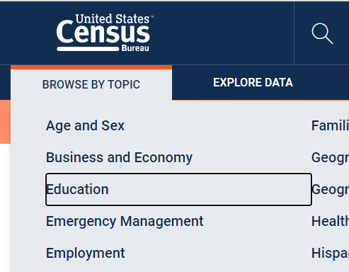
You need strong visual cues on your web forms so that keyboard navigators know which fields are being selected. When the tab key selects an input field, it should be surrounded by a box with a contrasting color. According to The World Wide Web Consortium (W3C), the internet’s “accessibility bible,” the contrast ratio should be at least 4.5 to 1 for text under 14 pt. Here’s an example from the U.S. Census Bureau:
Here is an example focus styling snippet you can add to your CSS style sheet:
  &:focus {
    outline: 3px solid #2E1BA6;
    border-color: transparent;
  }
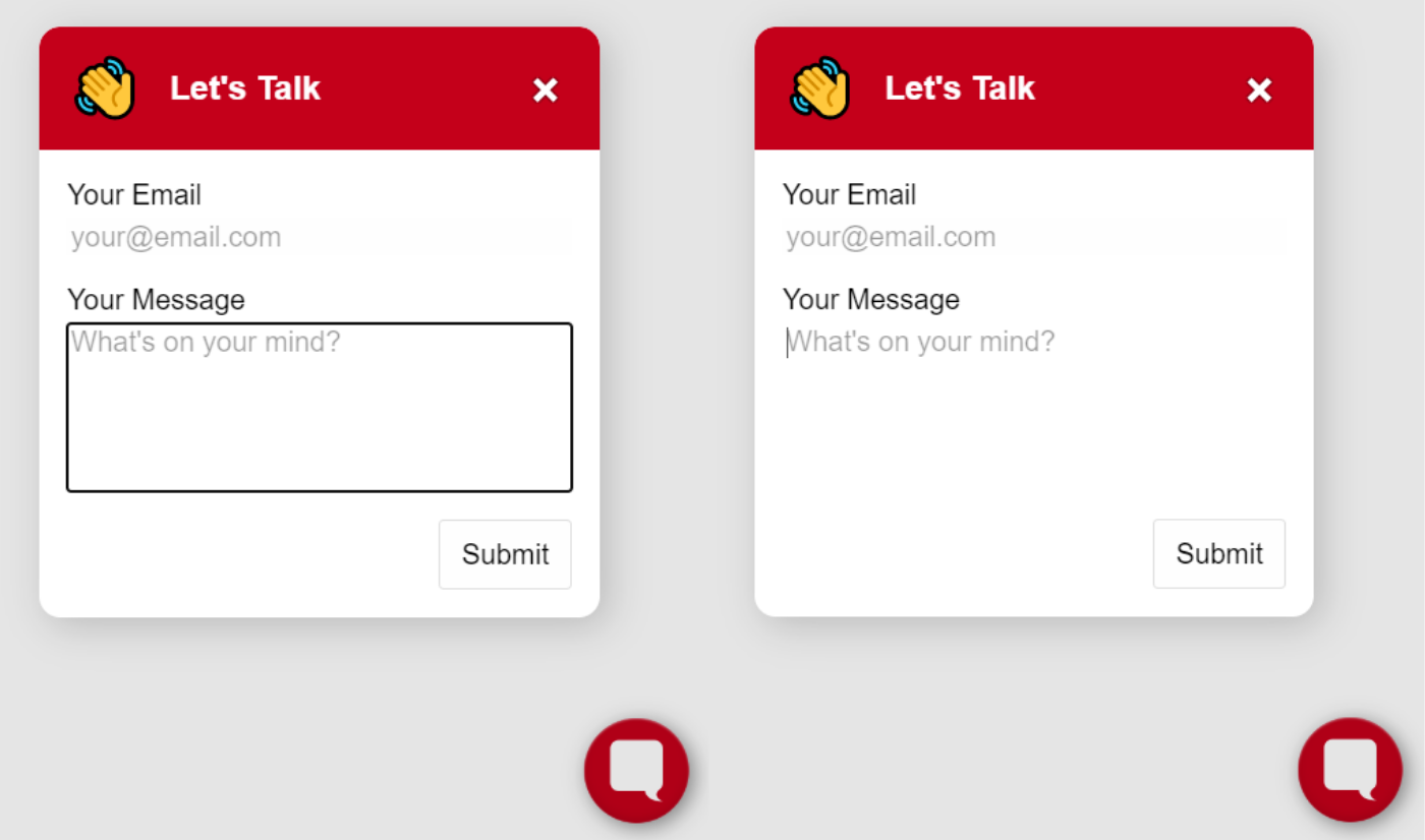
And don’t worry, focus styling doesn’t mean you have to sacrifice on design. You can customize the color of the box to match your brand colors, as long as there’s enough contrast. You can also set up different visual cues for keyboard and mouse navigation. Spotify took this approach. Here, the download button in the upper right turns green when you hover near it with a cursor:

When the same button is selected with the tab key, a light box appears around it as well:

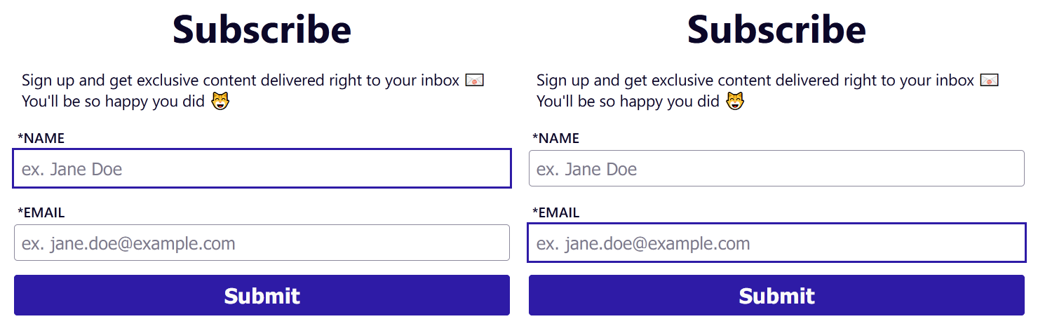
We used this same method when designing Formbutton, our form pop-up product. When a field receives keyboard focus, a high contrast box appears around it. When using a mouse, the focus outline is more subtle.
Additional resources:
WebAIM’s Contrast Checker
MDN web docs: HTML as a basis for accessibility
Carnegie Museums on Keyboard Accessibility
2. Use a Clear Visual Label—Not Placeholder Text
Placeholder text—the lightly colored, temporary copy in form fields—introduces a number of issues for users.
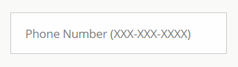
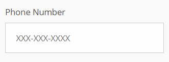
Here, both the type of form field (phone number) and instructions for formatting (XXX-XXX-XXXX) are in the placeholder text. This is the number-one form accessibility fail we see on the internet.
Visually impaired people often have trouble reading it since there is low contrast between the text color and the form field background. Plus, screen readers often don’t detect placeholder text.
This design also strains short-term memory since the text disappears once the user selects the field. These temporary instructions are frustrating for just about everyone. It’s easy to forget the text, especially if you’re in a frenzy of online multitasking (how many browser tabs do you have open right now?).
Instead, include a clear visual label above the form fields. Continuing with our previous example, insert “phone number” above the form.
Even better, include phone number formatting details above the input field as well.
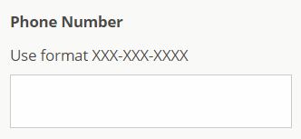
The label is clear and the formatting instructions are outside of the field.
It’s okay to occasionally use placeholder text to give people more context or hints. For information that is essential for filling out the form, it’s best to avoid placeholder text.
Additional resources:
Placeholders in Form Fields Are Harmful by NN/g
Designing for accessibility is not that hard by the UX Collective
3. Code Programmatic Form Labels for Screen Readers
Label tags (<label> and </label>) are required to make your form accessible to screen reader users. The assistive technology will announce the text within them when it reaches its associated form input. Label tags also create a clear visual label (our best practice #2 above).
What you don’t want to do is create a label with text formatting:
  <b>Full Name</b>
  <input type="text" name="name" id="full-name">
It renders like this:
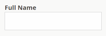
It looks like you properly labeled your form, but it’s all style and no substance. Screen readers won’t be able to associate the text label with the form field. Use <label> tags to connect the two.
There are two ways to connect the <label> with the <input> in your code:
- Option 1: Match the label’s
for=""attribute with the input’sid=""attribute.
  <label for="full-name">Full Name</label>
  <input type="text" name="name" id="full-name">
- Option 2: Code the input within the
<label>tags.
  <label>
    Full Name
    <input type="text" name="full-name">
  </label>
Both methods will get you an accessible form field with a clear visual label.
Additional resources:
W3C on Labeling Controls
Deque’s Anatomy of Accessible Forms
4. Group-Related Inputs with Fieldsets and Legends
Giving multiple-choice questions a logical structure helps screen readers clearly interpret the form. This is where <fieldset> and <legend> tags come into play, especially with questions involving checkboxes or radio buttons.
The <fieldset> tag tells the form that a group of inputs belongs together, and the <legend> tag acts as a label for the group of inputs. If your code doesn’t have these elements, people using screen readers will hear the label for each option but not the question it is answering.
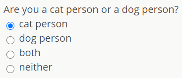
Consider this form question:
The code with proper <fieldset> and <legend> tags looks like this:
  <fieldset>
    <legend>Are you a cat person or a dog person?</legend>
    <div>
      <input type="radio" name="animal" value="cat-person" id="cat-person">
      <label for="cat-person">cat person</label>
    </div>
    <div>
      <input type="radio" name="animal" value="dog-person" id="dog-person">
      <label for="dog-person">dog person</label>
    </div>
    <div>
      <input type="radio" name="animal" value="both" id="both">
      <label for="both">both</label>
    </div>
    <div>
      <input type="radio" name="animal" value="neither" id="neither">
      <label for="neither">neither</label>
    </div>
  </fieldset>
Without the <legend> tag in your code, a screen reader would only read out the labels for each input—cat person, dog person, both, and neither. But what was the question? It could just as well be, “Who is the most likely to wear socks with sandals?”
This issue is especially problematic with “yes or no” questions. After hearing these general answers, visually impaired users wouldn’t even be able to guess what is being asked.
Use <fieldset> and <legend> tags in your code, so the questions and possible responses are clear to all users.
Additional resources:
University of Washington Accessible Forms Checklist
Carnegie Museums’ Web Accessibility Guidelines
W3C on Grouping Form Controls
5. Provide Instructions for Screen Readers with ARIA labels
ARIA—Accessible Rich Internet Applications—is a set of related HTML attributes that includes instructions and information for screen readers. These attributes, such as aria-label and aria-labeledby, don’t display anything on the web page. Per WebAIM, ARIA should only be used when native HTML is not sufficiently clear.
ARIA attributes are essential when they provide information that someone relying on a screen reader needs to hear to understand the form.
Say, for example, you have a field with a button that says “Search”:
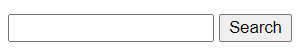
This field is visually clear, but to make it accessible to screen readers, it needs an ARIA attribute:
  <input type="text" name="search" aria-label="Search">
  <button type="submit">Search</button>
As with most things HTML, there’s more than one way to go about it. This W3C tutorial shows you several ways to approach accessible labeling using both ARIA attributes and native HTML.
You can also use ARIA to provide instructions, such as date formatting. This is a case where ARIA is helpful but not necessarily mandatory. Consider this code from the University of Washington.
  <label for="DOB">Date of birth:</label>
  <input type="text" name="birthdate" id="DOB" aria-describedby="DOB-help">
  <span id="DOB-help">MM/DD/YYYY</span>
This is how it renders:
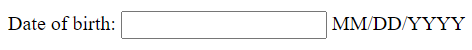
The attribute aria-describedby tells the screen reader to use the matching id=“DOB-help” input as a description. The screen reader will then announce the value “MM/DD/YYYY” that is associated with the designated id.
ARIA attributes are more complex than what we cover here. We recommend checking out the additional resources below if you’re interested in learning more.
Additional resources:
Introduction to ARIA by WebAIM (so good we’re linking to it twice)
Advanced Form Labeling by WebAIM
ARIA by MDN web docs
ARIA Landmarks by NC State University
Accessible Forms Are One Piece of the Puzzle
Too often, accessibility is still an afterthought in web design. Many people still have frustrating experiences navigating the web, even with assistive technology. The good news is that if you are reading this article, you probably want to do better. Try Google’s Lighthouse or another tool to grade your website’s accessibility and identify opportunities to improve.
At Formspree, we take accessibility seriously. If you come across any accessibility problems on our website or with our tools, let us know and we’ll fix it right away.