Contact Form
 Preview
 Code
Code
HTML
 Copy
Copy
<form
action="https://formspree.io/f/{FORM_ID}"
class="fs-form"
target="_top"
method="POST"
>
<div class="fs-field">
<label class="fs-label" for="email">Email</label>
<input class="fs-input" id="email" name="email" required />
</div>
<div class="fs-field">
<label class="fs-label" for="message">Message</label>
<textarea class="fs-textarea" id="message" name="message"></textarea>
</div>
<div class="fs-button-group">
<button class="fs-button" type="submit">Submit</button>
</div>
</form>
Show more
 CSS
Copy
CSS
Copy
@import url("https://fonts.googleapis.com/css2?family=Inter:ital,opsz,wght@0,14..32,100..900;1,14..32,100..900&display=swap");
/** Variables **/
:root {
--color-background: #cbd5e1;
--color-background-alt: #64748b;
--color-border-active: #64748b;
--color-border-default: #94a3b8;
--color-highlight: #cbd5e1;
--color-primary: #1e293b;
--color-primary-active: #090f1d;
--color-text-default: #0f172a;
--color-text-muted: #475569;
--font-family-body: "Inter", sans-serif;
}
/** Base **/
*,
::before,
::after {
box-sizing: border-box;
}
* {
border: 0;
margin: 0;
padding: 0;
}
body {
-webkit-font-smoothing: antialiased;
font-family: var(--font-family-body);
font-optical-sizing: auto;
font-style: normal;
}
button,
input,
optgroup,
select,
textarea {
font-family: inherit;
font-feature-settings: inherit;
font-variation-settings: inherit;
font-size: 100%;
font-weight: inherit;
line-height: inherit;
color: inherit;
margin: 0;
padding: 0;
}
[type="checkbox"],
[type="radio"],
[type="range"] {
appearance: none;
flex-shrink: 0;
padding: 0;
user-select: none;
}
[type="checkbox"]:focus,
[type="radio"]:focus,
[type="range"]:focus {
outline: none;
}
/** Components **/
.fs-form {
display: grid;
row-gap: 1.5rem;
}
.fs-form:where(.fs-layout__2-column) {
column-gap: 1.5rem;
grid-template-columns: 1fr 1fr;
}
fieldset {
display: grid;
margin: 1.5rem 0;
row-gap: 1.5rem;
}
.fs-form:where(.fs-layout__2-column) fieldset {
column-gap: 1.5rem;
grid-template-columns: 1fr 1fr;
grid-column: 1 / -1;
}
.fs-fieldset-title {
color: var(--color-text-default);
font-family: var(--font-family-display);
font-size: 1.25rem;
font-weight: 500;
line-height: 1.75rem;
margin-bottom: 1.5rem;
grid-column: 1 / -1;
}
.fs-field {
display: flex;
flex-direction: column;
row-gap: 0.375rem;
}
.fs-label {
color: var(--color-text-default);
display: block;
font-family: var(--font-family-display);
font-size: 0.875rem;
font-weight: 500;
line-height: 1.25rem;
}
.fs-description {
color: var(--color-text-muted);
display: block;
font-size: 0.875rem;
line-height: 1.25rem;
}
.fs-button-group {
display: flex;
flex-direction: row-reverse;
column-gap: 1.5rem;
}
.fs-form:where(.fs-layout__2-column) .fs-button-group {
grid-column: 1 / -1;
}
.fs-button {
background-color: var(--color-primary);
border-radius: 0.375rem;
color: white;
cursor: pointer;
font-size: 0.875rem;
font-weight: 500;
line-height: 1rem;
padding: 1rem 2rem;
transition-duration: 200ms;
transition-property: background-color;
transition-timing-function: cubic-bezier(0.4, 0, 0.2, 1);
}
.fs-button:hover {
background-color: var(--color-primary-active);
}
.fs-button:focus-visible {
background-color: var(--color-primary-active);
outline: 3px solid var(--color-highlight);
}
.fs-input,
.fs-select {
appearance: none;
border-radius: 0.375rem;
border-width: 0;
box-shadow: var(--color-border-default) 0 0 0 1px inset;
color: var(--color-primary);
font-size: 1rem;
height: 2.5rem;
line-height: 1.5rem;
outline: none;
padding-left: 0.75rem;
padding-right: 0.75rem;
}
.fs-input:focus-visible,
.fs-select:focus-visible {
box-shadow: var(--color-border-active) 0 0 0 1.5px inset;
outline: 3px solid var(--color-highlight);
outline-offset: 0;
}
.fs-input::placeholder {
color: var(--color-text-muted);
}
.fs-checkbox-group,
.fs-radio-group {
display: flex;
flex-direction: column;
row-gap: 0.5rem;
}
.fs-checkbox-field,
.fs-radio-field {
column-gap: 0.5rem;
display: flex;
}
:is(.fs-checkbox-field, .fs-radio-field) .fs-label + .fs-description {
margin-top: 0.125rem;
}
.fs-checkbox-wrapper,
.fs-radio-wrapper {
align-items: center;
display: flex;
height: 1.25rem;
}
.fs-checkbox,
.fs-radio {
background-color: #fff;
border: 1px solid var(--color-primary);
height: 1rem;
width: 1rem;
}
.fs-checkbox {
border-radius: 0.25rem;
}
.fs-radio {
border-radius: 100%;
}
.fs-checkbox:checked,
.fs-radio:checked {
background-color: var(--color-primary);
background-position: center;
background-repeat: no-repeat;
background-size: 100% 100%;
border-color: transparent;
}
.fs-checkbox:checked {
background-image: url("data:image/svg+xml,%3csvg viewBox='0 0 16 16' fill='white' xmlns='http://www.w3.org/2000/svg'%3e%3cpath d='M12.207 4.793a1 1 0 010 1.414l-5 5a1 1 0 01-1.414 0l-2-2a1 1 0 011.414-1.414L6.5 9.086l4.293-4.293a1 1 0 011.414 0z'/%3e%3c/svg%3e");
}
.fs-radio:checked {
background-image: url("data:image/svg+xml,%3csvg viewBox='0 0 16 16' fill='white' xmlns='http://www.w3.org/2000/svg'%3e%3ccircle cx='8' cy='8' r='3'/%3e%3c/svg%3e");
}
.fs-checkbox:focus-visible,
.fs-radio:focus-visible {
outline: 3px solid var(--color-highlight);
outline-offset: 0;
}
.fs-select {
background-color: #fff;
background-image: url("data:image/svg+xml,%3csvg xmlns='http://www.w3.org/2000/svg' fill='none' viewBox='0 0 20 20'%3e%3cpath stroke='%236b7280' stroke-linecap='round' stroke-linejoin='round' stroke-width='1.5' d='M6 8l4 4 4-4'/%3e%3c/svg%3e");
background-position: right 0.5rem center;
background-repeat: no-repeat;
background-size: 1.5em 1.5em;
padding-right: 2.5rem;
}
.fs-slider {
background: transparent;
cursor: pointer;
height: 1.25rem;
width: 100%;
}
.fs-slider::-moz-range-track {
background-color: var(--color-background);
border-radius: 0.5rem;
height: 0.5rem;
}
.fs-slider::-webkit-slider-runnable-track {
background-color: var(--color-background);
border-radius: 0.5rem;
height: 0.5rem;
}
.fs-slider::-moz-range-thumb {
background-color: var(--color-primary);
border: none; /* Removes extra border that FF applies */
border-radius: 50%;
height: 1.25rem;
width: 1.25rem;
}
.fs-slider::-webkit-slider-thumb {
appearance: none;
background-color: var(--color-primary);
border-radius: 50%;
height: 1.25rem;
margin-top: -0.375rem; /* Centers thumb on the track */
width: 1.25rem;
}
.fs-slider:focus-visible::-moz-range-thumb {
outline: 2px solid var(--color-primary);
outline-offset: 2px;
}
.fs-slider:focus-visible::-webkit-slider-thumb {
outline: 2px solid var(--color-primary);
outline-offset: 2px;
}
.fs-switch-field {
align-items: center;
column-gap: 0.75rem;
display: flex;
justify-content: space-between;
}
.fs-switch {
background-color: var(--color-background-alt);
background-image: url("data:image/svg+xml,%3csvg xmlns='http://www.w3.org/2000/svg' viewBox='-4 -4 8 8'%3e%3ccircle r='3' fill='white'/%3e%3c/svg%3e");
background-position: left center;
background-repeat: no-repeat;
border-radius: 1.5rem;
cursor: pointer;
height: 1.5rem;
transition-duration: 200ms;
transition-property: background-color, background-position;
transition-timing-function: cubic-bezier(0.4, 0, 0.2, 1);
width: 2.75rem;
}
.fs-switch:checked {
background-color: var(--color-primary);
background-position: right center;
}
.fs-switch:focus-visible {
outline: 3px solid var(--color-highlight);
outline-offset: 0;
}
.fs-textarea {
appearance: none;
border-radius: 0.375rem;
border-width: 0;
box-shadow: var(--color-border-default) 0 0 0 1px inset;
color: var(--color-primary);
font-size: 1rem;
line-height: 1.5rem;
outline: none;
padding: 0.5rem 0.75rem;
resize: vertical;
}
.fs-textarea:focus-visible {
box-shadow: var(--color-border-active) 0 0 0 1.5px inset;
outline: 3px solid var(--color-highlight);
outline-offset: 0;
}
.fs-textarea::placeholder {
color: var(--color-text-muted);
}
Show more
           HTML/Tailwind
           Copy


        <form
  action="https://formspree.io/f/{FORM_ID}"
  class="grid gap-y-6"
  target="_top"
  method="POST"
>
  <div class="flex flex-col gap-y-1.5">
    <label
      class="block font-[family-name:--font-family-display] text-sm font-medium text-[--color-text-default]"
      for="email"
    >
      Email
    </label>
    <input
      class="h-10 appearance-none rounded-md border-0 px-3 text-[--color-text-default] outline-none ring-1 ring-inset ring-[--color-border-default] placeholder:text-[--color-text-muted] focus-visible:outline focus-visible:outline-[3px] focus-visible:outline-offset-0 focus-visible:outline-[--color-highlight] focus-visible:ring-[1.5px] focus-visible:ring-inset focus-visible:ring-[--color-border-active]"
      id="email"
      name="email"
      required
    />
  </div>
  <div class="flex flex-col gap-y-1.5">
    <label
      class="block font-[family-name:--font-family-display] text-sm font-medium text-[--color-text-default]"
      for="message"
    >
      Message
    </label>
    <textarea
      class="resize-y appearance-none rounded-md border-0 px-3 py-2 text-[--color-text-default] outline-none ring-1 ring-inset ring-[--color-border-default] placeholder:text-[--color-text-muted] focus-visible:outline focus-visible:outline-[3px] focus-visible:outline-offset-0 focus-visible:outline-[--color-highlight] focus-visible:ring-[1.5px] focus-visible:ring-inset focus-visible:ring-[--color-border-active]"
      id="message"
      name="message"
    ></textarea>
  </div>
  <div class="flex flex-row-reverse gap-x-6">
    <button
      class="cursor-pointer rounded-md bg-[--color-primary] px-8 py-4 text-sm font-medium leading-4 text-white transition-colors duration-200 hover:bg-[--color-primary-active] focus-visible:bg-[--color-primary-active] focus-visible:outline focus-visible:outline-[3px] focus-visible:outline-[--color-highlight]"
      type="submit"
    >
      Submit
    </button>
  </div>
</form>


        Show more

           CSS
           Copy


        @import url("https://fonts.googleapis.com/css2?family=Inter:ital,opsz,wght@0,14..32,100..900;1,14..32,100..900&display=swap");

@tailwind base;
@tailwind components;
@tailwind utilities;

@layer base {
  :root {
    --color-background: #cbd5e1;
    --color-background-alt: #64748b;
    --color-border-active: #64748b;
    --color-border-default: #94a3b8;
    --color-highlight: #cbd5e1;
    --color-primary: #1e293b;
    --color-primary-active: #090f1d;
    --color-text-default: #0f172a;
    --color-text-muted: #475569;

    --font-family-body: "Inter", sans-serif;
  }

  *,
  ::before,
  ::after {
    box-sizing: border-box;
  }

  * {
    border: 0;
    margin: 0;
    padding: 0;
  }

  body {
    -webkit-font-smoothing: antialiased;
    font-family: var(--font-family-body);
    font-optical-sizing: auto;
    font-style: normal;
  }

  button,
  input,
  optgroup,
  select,
  textarea {
    font-family: inherit;
    font-feature-settings: inherit;
    font-variation-settings: inherit;
    font-size: 100%;
    font-weight: inherit;
    line-height: inherit;
    color: inherit;
    margin: 0;
    padding: 0;
  }

  [type="checkbox"],
  [type="radio"],
  [type="range"] {
    appearance: none;
    flex-shrink: 0;
    padding: 0;
    user-select: none;
  }

  [type="checkbox"]:focus,
  [type="radio"]:focus,
  [type="range"]:focus {
    outline: none;
  }
}

@layer components {
  .fs-slider {
    background: transparent;
    cursor: pointer;
    height: 1.25rem;
    width: 100%;
  }

  .fs-slider::-moz-range-track {
    background-color: var(--color-background);
    border-radius: 0.5rem;
    height: 0.5rem;
  }

  .fs-slider::-webkit-slider-runnable-track {
    background-color: var(--color-background);
    border-radius: 0.5rem;
    height: 0.5rem;
  }

  .fs-slider::-moz-range-thumb {
    background-color: var(--color-primary);
    border: none; /* Removes extra border that FF applies */
    border-radius: 50%;
    height: 1.25rem;
    width: 1.25rem;
  }

  .fs-slider::-webkit-slider-thumb {
    appearance: none;
    background-color: var(--color-primary);
    border-radius: 50%;
    height: 1.25rem;
    margin-top: -0.375rem; /* Centers thumb on the track */
    width: 1.25rem;
  }

  .fs-slider:focus-visible::-moz-range-thumb {
    outline: 2px solid var(--color-primary);
    outline-offset: 2px;
  }

  .fs-slider:focus-visible::-webkit-slider-thumb {
    outline: 2px solid var(--color-primary);
    outline-offset: 2px;
  }
}

@layer utilities {
  .bg-caret-down {
    background-image: url("data:image/svg+xml,%3csvg xmlns='http://www.w3.org/2000/svg' fill='none' viewBox='0 0 20 20'%3e%3cpath stroke='%236b7280' stroke-linecap='round' stroke-linejoin='round' stroke-width='1.5' d='M6 8l4 4 4-4'/%3e%3c/svg%3e");
  }

  .bg-checkbox-checked {
    background-image: url("data:image/svg+xml,%3csvg viewBox='0 0 16 16' fill='white' xmlns='http://www.w3.org/2000/svg'%3e%3cpath d='M12.207 4.793a1 1 0 010 1.414l-5 5a1 1 0 01-1.414 0l-2-2a1 1 0 011.414-1.414L6.5 9.086l4.293-4.293a1 1 0 011.414 0z'/%3e%3c/svg%3e");
  }

  .bg-radio-checked {
    background-image: url("data:image/svg+xml,%3csvg viewBox='0 0 16 16' fill='white' xmlns='http://www.w3.org/2000/svg'%3e%3ccircle cx='8' cy='8' r='3'/%3e%3c/svg%3e");
  }

  .bg-switch-thumb {
    background-image: url("data:image/svg+xml,%3csvg xmlns='http://www.w3.org/2000/svg' viewBox='-4 -4 8 8'%3e%3ccircle r='3' fill='white'/%3e%3c/svg%3e");
  }
}


        Show more
           React
           Copy


        // Make sure to run npm install @formspree/react
// For more help visit https://formspr.ee/react-help
import React from "react";
import { useForm, ValidationError } from "@formspree/react";

export function ExampleForm() {
  const [state, handleSubmit] = useForm("FORM_ID");

  if (state.succeeded) {
    return <p>Thanks for joining!</p>;
  }

  return (
    <form className="fs-form" onSubmit={handleSubmit}>
      <div className="fs-field">
        <label className="fs-label" htmlFor="email">
          Email
        </label>
        <input className="fs-input" id="email" name="email" required />
      </div>
      <div className="fs-field">
        <label className="fs-label" htmlFor="message">
          Message
        </label>
        <textarea className="fs-textarea" id="message" name="message" />
      </div>
      <div class="fs-button-group">
        <button className="fs-button" type="submit">
          Submit
        </button>
      </div>
    </form>
  );
}


        Show more

           CSS
           Copy


        @import url("https://fonts.googleapis.com/css2?family=Inter:ital,opsz,wght@0,14..32,100..900;1,14..32,100..900&display=swap");

/** Variables **/

:root {
  --color-background: #cbd5e1;
  --color-background-alt: #64748b;
  --color-border-active: #64748b;
  --color-border-default: #94a3b8;
  --color-highlight: #cbd5e1;
  --color-primary: #1e293b;
  --color-primary-active: #090f1d;
  --color-text-default: #0f172a;
  --color-text-muted: #475569;

  --font-family-body: "Inter", sans-serif;
}

/** Base **/

*,
::before,
::after {
  box-sizing: border-box;
}

* {
  border: 0;
  margin: 0;
  padding: 0;
}

body {
  -webkit-font-smoothing: antialiased;
  font-family: var(--font-family-body);
  font-optical-sizing: auto;
  font-style: normal;
}

button,
input,
optgroup,
select,
textarea {
  font-family: inherit;
  font-feature-settings: inherit;
  font-variation-settings: inherit;
  font-size: 100%;
  font-weight: inherit;
  line-height: inherit;
  color: inherit;
  margin: 0;
  padding: 0;
}

[type="checkbox"],
[type="radio"],
[type="range"] {
  appearance: none;
  flex-shrink: 0;
  padding: 0;
  user-select: none;
}

[type="checkbox"]:focus,
[type="radio"]:focus,
[type="range"]:focus {
  outline: none;
}

/** Components **/

.fs-form {
  display: grid;
  row-gap: 1.5rem;
}

.fs-form:where(.fs-layout__2-column) {
  column-gap: 1.5rem;
  grid-template-columns: 1fr 1fr;
}

fieldset {
  display: grid;
  margin: 1.5rem 0;
  row-gap: 1.5rem;
}

.fs-form:where(.fs-layout__2-column) fieldset {
  column-gap: 1.5rem;
  grid-template-columns: 1fr 1fr;
  grid-column: 1 / -1;
}

.fs-fieldset-title {
  color: var(--color-text-default);
  font-family: var(--font-family-display);
  font-size: 1.25rem;
  font-weight: 500;
  line-height: 1.75rem;
  margin-bottom: 1.5rem;
  grid-column: 1 / -1;
}

.fs-field {
  display: flex;
  flex-direction: column;
  row-gap: 0.375rem;
}

.fs-label {
  color: var(--color-text-default);
  display: block;
  font-family: var(--font-family-display);
  font-size: 0.875rem;
  font-weight: 500;
  line-height: 1.25rem;
}

.fs-description {
  color: var(--color-text-muted);
  display: block;
  font-size: 0.875rem;
  line-height: 1.25rem;
}

.fs-button-group {
  display: flex;
  flex-direction: row-reverse;
  column-gap: 1.5rem;
}

.fs-form:where(.fs-layout__2-column) .fs-button-group {
  grid-column: 1 / -1;
}

.fs-button {
  background-color: var(--color-primary);
  border-radius: 0.375rem;
  color: white;
  cursor: pointer;
  font-size: 0.875rem;
  font-weight: 500;
  line-height: 1rem;
  padding: 1rem 2rem;
  transition-duration: 200ms;
  transition-property: background-color;
  transition-timing-function: cubic-bezier(0.4, 0, 0.2, 1);
}

.fs-button:hover {
  background-color: var(--color-primary-active);
}

.fs-button:focus-visible {
  background-color: var(--color-primary-active);
  outline: 3px solid var(--color-highlight);
}

.fs-input,
.fs-select {
  appearance: none;
  border-radius: 0.375rem;
  border-width: 0;
  box-shadow: var(--color-border-default) 0 0 0 1px inset;
  color: var(--color-primary);
  font-size: 1rem;
  height: 2.5rem;
  line-height: 1.5rem;
  outline: none;
  padding-left: 0.75rem;
  padding-right: 0.75rem;
}

.fs-input:focus-visible,
.fs-select:focus-visible {
  box-shadow: var(--color-border-active) 0 0 0 1.5px inset;
  outline: 3px solid var(--color-highlight);
  outline-offset: 0;
}

.fs-input::placeholder {
  color: var(--color-text-muted);
}

.fs-checkbox-group,
.fs-radio-group {
  display: flex;
  flex-direction: column;
  row-gap: 0.5rem;
}

.fs-checkbox-field,
.fs-radio-field {
  column-gap: 0.5rem;
  display: flex;
}

:is(.fs-checkbox-field, .fs-radio-field) .fs-label + .fs-description {
  margin-top: 0.125rem;
}

.fs-checkbox-wrapper,
.fs-radio-wrapper {
  align-items: center;
  display: flex;
  height: 1.25rem;
}

.fs-checkbox,
.fs-radio {
  background-color: #fff;
  border: 1px solid var(--color-primary);
  height: 1rem;
  width: 1rem;
}

.fs-checkbox {
  border-radius: 0.25rem;
}

.fs-radio {
  border-radius: 100%;
}

.fs-checkbox:checked,
.fs-radio:checked {
  background-color: var(--color-primary);
  background-position: center;
  background-repeat: no-repeat;
  background-size: 100% 100%;
  border-color: transparent;
}

.fs-checkbox:checked {
  background-image: url("data:image/svg+xml,%3csvg viewBox='0 0 16 16' fill='white' xmlns='http://www.w3.org/2000/svg'%3e%3cpath d='M12.207 4.793a1 1 0 010 1.414l-5 5a1 1 0 01-1.414 0l-2-2a1 1 0 011.414-1.414L6.5 9.086l4.293-4.293a1 1 0 011.414 0z'/%3e%3c/svg%3e");
}

.fs-radio:checked {
  background-image: url("data:image/svg+xml,%3csvg viewBox='0 0 16 16' fill='white' xmlns='http://www.w3.org/2000/svg'%3e%3ccircle cx='8' cy='8' r='3'/%3e%3c/svg%3e");
}

.fs-checkbox:focus-visible,
.fs-radio:focus-visible {
  outline: 3px solid var(--color-highlight);
  outline-offset: 0;
}

.fs-select {
  background-color: #fff;
  background-image: url("data:image/svg+xml,%3csvg xmlns='http://www.w3.org/2000/svg' fill='none' viewBox='0 0 20 20'%3e%3cpath stroke='%236b7280' stroke-linecap='round' stroke-linejoin='round' stroke-width='1.5' d='M6 8l4 4 4-4'/%3e%3c/svg%3e");
  background-position: right 0.5rem center;
  background-repeat: no-repeat;
  background-size: 1.5em 1.5em;
  padding-right: 2.5rem;
}

.fs-slider {
  background: transparent;
  cursor: pointer;
  height: 1.25rem;
  width: 100%;
}

.fs-slider::-moz-range-track {
  background-color: var(--color-background);
  border-radius: 0.5rem;
  height: 0.5rem;
}

.fs-slider::-webkit-slider-runnable-track {
  background-color: var(--color-background);
  border-radius: 0.5rem;
  height: 0.5rem;
}

.fs-slider::-moz-range-thumb {
  background-color: var(--color-primary);
  border: none; /* Removes extra border that FF applies */
  border-radius: 50%;
  height: 1.25rem;
  width: 1.25rem;
}

.fs-slider::-webkit-slider-thumb {
  appearance: none;
  background-color: var(--color-primary);
  border-radius: 50%;
  height: 1.25rem;
  margin-top: -0.375rem; /* Centers thumb on the track */
  width: 1.25rem;
}

.fs-slider:focus-visible::-moz-range-thumb {
  outline: 2px solid var(--color-primary);
  outline-offset: 2px;
}

.fs-slider:focus-visible::-webkit-slider-thumb {
  outline: 2px solid var(--color-primary);
  outline-offset: 2px;
}

.fs-switch-field {
  align-items: center;
  column-gap: 0.75rem;
  display: flex;
  justify-content: space-between;
}

.fs-switch {
  background-color: var(--color-background-alt);
  background-image: url("data:image/svg+xml,%3csvg xmlns='http://www.w3.org/2000/svg' viewBox='-4 -4 8 8'%3e%3ccircle r='3' fill='white'/%3e%3c/svg%3e");
  background-position: left center;
  background-repeat: no-repeat;
  border-radius: 1.5rem;
  cursor: pointer;
  height: 1.5rem;
  transition-duration: 200ms;
  transition-property: background-color, background-position;
  transition-timing-function: cubic-bezier(0.4, 0, 0.2, 1);
  width: 2.75rem;
}

.fs-switch:checked {
  background-color: var(--color-primary);
  background-position: right center;
}

.fs-switch:focus-visible {
  outline: 3px solid var(--color-highlight);
  outline-offset: 0;
}

.fs-textarea {
  appearance: none;
  border-radius: 0.375rem;
  border-width: 0;
  box-shadow: var(--color-border-default) 0 0 0 1px inset;
  color: var(--color-primary);
  font-size: 1rem;
  line-height: 1.5rem;
  outline: none;
  padding: 0.5rem 0.75rem;
  resize: vertical;
}

.fs-textarea:focus-visible {
  box-shadow: var(--color-border-active) 0 0 0 1.5px inset;
  outline: 3px solid var(--color-highlight);
  outline-offset: 0;
}

.fs-textarea::placeholder {
  color: var(--color-text-muted);
}


        Show more
           React/Tailwind
           Copy


        // Make sure to run npm install @formspree/react
// For more help visit https://formspr.ee/react-help
import React from "react";
import { useForm, ValidationError } from "@formspree/react";

export function ExampleForm() {
  const [state, handleSubmit] = useForm("FORM_ID");

  if (state.succeeded) {
    return <p>Thanks for joining!</p>;
  }

  return (
    <form className="grid gap-y-6" onSubmit={handleSubmit}>
      <div className="flex flex-col gap-y-1.5">
        <label
          className="block font-[family-name:--font-family-display] text-sm font-medium text-[--color-text-default]"
          htmlFor="email"
        >
          Email
        </label>
        <input
          className="h-10 appearance-none rounded-md border-0 px-3 text-[--color-text-default] outline-none ring-1 ring-inset ring-[--color-border-default] placeholder:text-[--color-text-muted] focus-visible:outline focus-visible:outline-[3px] focus-visible:outline-offset-0 focus-visible:outline-[--color-highlight] focus-visible:ring-[1.5px] focus-visible:ring-inset focus-visible:ring-[--color-border-active]"
          id="email"
          name="email"
          required
        />
      </div>
      <div className="flex flex-col gap-y-1.5">
        <label
          className="block font-[family-name:--font-family-display] text-sm font-medium text-[--color-text-default]"
          htmlFor="message"
        >
          Message
        </label>
        <textarea
          className="resize-y appearance-none rounded-md border-0 px-3 py-2 text-[--color-text-default] outline-none ring-1 ring-inset ring-[--color-border-default] placeholder:text-[--color-text-muted] focus-visible:outline focus-visible:outline-[3px] focus-visible:outline-offset-0 focus-visible:outline-[--color-highlight] focus-visible:ring-[1.5px] focus-visible:ring-inset focus-visible:ring-[--color-border-active]"
          id="message"
          name="message"
        />
      </div>
      <div class="flex flex-row-reverse gap-x-6">
        <button
          className="cursor-pointer rounded-md bg-[--color-primary] px-8 py-4 text-sm font-medium leading-4 text-white transition-colors duration-200 hover:bg-[--color-primary-active] focus-visible:bg-[--color-primary-active] focus-visible:outline focus-visible:outline-[3px] focus-visible:outline-[--color-highlight]"
          type="submit"
        >
          Submit
        </button>
      </div>
    </form>
  );
}


        Show more

           CSS
           Copy


        @import url("https://fonts.googleapis.com/css2?family=Inter:ital,opsz,wght@0,14..32,100..900;1,14..32,100..900&display=swap");

@tailwind base;
@tailwind components;
@tailwind utilities;

@layer base {
  :root {
    --color-background: #cbd5e1;
    --color-background-alt: #64748b;
    --color-border-active: #64748b;
    --color-border-default: #94a3b8;
    --color-highlight: #cbd5e1;
    --color-primary: #1e293b;
    --color-primary-active: #090f1d;
    --color-text-default: #0f172a;
    --color-text-muted: #475569;

    --font-family-body: "Inter", sans-serif;
  }

  *,
  ::before,
  ::after {
    box-sizing: border-box;
  }

  * {
    border: 0;
    margin: 0;
    padding: 0;
  }

  body {
    -webkit-font-smoothing: antialiased;
    font-family: var(--font-family-body);
    font-optical-sizing: auto;
    font-style: normal;
  }

  button,
  input,
  optgroup,
  select,
  textarea {
    font-family: inherit;
    font-feature-settings: inherit;
    font-variation-settings: inherit;
    font-size: 100%;
    font-weight: inherit;
    line-height: inherit;
    color: inherit;
    margin: 0;
    padding: 0;
  }

  [type="checkbox"],
  [type="radio"],
  [type="range"] {
    appearance: none;
    flex-shrink: 0;
    padding: 0;
    user-select: none;
  }

  [type="checkbox"]:focus,
  [type="radio"]:focus,
  [type="range"]:focus {
    outline: none;
  }
}

@layer components {
  .fs-slider {
    background: transparent;
    cursor: pointer;
    height: 1.25rem;
    width: 100%;
  }

  .fs-slider::-moz-range-track {
    background-color: var(--color-background);
    border-radius: 0.5rem;
    height: 0.5rem;
  }

  .fs-slider::-webkit-slider-runnable-track {
    background-color: var(--color-background);
    border-radius: 0.5rem;
    height: 0.5rem;
  }

  .fs-slider::-moz-range-thumb {
    background-color: var(--color-primary);
    border: none; /* Removes extra border that FF applies */
    border-radius: 50%;
    height: 1.25rem;
    width: 1.25rem;
  }

  .fs-slider::-webkit-slider-thumb {
    appearance: none;
    background-color: var(--color-primary);
    border-radius: 50%;
    height: 1.25rem;
    margin-top: -0.375rem; /* Centers thumb on the track */
    width: 1.25rem;
  }

  .fs-slider:focus-visible::-moz-range-thumb {
    outline: 2px solid var(--color-primary);
    outline-offset: 2px;
  }

  .fs-slider:focus-visible::-webkit-slider-thumb {
    outline: 2px solid var(--color-primary);
    outline-offset: 2px;
  }
}

@layer utilities {
  .bg-caret-down {
    background-image: url("data:image/svg+xml,%3csvg xmlns='http://www.w3.org/2000/svg' fill='none' viewBox='0 0 20 20'%3e%3cpath stroke='%236b7280' stroke-linecap='round' stroke-linejoin='round' stroke-width='1.5' d='M6 8l4 4 4-4'/%3e%3c/svg%3e");
  }

  .bg-checkbox-checked {
    background-image: url("data:image/svg+xml,%3csvg viewBox='0 0 16 16' fill='white' xmlns='http://www.w3.org/2000/svg'%3e%3cpath d='M12.207 4.793a1 1 0 010 1.414l-5 5a1 1 0 01-1.414 0l-2-2a1 1 0 011.414-1.414L6.5 9.086l4.293-4.293a1 1 0 011.414 0z'/%3e%3c/svg%3e");
  }

  .bg-radio-checked {
    background-image: url("data:image/svg+xml,%3csvg viewBox='0 0 16 16' fill='white' xmlns='http://www.w3.org/2000/svg'%3e%3ccircle cx='8' cy='8' r='3'/%3e%3c/svg%3e");
  }

  .bg-switch-thumb {
    background-image: url("data:image/svg+xml,%3csvg xmlns='http://www.w3.org/2000/svg' viewBox='-4 -4 8 8'%3e%3ccircle r='3' fill='white'/%3e%3c/svg%3e");
  }
}


        Show more
How to use this form
Get started in just a few steps.
-
Create a form on Formspree
Create a free account and choose New Form.
-
Add actions and validation rules
Choose from our growing list of actions, from Airtable to Zendesk and everything in between.
-
Update your form's action
Replace with the form endpoint in the code above with the ID from your new form.
<form action="https://formspree.io/f/{form_id}" method="post"> -
Tweak your form's code
Don’t forget to include a name attribute for every input.
-
Deploy your form to your hosting platform
Formspree works great with static websites, but also plays nicely with many hosting platforms like Shopify, Webflow and more. See the guides below.
How to Use This Form in Your Shopify Store
Follow these steps to copy and paste this form into your Shopify theme and get it working in minutes.
-
Create a Form on Formspree
Sign up for a free Formspree account and create a new form. Once created, you’ll get a unique form endpoint like
https://formspree.io/f/your-form-id. -
Copy the HTML from this Library Page
Scroll up and copy the full HTML form code shown above. Don’t forget to replace the
FORM_IDin theactionattribute with your actual form ID. -
Paste the Form into a Shopify Page
Go to your Shopify Admin and navigate to Online Store > Themes > Customize. Select the page where you want the form to appear, then add a new Custom Liquid section. Paste the copied HTML into the Custom Liquid field and save.
-
Copy the CSS Styles
Scroll up and copy the CSS snippet provided on this page. These styles are optimized for the form layout and appearance.
-
Paste the CSS into Your Shopify Theme
In your Shopify Admin, go to Online Store > Themes > Actions > Edit Code. Open the
assets/base.cssfile (or your theme’s main CSS file) and paste the copied CSS at the very end. Save the file. -
Preview and Publish
Return to the page where you added the form. You should now see your styled Formspree form live in your Shopify store. Test it out and then hit “Publish” to make it live for customers.
How to Use This Form in Your Webflow Project
Follow these simple steps to connect your Webflow form to Formspree and start receiving submissions instantly.
-
Add the Webflow Code Embed Block
In Webflow Designer, drag the Code Embed Block component from the Add panel onto your page.
-
Copy the HTML from this Page and Paste it in the Editor
Scroll up and copy the full HTML form code shown above. Paste it in the Code Embed Editor.
-
Add the CSS Styles
Scroll up and copy the CSS snippet provided on this page. These styles are optimized for the form layout and appearance. In the HTML code, add a
<style></style>tag and paste the CSS inside it. -
Create a Formspree Form Endpoint
Sign up for a free Formspree account and create a new form. Once it's created, you'll receive a unique form endpoint URL like
https://formspree.io/f/your-form-id. -
Set the Form Action in Webflow
In the HTML code, replace the value of the
actionattribute of the<form>tag with your Formspree endpoint URL. For example:<form action="https://formspree.io/f/your-form-id" method="post">. Once done, click on the Save & Close button in the Code Embed Block. -
Publish and Test Your Site
Click Publish in Webflow to deploy your site. Then visit the live page and test the form. You should see submissions appear in your Formspree dashboard immediately.
What Is a Shopify Contact Form?
If you’re running a Shopify store, one of the most essential features you need is a way for customers to get in touch with you. That’s where a Shopify contact form comes in. Whether customers want to ask about your products, check the status of an order, or request support, a contact form provides a structured, secure, and user-friendly method of communication.
In this article, we’ll break down what a Shopify contact form is, why it matters, and how to customize or extend it based on your needs. We’ll also explore tips for improving form performance and customer engagement—so you can grow your brand while keeping communication smooth. You can explore the templates at the top to quickly plug in contact forms in your Shopify site!
What is a Contact Form?
A contact form is a web form that allows users to send a message to a business directly from the website. It usually includes fields like:
- Name
- Email address
- Subject
- Message body
Sometimes, businesses add custom fields, like phone numbers or dropdowns for different types of inquiries (e.g., product support, returns, wholesale requests).
In Shopify, the contact form is typically pre-built into your Shopify theme, making it easy to get started—even if you don’t know how to code.
Why Do You Need a Contact Form in Your Shopify Store?
Adding a contact form to your Shopify store offers several advantages:
- Improves Customer Support: not every customer wants to call or send an email. A contact form simplifies the process, letting customers reach out from the site in seconds.
- Builds Trust and Credibility: Customers are more likely to trust a brand that’s accessible. A professional contact form reassures visitors that your store is legit and you’re ready to help.
- Reduces Spam: Compared to publishing your email address online, contact forms reduce the risk of spam from bots.
- Organizes Inquiries: You can route contact form submissions to specific email addresses, apply tags, or even connect them to customer support tools.
Where is the Default Shopify Contact Form?
Most Shopify themes come with a built-in contact form that’s easy to enable. Here’s how to find it on desktop devices:
- Go to your Shopify Admin.
- Navigate to Online Store > Pages.
- Click Add Page.
- Title the page “Contact” or something similar.
- In the Content box, feel free to add any content that you would want to show just above the form.
- Select
contactfrom the Theme template drop-down menu in the Online store section. - Click Save.
Now, when you visit the new page, you’ll see a simple contact form that includes fields for name, email, message, and a “send” button.
You can now link to this page in your store’s header or footer for easy access. To check out how to implement this on a mobile device, here are Shopify’s guides for vintage themes and for Online Store 2.0 themes.
How to Customize a Shopify Contact Form
The default contact form is great for basic needs, but you might want more control—like adding fields or validating email addresses. Here are a few ways to customize it:
1. Add New Fields
To add custom fields, you’ll need to edit the contact page template first to add your HTML fields. To do that, head over to your Shopify admin and navigate to Online store > Themes > Customize on your chosen theme.
In the editor that opens, navigate to the Contact page and delete the existing form section titled “Contact Form”. Now, add a new section of type Custom Liquid. This section will allow you to provide your own Liquid code to create web components.
In the Liquid code section, add the following code:
  <div style="display: flex; flex-direction: column; align-items: center">
    <form
      action="https://formspree.io/f/FORM_ID"
      class="fs-form"
      target="_top"
      method="POST"
    style="display: flex; flex-direction: column; width: 400px">
      <div class="fs-field">
        <label class="fs-label" for="email">Email</label>
        <input class="fs-input" id="email" name="email" required />
      </div>
      <div class="fs-field">
        <label class="fs-label" for="message">Message</label>
        <textarea class="fs-textarea" id="message" name="message"></textarea>
      </div>
      <div class="fs-button-group">
        <button class="fs-button" type="submit">Submit</button>
      </div>
    </form>
  </div>
This creates a simple contact form in your Shopify contact page that has the fields email and message. Make sure to replace FORM_ID with a real Formspree form ID to make this work.
Once the editor refreshes, you will be able to view the form in the contact page. However, it might not look great right now. We’ll fix this next.
2. Style the form
You need to add CSS to make the contact form look better. To do that:
- Go to Online Store > Themes > Actions > Edit Code
- Open the assets/base.css file
- Add your custom CSS to the end of the file. Feel free to copy the CSS from our forms library
This way, your form will better match the branding and feel of your Shopify store.
3. Add Validation
You can use JavaScript in your Liquid code to validate fields before submission—making sure fields like “email” are filled out correctly.
Here’s an example script:
  <script>
    document.querySelector('form').addEventListener('submit', function(e) {
      const email = document.querySelector('input[type="email"]').value;
      if (!email.includes('@')) {
        e.preventDefault();
        alert('Please enter a valid email address.');
      }
    });
  </script>
Best Practices for Your Shopify Contact Form
To make your contact form effective, you should keep the following tips in mind:
- Keep It Short: Only ask for what you really need. Long forms reduce completion rates.
- Make It Easy to Find: Put a link to your contact form in your navigation, footer, or “Help” section.
- Send Confirmation Messages: After submission, show a message like: “Thanks for reaching out! We’ll respond within 24 hours.” This improves user experience and reduces anxiety.
- Route Emails Effectively: Use Shopify’s notification settings or email filters to route different types of messages to different inboxes (sales@, support@, etc.)
- Protect Against Spam: Add CAPTCHA or honeypot fields to protect your form from bots. Many contact form apps include this as a built-in feature.
Adding a Contact Form to a Shopify Product or Collection Page
Want customers to ask questions about a specific product? You can embed a contact form directly on product or collection pages.
Here’s how:
- Create a new snippet, like contact-form.liquid
- Paste your form HTML inside the snippet
- Add the snippet to your product.liquid or collection.liquid template
You can even pre-fill the subject line with the product name:
<input type="hidden" name="contact[Subject]" value="Product Inquiry: {{ product.title }}">
This makes it easy to keep conversations organized and helps you respond faster.
Common Issues and Fixes for Shopify Contact Forms
1. Not Receiving Form Submission Emails
- Check your spam/junk folder: Especially for new forms, your email provider may flag messages as spam. If you find them there, mark them as “Not Spam” to train your filter.
- Check your submission log: Go to your Formspree dashboard, select your form, and view the “Submissions” tab. If submissions are listed there but not showing up in your inbox, the issue is with email delivery — not the form.
2. Form Not Submitting
- Ensure your
<form>tag contains a correct Formspree endpoint:<form action="https://formspree.io/f/your-form-id" method="POST"> - All inputs must include a
nameattribute (e.g.,name="email"), or Formspree won’t capture the data. - If the form is embedded in a Shopify Custom Liquid section, make sure your HTML is valid and not wrapped inside broken Liquid logic.
- Disable conflicting JavaScript from other apps that might hijack form submission or modify DOM behavior.
3. Form Styles Look Broken or Inconsistent
When you copy a Formspree form into a Shopify Custom Liquid section, you may notice that the form looks unstyled, cramped, or inconsistent with the preview shown in the Formspree Library. This happens because Shopify’s theme CSS can override or conflict with the Formspree form’s styling.
To fix this, make sure you include the provided CSS from the Formspree form page in the source file of your Shopify theme. While you can use style="" attributes in the HTML, Shopify implements a character limit on the custom code box, and often caches and minifies inline styles in custom HTMl code, which can make future editing harder. This is why it is all the more necessary to add your custom styles directly to the code of your Shopify theme.
Shopify Contact Form vs Live Chat
You might wonder if you even need a contact form in the age of live chat and social media. The truth is, both are valuable:
- Contact forms are great for structured, long-form questions that may take time to answer.
- Live chat works well for quick questions or product recommendations.
Combining both gives your Shopify store the best of both worlds—immediate support and thoughtful customer care.
Final Thoughts
The Shopify contact form may seem like a small feature, but it plays a big role in customer satisfaction, trust-building, and business operations. Whether you use the default form or a custom one, keeping it clear, easy to use, and accessible is key.
As your Shopify store grows, you can expand your contact forms with custom fields, multiple form types, or third-party apps to streamline customer communication even further.
If you’re looking to take your Shopify theme to the next level, a well-designed contact form paired with the Formspree forms backend is a great place to start!
FAQ
-
What is a contact form?
A contact form is a simple yet essential tool on websites, allowing visitors to send messages or inquiries directly to the site owner or support team without exposing their email addresses. It streamlines communication, making it easier for visitors to get in touch and for site owners to respond promptly.
-
What should be in a contact form?
A contact form typically includes fields such as the visitor's name, email address, subject, and message. These fields provide structured information, making it easier to understand the visitor’s request and respond accordingly.
-
Can the contact form templates be embedded directly on your website?
Yes, contact form templates can be easily embedded on your website. With Formspree as the backend, these forms are simple to integrate and require no server-side code, allowing seamless setup directly within your site’s HTML.
-
Can you set up the form to automatically notify a specific person whenever the form is filled out?
Absolutely, Formspree enables you to set up notifications so a designated person is alerted each time a form is filled out. This feature helps ensure prompt responses to inquiries, enhancing customer engagement.
-
Do the contact form templates allow for instant viewing of responses?
Yes, contact form templates integrated with Formspree allow for instant viewing of responses. Submissions are accessible in real-time through the Formspree dashboard, providing immediate access to visitor messages.
-
Do the offered contact form templates work seamlessly on mobile devices?
Yes, Formspree’s contact form templates are fully responsive and work seamlessly on mobile devices. They adjust to various screen sizes, ensuring a consistent user experience across all devices, including smartphones and tablets.
-
Are the form templates free to use?
Yes, all contact form templates on this website are free to use. Formspree offers a selection of ready-to-use templates that you can easily integrate into your website to enhance visitor engagement at no additional cost.
More shopify Forms
-
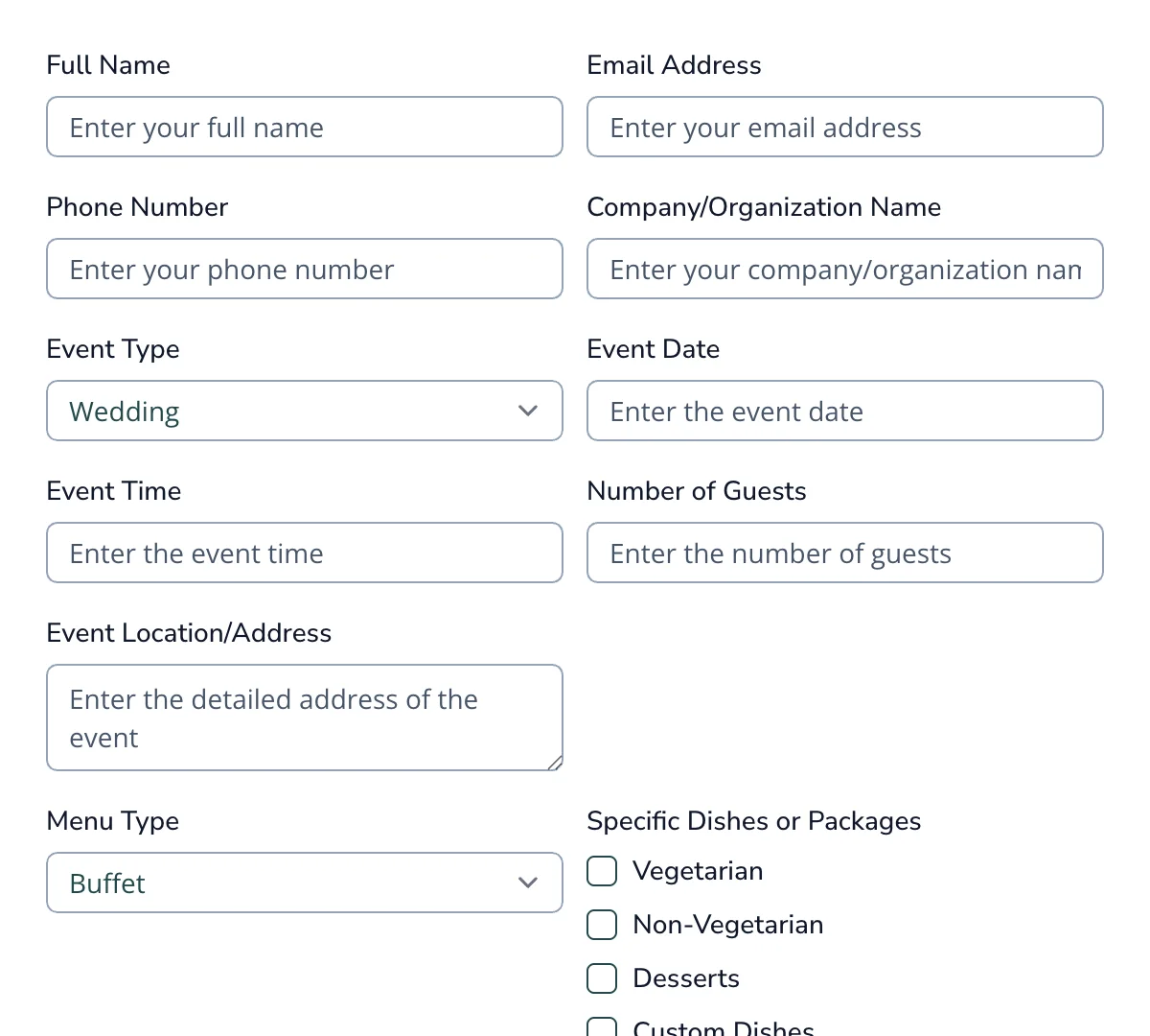
Catering Order Form
Clean, user-friendly catering order form for seamless order management and planning.
Get code -
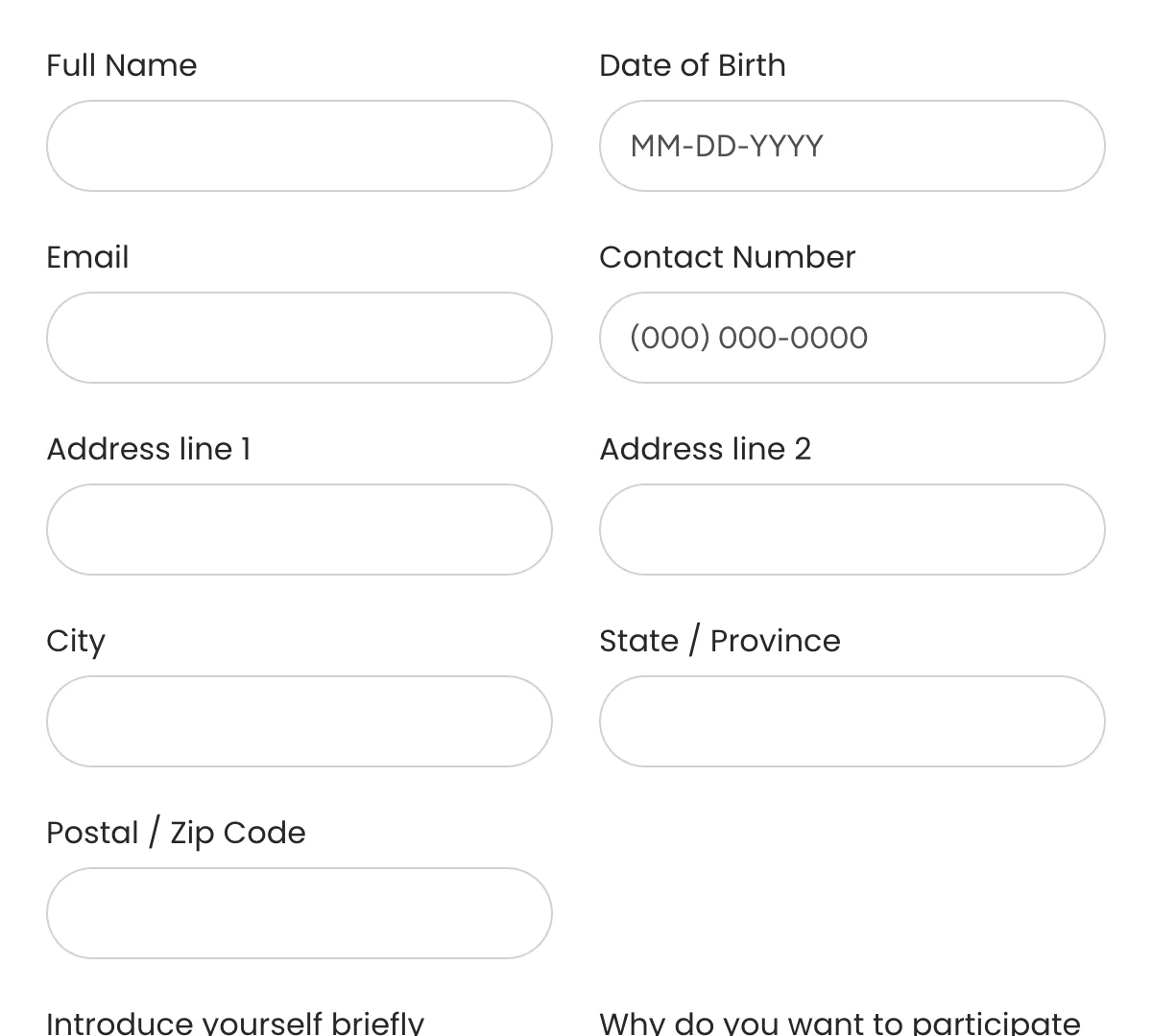
Contest Entry Form
Quick contest entry form for seamless participation signups
Get code -
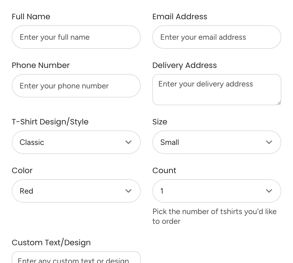
Tshirt Order Form
Simple, user-friendly t-shirt order form for seamless order tracking and customization.
Get code