Improve Your Forms with HTML Textarea: An In-Depth Tutorial
Learn when to use the HTML Textarea element with real-world examples!
Have you ever found yourself staring at a bland, single-line input field, wishing you had more room to type out your thoughts? Enter the HTML textarea tag! Perfect for capturing multi-line input, textareas are the go-to solution for comments, feedback, and more detailed user responses. Whether you’re building a blog comment section, a feedback form, or a chat application, using and styling the tag right can significantly enhance the user experience of your forms.
In this tutorial, we’ll cover everything you need to know about the textarea tag. From its basic syntax and common attributes to advanced styling techniques and practical use cases, you’ll learn how to effectively incorporate textareas into your web forms.
Getting Started with HTML Textarea
The basic syntax of the <textarea> consists of an opening <textarea> tag, optional attributes, and a closing </textarea> tag. Here’s the basic structure:
<textarea></textarea>
Here’s how you can use it to create a simple comment box:
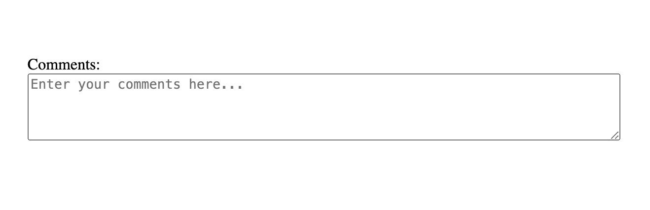
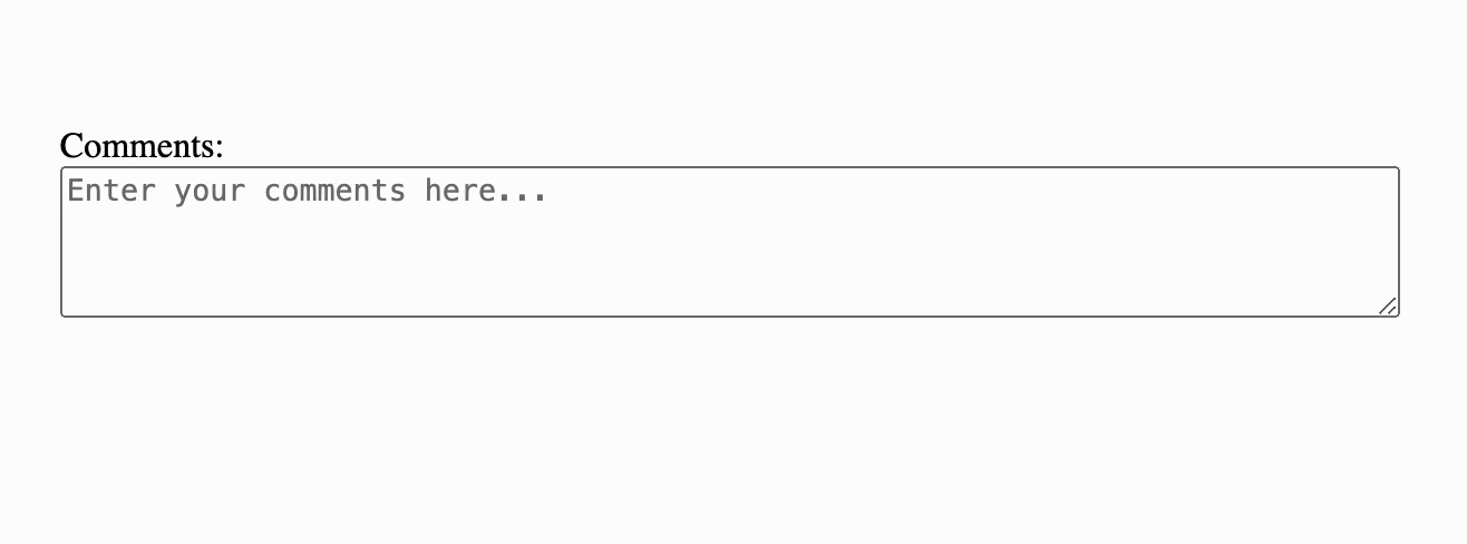
  <label for="comments">Comments:</label>
  <textarea id="comments" name="comments" rows="4" cols="50" placeholder="Enter your comments here..."></textarea>
Here’s what the text box would look like:
In this example:
- The
<label>element is associated with the<textarea>for accessibility. - The
idandnameattributes uniquely identify the textarea within the form. - The
rowsattribute specifies the number of visible text lines. - The
colsattribute specifies the visible width of the text area. - The
placeholderattribute provides a hint to the user about what to enter in the textarea.
When Should You Use textarea?
The HTML textarea tag is ideal for scenarios where you need to collect multi-line input from users. This includes collecting comments, feedback, and messages that go beyond the needs of a single-line input field. For example, in blog comment sections, a textarea element allows users to provide detailed responses and engage more deeply with the content. Similarly, feedback forms benefit from the textarea element by enabling users to elaborate on their experiences and suggestions.
While single-line input fields (<input type="text">) are perfect for short, concise entries like names and email addresses, the textarea element is useful for capturing more extensive information. Another alternative for such use cases is the <div contenteditable="true"> element, which also allows for multi-line input and rich text editing. However, textareas are more straightforward to implement and come with built-in form support. With the <div contenteditable="true"> element, you would need to implement your own logic to make the click event on the submit button track down the editable div, access its contents, and add it to the form data before form submission.
Advanced Features and Attributes of HTML Textarea
The <textarea> tag is a powerful tool for collecting multi-line input in web forms, but its capabilities extend far beyond just providing a space for text. By leveraging its attributes and applying advanced styling techniques, you can create a highly functional and user-friendly textarea. In this section, we’ll explore the various attributes of the HTML textarea tag, how to style it effectively, and some common use cases.
Attributes of the Textarea Tag
The <textarea> tag comes with several attributes that allow you to control its behavior and appearance:
rowsandcols: These attributes define the visible dimensions of the textarea element. Therowsattribute specifies the number of visible text lines, while thecolsattribute specifies the width of the textarea in character columns.placeholder: This attribute provides a hint to the user about what to enter in the textarea. It’s displayed as light gray text inside the textarea when it is empty.maxlength: Themaxlengthattribute sets a limit on the number of characters that can be entered in the text area. This is useful for preventing excessively long inputs.readonlyanddisabled: These attributes control the user’s ability to interact with the textarea. Areadonlytextarea allows users to read but not modify the text, while adisabledtextarea cannot be interacted with at all.wrap: Thewrapattribute controls how text is wrapped inside the textarea. It can take the valuessoft(default, lines longer than the textarea’s width will not wrap) orhard(lines will wrap and be submitted as such).autofocus: This attribute makes the textarea automatically focus when the page loads, improving user experience by directing their attention to the textarea.
Styling the Textarea
Styling a textarea can significantly enhance the user experience. Using regular CSS properties like width, height, border, padding, background-color, etc., you can adjust the size, add borders, change background colors, and more to make your textarea visually appealing and functional. However, it is important to keep UX in mind when styling these input fields.
A common aspect of the textarea element that you might want to play around with might be its resizeable property. A resizable text box has two diagonal lines at the bottom right, and allows the user to drag those lines around to resize the textarea as they wish:
However, there might be use cases where you’d want to restrict the height and width of the text area to suit your app’s UI design (and not break stuff if a user decides to set a ridiculous size of the text area). In such cases, you can define the height and width of the textarea element via CSS and set resize:none; to disable user-controlled resizing of the element. However, remember to use it very cautiously, as it can result in a frustrating user experience. At its core, the textarea element is meant to give users the freedom to type large inputs without any hassle, and putting up size restrictions can add a lot of hassle. In normal cases, your textarea input field should be able to take in all of the allowed user input without having to show any scroll bars.
Another consideration to keep in mind when styling textareas is to keep their shapes regular. Unusual input boxes like those described here might come up in design discussions once in a blue moon. However, always keep in mind that it is very difficult to make these responsive, and in most situations, you can’t implement these with textarea anyway.
Practical Applications of HTML Textarea
Now that you know most of what not to do with textarea, let’s take a look at what you can do with it. Here are a few real-world example implementations of this form element.
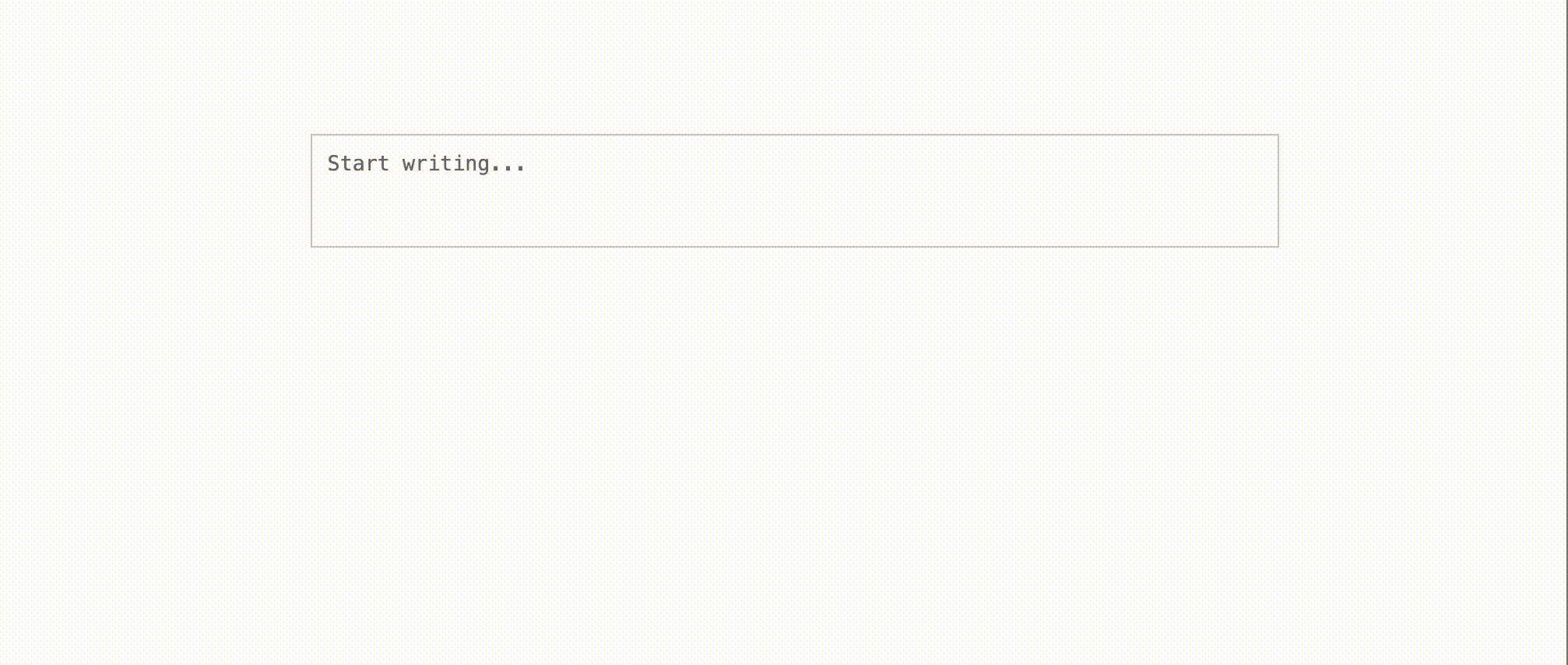
Auto-resizing Text Editor
One of the simplest use cases of the textarea element is to create a text input field that automatically resizes to accommodate all of the entered text in its viewable area. Here’s how you can implement it:
  <!DOCTYPE html>
  <html lang="en">

  <head>
      <meta charset="UTF-8">
      <meta name="viewport" content="width=device-width, initial-scale=1.0">
      <title>Editable Div</title>
      <style>
          body {
              padding: 100px 30vw;
              margin: 0;
          }

          .container {
              width: 40vw;
          }

          .auto-resize-textarea {
              width: 100%;
              padding: 10px;
              border: 1px solid #ccc;
              resize: none;
          }
      </style>
  </head>

  <body>
      <div class="container">
          <textarea id="textArea" class="auto-resize-textarea" placeholder="Start writing..."></textarea>
      </div>
      <script>
          const textArea = document.getElementById('textArea');

          textArea.style.height = textArea.scrollHeight + "px";
          textArea.style.overflowY = "hidden";

          textArea.addEventListener("input", function () {
              this.style.height = "auto";
              this.style.height = this.scrollHeight + "px";
          });

      </script>
  </body>

  </html>
The provided HTML, CSS, and JavaScript code creates an textarea that resized as you type. The HTML structure consists of a div with a textarea that has a placeholder. CSS is used to style the div and textarea, ensuring the textarea is centered on the page. JavaScript is used to set up an input event listener that resizes the textarea dynamically as the user types.
Here’s how it looks in action:
GitHub’s New Comment Field with a Drop Target for Images
GitHub’s comment fields on issues and PRs allow users to drag and drop images to attach to the comment.
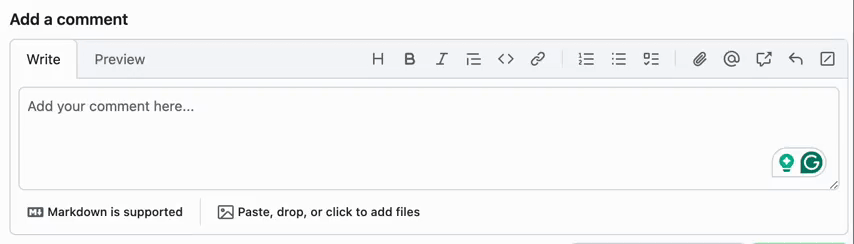
This is different from the HTML file input field, since this allows you to use the textarea as a source of file uploads, and then refer to the uploaded file in the contents of the textarea input.
For instance, you want to describe an issue to someone in detail. Uploading screenshots at the bottom of the form using an HTML input field tag would mean that the receiving person would need to figure out how the attachments fit into your description. However, by using the textarea field to upload the attachments to a file server in real-time and link to it in text, you can easily upload as many screenshots as you would like and mention their name/URL in the text of your issue description. Platforms like GitHub can then use Markdown to download and render your uploaded images when displaying the issue description to anyone.
Here’s how you can implement something similar for yourself:
  <!DOCTYPE html>
  <html lang="en">

  <head>
      <title>GitHub-like Comment Input</title>
      <style>
          body {
              padding: 100px 30vw;
              margin: 0;
          }

          .comment-box {
              border: 1px solid #ccc;
              padding: 10px;
              border-radius: 4px;
              margin-bottom: 10px;
              position: relative;
          }

          .comment-box textarea {
              display: block;
              width: 96%;
              min-height: 102px;
              line-height: 1.5;
              resize: vertical;
              background: none;
              border: 0;
              border: 1px solid #CACACA;
              border-radius: 4px;
              padding: 2%;
          }

          .comment-box .file-drop {
              border: 2px dashed #ccc;
              padding: 20px;
              text-align: center;
              border-radius: 4px;
              color: #999;
              display: none;
              position: absolute;
              top: 0;
              left: 0;
              right: 0;
              bottom: 0;
              background: rgba(255, 255, 255, 0.9);
              z-index: 10;
              transition: all 0.3s;
          }

          .comment-box.dragover .file-drop {
              display: block;
          }

          .files-button {
              font-family: sans-serif;
              font-size: 14px;
              padding: 8px;
              width: 160px;
              text-align: center;
              transition-duration: 0.2s;
              margin-top: 4px;
          }

          .files-button:hover {
              background-color: #f7f7f7;
              cursor: pointer;
              border-radius: 4px;
          }
      </style>
  </head>

  <body>
      <div class="comment-box" id="commentBox">
          <textarea placeholder="Add your comment here..." rows="4"></textarea>
          <input type="file" id="fileInput" multiple hidden>
          <div class="file-drop" id="fileDrop">Drop files here to upload</div>
          <div class="files-button" id="filesButton">Drop or click to add files</div>
      </div>
      <label id="uploadingLabel" style="display: none;">uploading...</label>

      <script>
          const commentBox = document.getElementById('commentBox');
          const fileDrop = document.getElementById('fileDrop');
          const fileInput = document.getElementById('fileInput');
          const textarea = commentBox.querySelector('textarea');
          const uploadingLabel = document.getElementById('uploadingLabel')
          const filesButton = document.getElementById('filesButton')

          textarea.addEventListener('input', () => {
              textarea.style.height = 'auto';
              textarea.style.height = textarea.scrollHeight + 'px';
          });

          commentBox.addEventListener('dragover', (e) => {
              e.preventDefault();
              commentBox.classList.add('dragover');
          });

          fileDrop.addEventListener('dragleave', () => {
              commentBox.classList.remove('dragover');
          });

          filesButton.addEventListener('click', () => {
              fileInput.click()
          })

          commentBox.addEventListener('drop', (e) => {
              e.preventDefault();
              commentBox.classList.remove('dragover');
              const files = e.dataTransfer.files;
              handleFiles(files);
          });

          fileInput.addEventListener('change', () => {
              const files = fileInput.files;
              handleFiles(files);
          });

          function handleFiles(files) {
              if (files && files.length > 0) {

                  uploadingLabel.style.display = "block"
                  for (let i = 0; i < files.length; i++) {
                      console.log(`File: ${files[i].name}`);
                      // Implement your file upload logic here

                      setTimeout(() => {
                          textarea.value = `${textarea.value} [${files[i].name}]`
                          console.log(`${textarea.innerText} [${files[i].name}]`)
                          uploadingLabel.style.display = 'none'
                      }, 2000)
                  }
              }
          }
      </script>
  </body>

  </html>
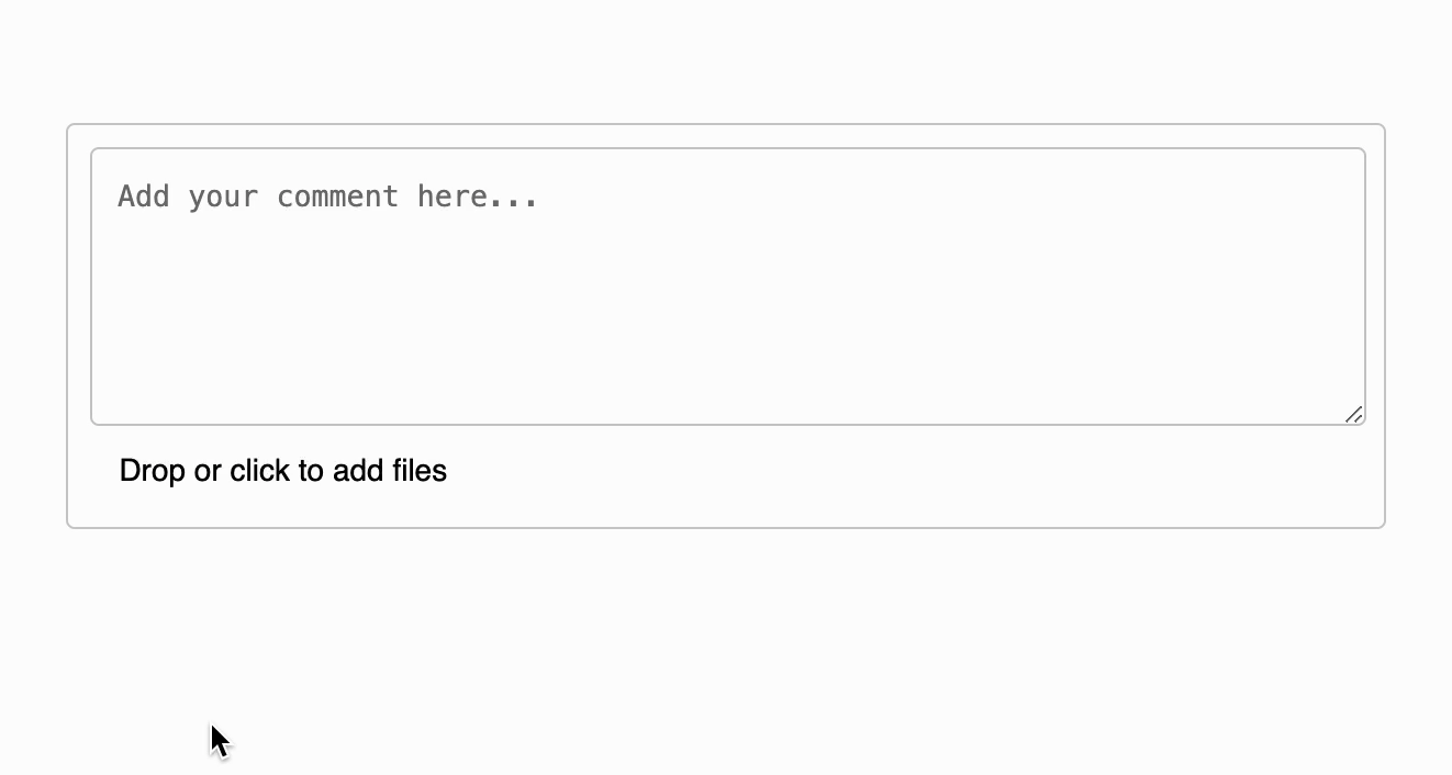
This snippet creates a GitHub-like comment input box with the ability to upload files via drag-and-drop or file input selection. The HTML structure includes a textarea for entering comments, a hidden input element of type file for file selection, a div for displaying a file drop area, and a button-like div to trigger the file input. A label is also included to indicate when files are being uploaded.
The .comment-box class styles the container with a border, padding, and rounded corners. The textarea is styled to be block-level, resizable, and visually integrated with the comment box. The .file-drop class styles the drop area with a dashed border, centered text, and a semi-transparent background that overlays the comment box when files are dragged over it. The .files-button class styles the button to trigger the file input, with hover effects for better user interaction.
JavaScript is used to add event listeners to handle text input, drag-and-drop file uploads, and file input selection. When the user types in the textarea, its height automatically adjusts to fit the content. When files are dragged over the comment box, the .dragover class is added to display the file drop area. Dropping files or selecting them via the file input triggers the handleFiles function, which logs the file names and simulates a file upload process by displaying an “uploading…” label and appending the file names to the textarea after a short delay. This creates a user experience similar to GitHub’s comment and file upload features.
Here’s what it looks like in action:
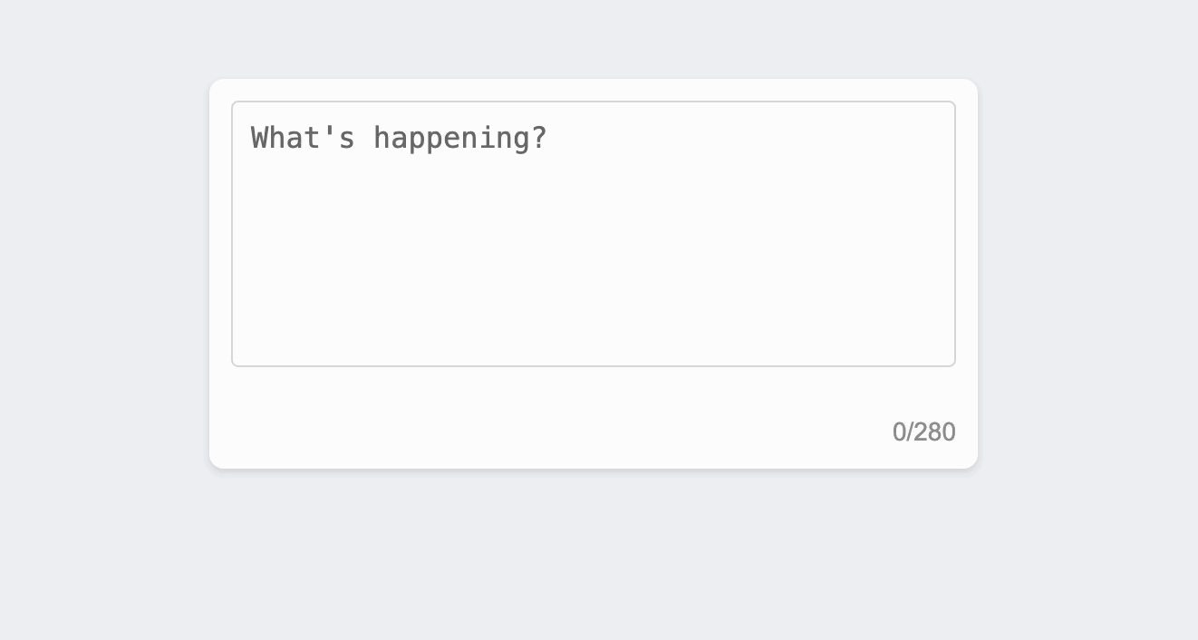
X’s New Post Field With a Character Counter
Platforms like X display a character counter to inform users of the remaining character limit.

Here’s how you can implement something similar for yourself:
  <!DOCTYPE html>
  <html lang="en">

  <head>
      <title>Twitter-like Post Box</title>
      <style>
          body {
              font-family: Arial, sans-serif;
              display: flex;
              justify-content: center;
              align-items: center;
              height: 100vh;
              margin: 0;
              background-color: #f0f2f5;
          }

          .post-box {
              width: 400px;
              padding: 12px;
              background: #fff;
              border-radius: 8px;
              box-shadow: 0 2px 4px rgba(0, 0, 0, 0.1);
              position: relative;
              display: flex;
              flex-direction: column;
          }

          .post-box textarea {
              width: 100%;
              padding: 10px 10px 40px 10px;
              border: 1px solid #ddd;
              border-radius: 4px;
              resize: none;
              font-size: 16px;
              box-sizing: border-box;
          }

          .progress {
              display: flex;
              flex-direction: row;
              align-items: end;
              justify-content: space-between;
              margin-top: 4px;
          }

          .progress-container {
              background: #fff;
              border-radius: 50%;
              display: flex;
              align-items: center;
              justify-content: center;
          }

          .progress-circle {
              width: 40px;
              height: 40px;
              position: relative;
              display: flex;
              align-items: center;
              justify-content: center;
          }

          .progress-circle svg {
              transform: rotate(-90deg);
          }

          .progress-circle circle {
              fill: none;
              stroke-width: 4;
          }

          .progress-circle .progress {
              stroke: #1da1f2;
              stroke-linecap: round;
              transition: stroke-dashoffset 0.3s;
          }

          .char-count {
              font-size: 14px;
              color: #999;
          }
      </style>
  </head>
  <body>
      <div class="post-box">
          <textarea id="postTextarea" rows="5" maxlength="280" placeholder="What's happening?"></textarea>
          <div class="progress">
              <div class="progress-container">
                  <div class="progress-circle">
                      <svg width="40" height="40">
                          <circle class="bg" cx="20" cy="20" r="18"></circle>
                          <circle class="progress" cx="20" cy="20" r="18"></circle>
                      </svg>
                  </div>
              </div>
              <div class="char-count" id="charCount">0/280</div>
          </div>
      </div>

      <script>
          const textarea = document.getElementById('postTextarea');
          const charCount = document.getElementById('charCount');
          const progress = document.querySelector('.progress');
          const maxLength = textarea.getAttribute('maxlength');

          textarea.addEventListener('input', () => {
              const currentLength = textarea.value.length;
              const percentage = (currentLength / maxLength) * 100;

              // Update character count display
              charCount.textContent = `${currentLength}/${maxLength}`;

              // Update progress circle
              const circumference = 2 * Math.PI * 18;
              const offset = circumference - (percentage / 100) * circumference;
              progress.style.strokeDasharray = circumference;
              progress.style.strokeDashoffset = offset;
          });

          // Initialize the progress circle
          const initProgressCircle = () => {
              const circumference = 2 * Math.PI * 18;
              progress.style.strokeDasharray = circumference;
              progress.style.strokeDashoffset = circumference;
          };

          initProgressCircle();
      </script>
  </body>

  </html>
This code snippet creates a post input box that includes a round progress bar to indicate the number of characters typed by the user. The HTML structure consists of a textarea for entering the post, a circular progress indicator made using SVG, and a character count display. The textarea allows users to type their message, while the progress circle visually shows how much of the 280-character limit has been used, providing a familiar experience similar to Twitter’s interface.
The .post-box class provides a centered, card-like container with rounded corners and a subtle shadow, making it visually appealing. The textarea is styled to be responsive and easily editable, with appropriate padding and borders. The circular progress bar is positioned at the bottom-right corner of the container, using two overlapping SVG circles—one for the background and another for the actual progress. This design helps users keep track of their character count without being intrusive.
JavaScript is used to handle the dynamic updates to the character count and progress circle. An input event listener on the textarea calculates the number of characters entered and updates both the text displaying the count and the progress circle’s stroke-dashoffset, which visually represents the percentage of the character limit used. The initialization function ensures the progress circle is correctly configured when the page loads, setting up the stroke properties for smooth, responsive updates as the user types.
Here’s what it looks like in action:
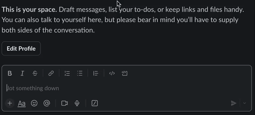
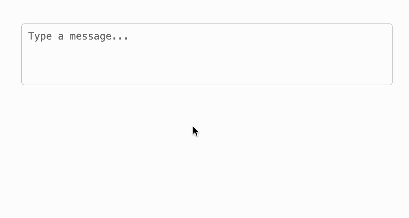
Slack’s Message Box With Slash Commands, Mentions, and Emojis
Slack’s message input supports commands and emojis, making the textarea more interactive and a useful tool for power users.
Here’s how you can implement something similar for yourself:
  <!DOCTYPE html>
  <html lang="en">
  <head>
      <title>Slack-like Message Input</title>
      <style>
          body {
              font-family: Arial, sans-serif;
              margin: 50px;
          }
          .container {
              max-width: 600px;
              margin: 0 auto;
          }
          #slack-message {
              width: 100%;
              height: 100px;
              padding: 10px;
              box-sizing: border-box;
              font-size: 16px;
              border: 1px solid #ccc;
              border-radius: 5px;
              resize: none;
          }
          .suggestions {
              margin-top: 5px;
              padding: 10px;
              border: 1px solid #ccc;
              border-radius: 5px;
              background-color: #f9f9f9;
              display: none;
          }
      </style>
  </head>
  <body>
      <div class="container">
          <textarea id="slack-message" placeholder="Type a message..."></textarea>
          <div id="suggestions" class="suggestions"></div>
      </div>
      <script>
          const textarea = document.getElementById('slack-message');
          const suggestionsBox = document.getElementById('suggestions');

          textarea.addEventListener('keydown', (e) => {
              // Show command suggestions when '/' is typed
              if (e.key === '/') {
                  showActions([' /giphy', ' /shrug', ' /tableflip']);
              }
              // Show emoji suggestions when ':' is typed
              else if (e.key === ':') {
                  showEmojis({':smile:': '😄', ':cry:': '😢', ':tada:' : ' 🎉'});
              }
              // Hide suggestions on any other key
              else {
                  hideSuggestions();
              }
          });

          // Function to display actions
          function showActions(actions) {
              suggestionsBox.innerHTML = '';
              actions.forEach(action => {
                  const div = document.createElement('div');
                  div.textContent = action;
                  div.style.cursor = 'pointer';
                  div.addEventListener('click', () => {
                      // remove the slash
                      textarea.value = textarea.value.substring(0, textarea.value.length - 1)

                      // hide the suggestions
                      hideSuggestions()

                      // trigger your action here
                      console.log(action + " clicked")
                  });
                  suggestionsBox.appendChild(div);
              });
              suggestionsBox.style.display = 'block';
          }

          // Function to display emojis
          function showEmojis(emojis) {
              suggestionsBox.innerHTML = '';
              const emojiKeys = Object.keys(emojis)
              const emojiValues = Object.values(emojis)

              for (let i=0; i<emojiKeys.length ; i++) {
                  const div = document.createElement('div');
                  div.textContent = emojiKeys[i] + " " + emojiValues[i];
                  div.style.cursor = 'pointer';
                  div.addEventListener('click', () => {
                      insertEmoji(emojiValues[i]);
                  });
                  suggestionsBox.appendChild(div);
              }
              suggestionsBox.style.display = 'block';
          }

          // Function to hide suggestions
          function hideSuggestions() {
              suggestionsBox.style.display = 'none';
          }

          // Function to insert an  into the textarea
          function insertEmoji(emoji) {
              textarea.value = textarea.value.substring(0, textarea.value.length - 1) + emoji
              textarea.focus();
              hideSuggestions();
          }
      </script>

  </body>
  </html>
Here’s what it looks like in action:
Some Considerations for Using HTML Textarea
Since textareas take in user input, they will be a commonly used element of your website across all types of users and devices. So, you must keep accessibility in mind when using and styling them. You should always associate your textarea with a <label> element, which helps screen readers identify the purpose of the field. Additionally, you should consider using ARIA (Accessible Rich Internet Applications) attributes to enhance the accessibility of your forms. For instance, aria-labelledby or aria-describedby attributes can provide additional context to users who rely on screen readers. Here’s a quick example of how to implement these:
  <label for="comments">Comments:</label>
  <textarea id="comments" name="comments" aria-describedby="commentHelp"></textarea>
  <small id="commentHelp">Your comments will help us improve.</small>
Apart from accessibility, another key area to focus on is the user experience. When using the HTML textarea tag, you should use placeholder text to guide users on what to input, but keep in mind that placeholder text should not replace labels. Additionally, implementing the maxlength attribute can prevent users from entering excessively long content, which is especially useful for forms with character limits, like social media posts. Finally, providing real-time feedback or error messages can improve the user experience by helping users correct mistakes as they type.
With the increasing use of mobile devices, ensuring that your textareas are responsive and touch-friendly is important. Make sure the textarea resizes appropriately on different screen sizes, and consider increasing padding or using larger font sizes for better touch interaction. On top of all this, testing your forms on various devices can help identify and fix any potential usability issues.
Final Thoughts
The HTML textarea tag is a commonly used HTML element in web development, helpful for creating forms that require multi-line text input. Throughout this article, we’ve covered the basics of the textarea tag, explored its advanced features and attributes, showed you how to pair it with other elements and style it to replicate some of its most popular use cases around the internet, and discussed considerations for ensuring accessibility and an optimal user experience.
Do you have a particular use case of textarea in mind that you’d like to learn how to implement? Let us know below!