How to Do Bootstrap Form Validation Right
Build responsive, accessible forms with Bootstrap and connect them to Formspree for effortless backend handling.

Form validation is an important part of most web apps which helps maintain app data integrity and improves user experience by preventing incorrect or incomplete form submissions. Bootstrap, a popular front-end framework, offers a powerful suite of tools for building responsive and visually appealing web forms. By making use of Bootstrap’s form validation features, developers can create seamless and intuitive user interfaces that provide immediate feedback, keep data consistent, and look great while doing it.
In this article, you will learn how to effectively implement Bootstrap form validation. You’ll learn how to set up Bootstrap in your project, understand the essential HTML elements and classes for form layout, and utilize key validation classes to enhance your forms. Additionally, we’ll cover built-in HTML5 validation attributes, demonstrate custom validation rules using JavaScript, and show you how to integrate validation with React forms using @formspree/react. By the end of this guide, you’ll be equipped with the knowledge
Setting Up Bootstrap Form Validation
To start using Bootstrap for form validation, you need to include it in your project. There are two main ways to do this: using a CDN or downloading the files locally.
Using a CDN
Add the following lines to the <head> section of your HTML file to include Bootstrap from a CDN:
  <link href="https://cdn.jsdelivr.net/npm/bootstrap@5.3.3/dist/css/bootstrap.min.css" rel="stylesheet">
  <script src="https://cdn.jsdelivr.net/npm/bootstrap@5.3.3/dist/js/bootstrap.bundle.min.js"></script>
Make sure to checkout the Bootstrap docs to get the CDN links to the latest version of Bootstrap when installing it in your project.
Local Download
Alternatively, you can download Bootstrap files from Bootstrap’s official website and include them in your project:
  <link href="path/to/bootstrap.min.css" rel="stylesheet">
  <script src="path/to/jquery.min.js"></script>
  <script src="path/to/bootstrap.min.js"></script>
While CDN is the way to go for most cases, you can make use of a local copy to avoid having to rely on the Bootstrap CDN. Some people even recommend implementing both—use the CDN, but fall back on a local copy when it’s not reachable.
How Bootstrap Handles Validation
Bootstrap builds on the browser’s built-in HTML5 form validation by styling inputs that are valid or invalid. The browser itself applies the :valid and :invalid pseudo-classes when it checks fields. Bootstrap doesn’t mess with this logic. Instead, it adds CSS styles that only show up when the <form> has the .was-validated class. This design prevents fields from looking invalid as soon as the page loads and ensures that feedback only appears after you try to submit the form.
The recommended approach to validation with Bootstrap is to call the browser’s validation methods (for example, checkValidity() from the Constraint Validation API) inside a submit event listener. If the form is invalid, you stop submission and then add .was-validated to the <form> so Bootstrap’s validation styles appear. Here’s a code example that Bootstrap recommends:
  (() => {
    'use strict'

    const forms = document.querySelectorAll('.needs-validation')

    Array.from(forms).forEach(form => {
      form.addEventListener('submit', event => {
        if (!form.checkValidity()) {
          event.preventDefault()
          event.stopPropagation()
        }

        form.classList.add('was-validated')
      }, false)
    })
  })()
If you need to clear the form’s state later—e.g., after an Ajax submission—you can remove the .was-validated class from the form’s classlist. For server-side validation, you don’t need .was-validated at all: you can directly apply .is-valid or .is-invalid classes to form controls.
For custom feedback messages, you can rely on the Constraint Validation API. This API lets you test a field’s validity, show default browser messages, or override them with your own using setCustomValidity. You can then style feedback messages with Bootstrap’s .invalid-feedback or .valid-feedback helpers. You’ll see how to use these next.
Getting Started with Bootstrap Form Validation Quickly
To help you understand the use of these classes better, here’s a quick little newsletter signup form made using Bootstrap classes:
  <form id="newsletter-form"
    class="row row-cols-1 gy-2 needs-validation" novalidate>
    <div class="col">
      <label for="email" class="form-label">Email address</label>
      <input type="email" class="form-control" name="email" required>
      <div class="invalid-feedback">
        Please enter a valid email address.
      </div>
    </div>

    <div class="col">
      <div class="form-check">
        <input class="form-check-input" type="checkbox"
          name="agree" required>
        <label class="form-check-label" for="agree">
          I agree to receive the newsletter
        </label>
        <div class="invalid-feedback">
          You must agree before subscribing.
        </div>
      </div>
    </div>

    <div class="col">
      <button class="btn btn-primary" type="submit">Subscribe</button>
    </div>
  </form>
Here’s what the form looks like:
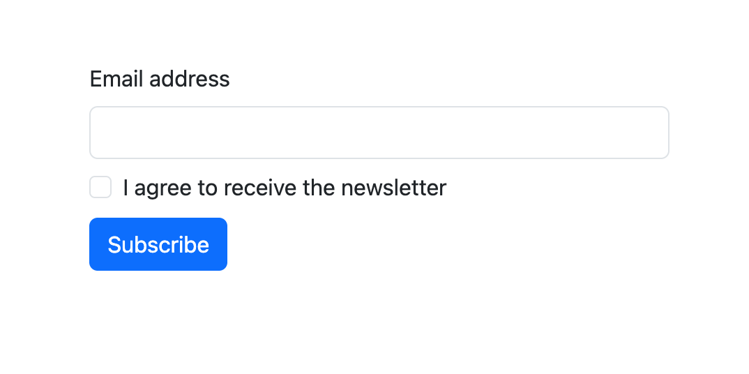
It has an email input field, a checkbox that records the user’s consent to receive newsletter emails, and a submit button. It also has a few extra div elements that contain text to show as feedback when the validation fails.
The <form> element has the novalidate attribute and the needs-validation class added to it. needs-validation tells Bootstrap that this form will receive validation results at some point, and its elements (inputs and labels) will need to be styled accordingly. If you don’t add this class to the form, Bootstrap will not show the error labels and mark the inputs red if the validation fails when submitting.
The novalidate attribute disable the browser’s built-in validation mechanism. If you were to not add that attribute, the browser’s tool tip for validation failures would pop up when you tried to submit the form.
To make this form work, you also need to add in a little bit of JavaScript. Here’s what your script will look like:
  <script>
  (() => {
    'use strict'

    const form = document.querySelector('#newsletter-form')

    if (form) {
      form.addEventListener('submit', event => {
        if (!form.checkValidity()) {
          event.preventDefault()
          event.stopPropagation()
        }
        form.classList.add('was-validated')
      }, false)
    }
  })()
  </script>
This code adds an event listener to listen for form submission. When the form is submitted, this listener runs validation on it using form.checkValidity(). If the validation fails, it runs event.preventDefault() to stop the form from submitting and event.stopPropagation() to stop the click event from propagating up to any other parent elements that might run any code in response to it. This stops the form from submitting.
After validating and stopping submission if necessary, the code adds the was-validated class to the form, so that Bootstrap can now style the form according to the validation results.
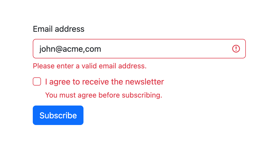
Here’s how a failed submission to this form will look like:
Real-time Bootstrap Form Validation
If you want to provide real-time feedback for fields, such as making sure that a date input is compliant with a special format, character usage, etc., you could make use of the setCustomValidity() and reportValidity() functions. Here’s how such an example would look like:
  <form  id="my-form" class="row row-cols-1 gy-2" novalidate>
    <div class="col">
      <label for="email" class="form-label">Email</label>
      <input type="email" class="form-control" id="email" required>
      <div class="invalid-feedback">
        Please provide a valid email address.
      </div>
    </div>

    <div class="col">
      <label for="dob" class="form-label">Date of Birth</label>
      <input type="date" class="form-control" id="dob" required>
      <div class="invalid-feedback" id="dob-feedback">
        Please enter a valid date of birth (between 18 and 60 years old).
      </div>
    </div>

    <div class="col">
      <div class="form-check">
        <input class="form-check-input" type="checkbox" value=""
        id="invalidCheck" required>
        <label class="form-check-label" for="invalidCheck">
          Agree to terms and conditions
        </label>
        <div class="invalid-feedback">
          You must agree before submitting.
        </div>
      </div>
    </div>

    <div class="col">
      <button class="btn btn-primary" type="submit">Log in</button>
    </div>
  </form>
This is how the form looks like:
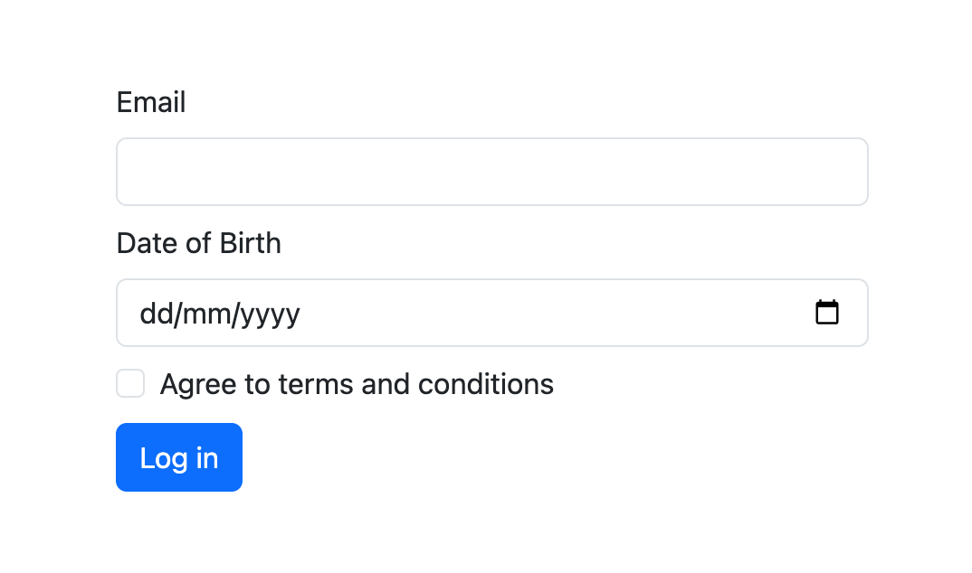
As you can see, the form contains an email field, a date of birth field, a checkbox for terms and conditions, and a submit button. Similar to the previous example, the novalidate attribute disables the browser’s default validation UI, allowing Bootstrap to apply its own visual cues. Each form field uses standard HTML5 attributes like required and type="email" to define validation constraints.
The real-time validation logic is written in its script. Here’s what the script will look like:
  <script>
    const dobInput = document.getElementById("dob");
    const feedback = document.getElementById("dob-feedback");

    function validateDOB() {
      const input = dobInput.value;
      const dobDate = new Date(input);
      const today = new Date();
      var form = document.querySelector("#my-form");

      let error = "";

      if (isNaN(dobDate.getTime())) {
        error = "Please enter a valid date.";
      } else if (dobDate > today) {
        error = "Date of birth cannot be in the future.";
      } else {
        const ageDifMs = today - dobDate;
        const ageDate = new Date(ageDifMs);
        const age = Math.abs(ageDate.getUTCFullYear() - 1970);

        if (age < 18) {
          error = "You must be at least 18 years old.";
        } else if (age > 60) {
          error = "You must be younger than 60 years old.";
        }
      }

      dobInput.setCustomValidity(error);
      feedback.textContent = error || "Looks good!";
      dobInput.reportValidity();
    }

    // Setting up real-time validation for date of birth
    dobInput.addEventListener("input", validateDOB);

    // Validation upon submission
    (function () {
      'use strict'
      var form = document.querySelector("#my-form");

      // If the form exists, add an event listener for the submit event
      if (form) {
        form.addEventListener('submit', function (event) {
          validateDOB(); // ensure DOB is valid before submit
          if (!form.checkValidity()) {
            event.preventDefault();
            event.stopPropagation();
          }
          form.classList.add('was-validated');
        }, false);
      }
    })();
  </script>
This form includes custom logic for the date of birth (DOB) field. The function validateDOB is set to run whenever the user types or changes the value in the DOB input. It checks whether the date is valid, not in the future, and whether the user’s age falls between 18 and 60. Based on these checks, the script uses the setCustomValidity() method to dynamically define a validation error message.
If the DOB is invalid, the custom message appears inside the .invalid-feedback element. To ensure immediate feedback, reportValidity() is called on every keystroke or date selection.
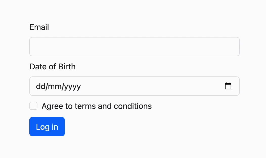
Here’s what that will look like in action:
When the form is submitted, an event listener checks the overall validity using form.checkValidity(). Based on the results, it either stops the submission and shows the errors or lets the form data be sent to the backend.
Validating React Forms with Bootstrap and Formspree
If you are building forms in a React application using Formspree, you can make use of Bootstrap and Formspree to set up both client side and server side form validation. Installing Formspree in your project is straightforward:
npm install @formspree/react
Now, you can make use of the errors object from Formspree’s useForm hook to know if any server side validations failed, and if they did, then you could make use of Bootstrap classes to show the validation error in your app:
  import { useForm } from '@formspree/react';

  function EmailForm() {
    const [state, handleSubmit] = useForm("your-formspree-form-id");
    const formRef = useRef(null);

    const submitForm = (event) => {
      if (formRef.current.checkValidity() === false) {
          event.preventDefault();
          event.stopPropagation();
      } else {
          handleSubmit(event);
      }

      formRef.current.classList.add('was-validated');
    }

    return (
        <>
          <div className="container mt-5">
            <div className="row justify-content-center">
                <div className="col-12">
                  <form ref={formRef} onSubmit={submitForm}
                  className={"row row-cols-1 gy-2 "
                    + (state.succeeded ? "was-validated" : "")}
                  noValidate>
                    <div className="col">
                      <label htmlFor="custom-validation"
                        className="form-label">Email</label>
                      <input
                        type="email"
                        className={"form-control "
                            + (state.errors &&
                              state.errors.getFieldErrors("email").length > 0
                            ? "is-invalid" : "")}
                        id="custom-validation" name="email" required />
                      <div className="invalid-feedback">
                          Please provide a valid email address.
                      </div>
                    </div>
                    <div className="col">
                        <button className="btn btn-primary" type="submit">
                          Submit form
                        </button>
                    </div>
                  </form>
                </div>
            </div>
          </div>
        </>
    )
  }

  export default EmailForm
Similar to the previous examples, this code also uses the checkValidity() function to check and display validation errors on the client side. If no client-side validation errors are found, the form is allowed to be submitted using the handleSubmit function from Formspree’s useForm hook.
The useForm hook returns a state object that contains an errors object in it. This errors object receives validation results from the Formspree server after the form is submitted. You can use the getFieldErrors("field-name") function on the errors object to retrieve a list of errors for any field, and based on whether there are any validation errors, you can add the is-invalid class to the field to let the user know about the error.
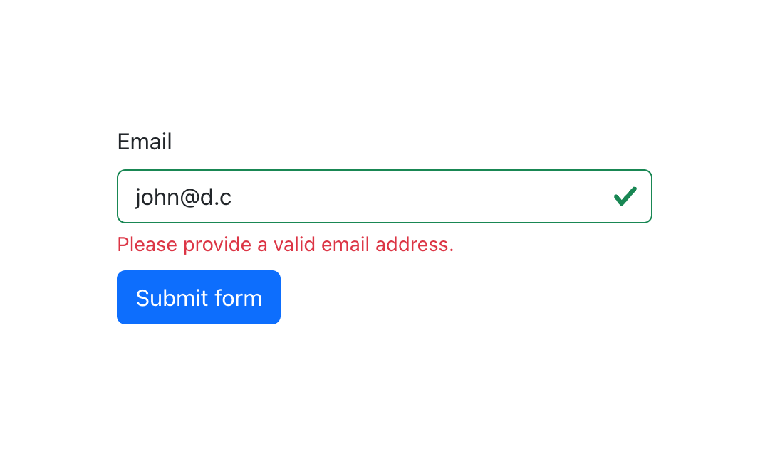
Here’s how a client-side error looks:

An interesting thing is that emails of the form “something@something.y” where the top-level domains are single-letter are approved by client-side validation since they follow the standard email address structure. However, no single-level top-level domains exist as of now, so such an email is definitely invalid. Formspree can automatically pick up such cases:
The result of the getFieldErrors("field-name") also contains details about the validation errors in case you’d like to include that in your validation logic. You can take a look at the Formspree React docs to learn more about the features offered by the Formspree React library.
Best Practices for Effective Form Validation
Getting form validation right goes beyond simply checking for required fields and correct input formats; it needs to be about enhancing user experience and ensuring accessibility. Here are some best practices to achieve efficient and user-friendly form validation.
Clear and Concise Error Messages
Error messages should be clear, concise, and guide users towards correcting their mistakes. Instead of vague messages like “Invalid input,” specify the issue and how to fix it. For example, “Date must be in DD-MM-YYYY format” or “Please enter a valid email address.” This clarity helps users quickly understand and resolve the issues, making the form submission process smoother.
User-Friendly Input Formats
Using user-friendly input formats significantly enhances the user experience. For instance, date pickers for date fields, dropdown menus for predefined options, and masked inputs for phone numbers ensure that users provide data in the correct format. These controls reduce the likelihood of errors and make the form more intuitive.
Timely Display of Validation Messages
Validation messages should be displayed only when the user interacts with a field or attempts to submit the form. Real-time validation, where feedback is provided as the user types, can be helpful but should be implemented thoughtfully to avoid overwhelming the user. For example, you could show a validation message as soon as the user moves out of a field (onBlur event) or upon form submission to ensure timely feedback without being intrusive.
Accessibility Concerns
Bootstrap’s client-side custom validation styles and tooltips are not currently accessible, meaning they are not exposed to assistive technologies. For inclusive design, it’s crucial to ensure that all users, including those relying on screen readers, can interact with your forms effectively. You can use ARIA (Accessible Rich Internet Applications) attributes to provide additional context to assistive technologies. For instance, aria-invalid can be used to indicate invalid fields, and aria-describedby can link error messages to form fields, enhancing accessibility.
You should consider using server-side validation or default browser validation to ensure accessibility wherever possible. Additionally, make sure to refer to guidelines on accessible form validation to further improve the accessibility of your forms.
Server-Side Validation
While client-side validation improves user experience by providing instant feedback, server-side validation is essential for security. It ensures that data integrity is maintained even if client-side validation is bypassed. You should always validate data on the server to protect against malicious input and ensure that the submitted data meets all necessary criteria.
A best practice is to combine both client-side and server-side validation. Client-side validation offers immediate feedback, improving user experience, while server-side validation provides a security layer to ensure data integrity. By integrating both, you create a robust and secure validation process.
Final Thoughts
Effective form validation is integral to creating user-friendly and secure web applications. By leveraging Bootstrap’s comprehensive suite of validation tools, developers can enhance user experience with immediate feedback and reduce server-side validation workload. This article has provided a detailed guide on setting up Bootstrap form validation, utilizing key validation classes, and implementing custom validation rules. Additionally, integrating Bootstrap validation with React forms using @formspree/react further extends its functionality.
Adopting best practices such as clear and concise error messages, user-friendly input formats, timely display of validation messages, and prioritizing accessibility ensures an inclusive and efficient validation process. Remember, combining client-side and server-side validation offers the best of both worlds, providing immediate feedback and maintaining data integrity. Explore further customization options and advanced validation techniques to continuously improve your forms, delivering a seamless user experience across all devices and browsers.