Tailwind Forms
Design a Tailwind form with Formspree's templates. Easily create customizable, embeddable forms for any website.
-
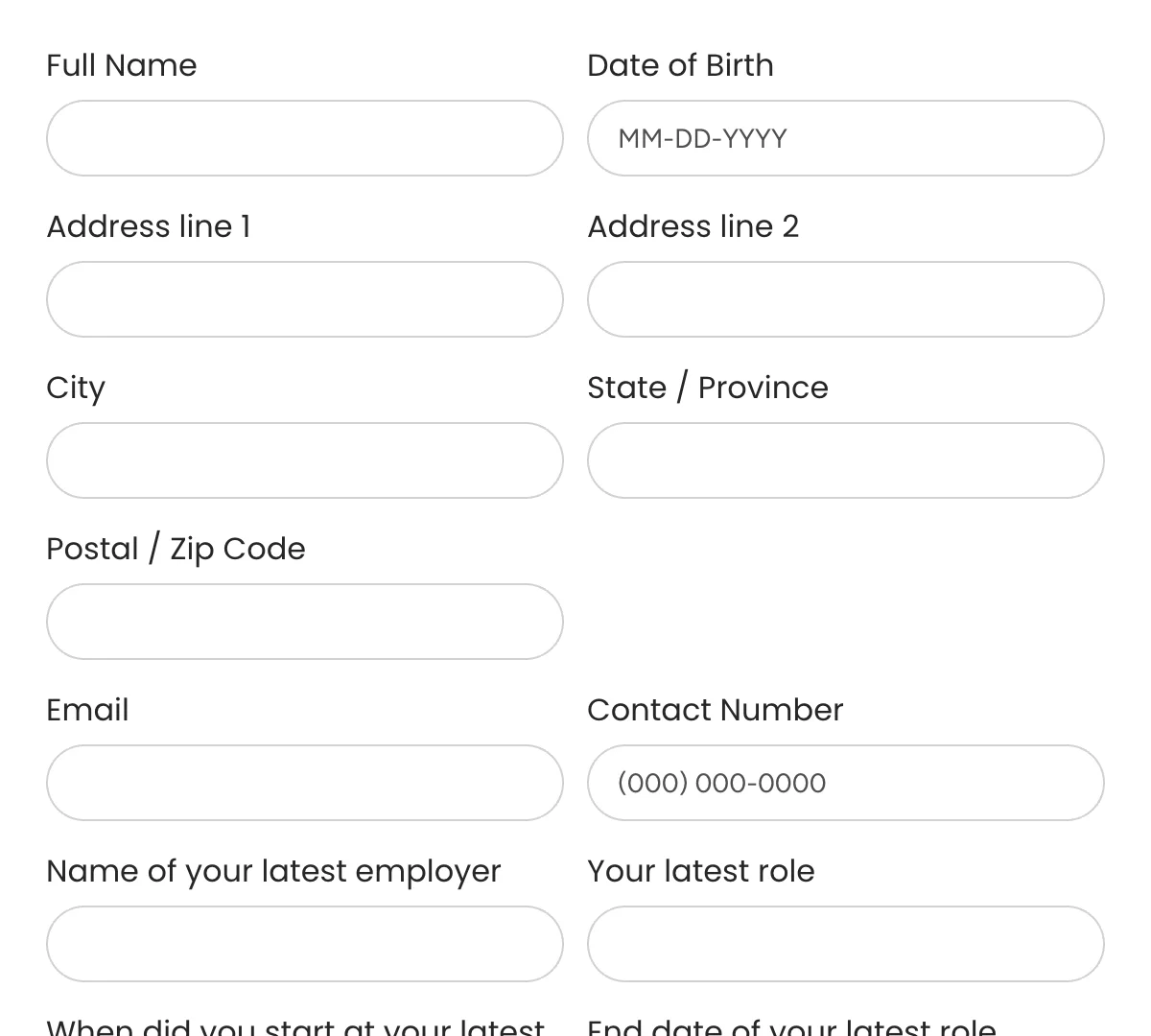
Tailwind Application Forms
Application forms to simplify hiring and screen candidates effectively!
-
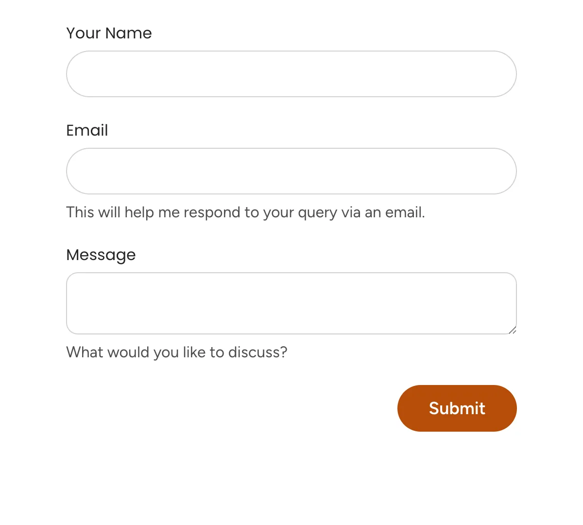
Tailwind Contact Forms
Essential contact forms for smooth communication with your business
-
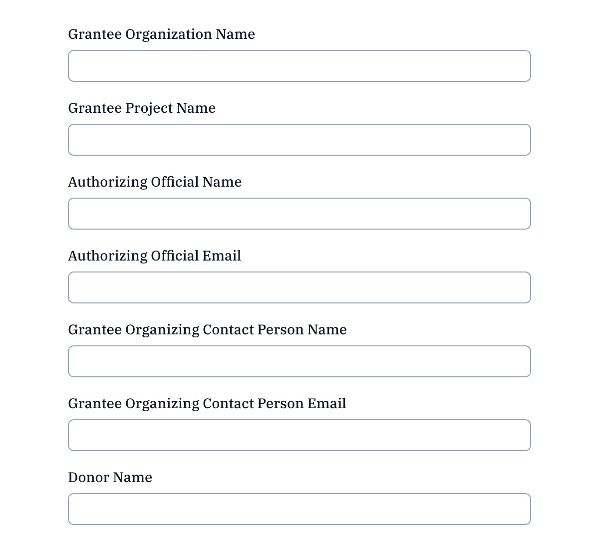
Tailwind Donation Forms
Ready-to-go donation forms for non-profits and charities
-
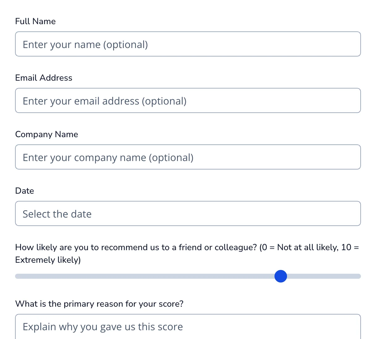
Tailwind Feedback Forms
Clean, minimal feedback forms for collecting opinions, reviews, and experiences
-
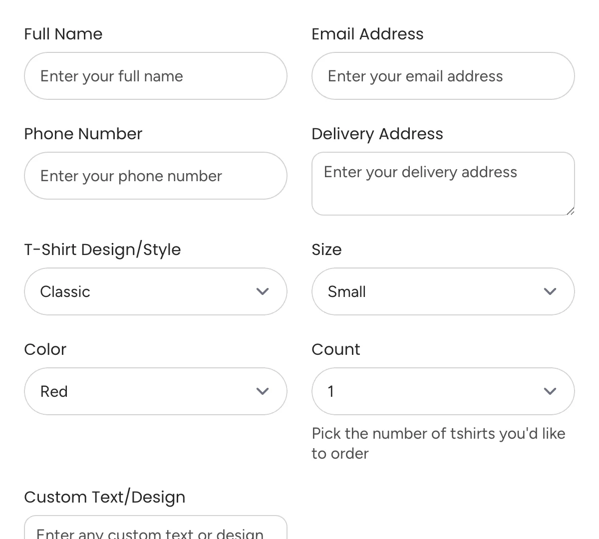
Tailwind Order Forms
Clean, versatile order forms for efficient tracking and processing.
-
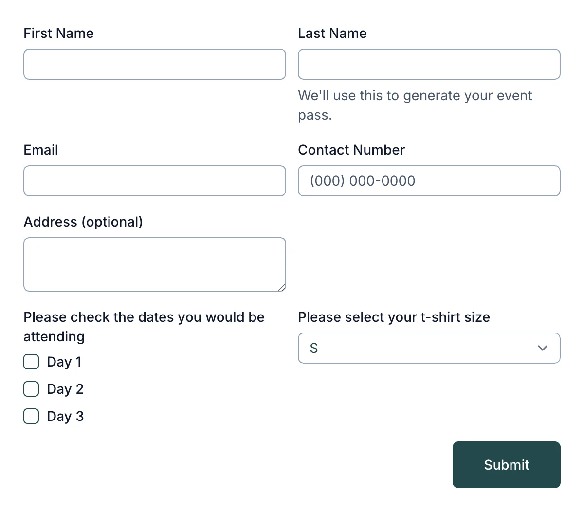
Tailwind Registration Forms
Simple registration forms for easy sign-ups and onboarding
-
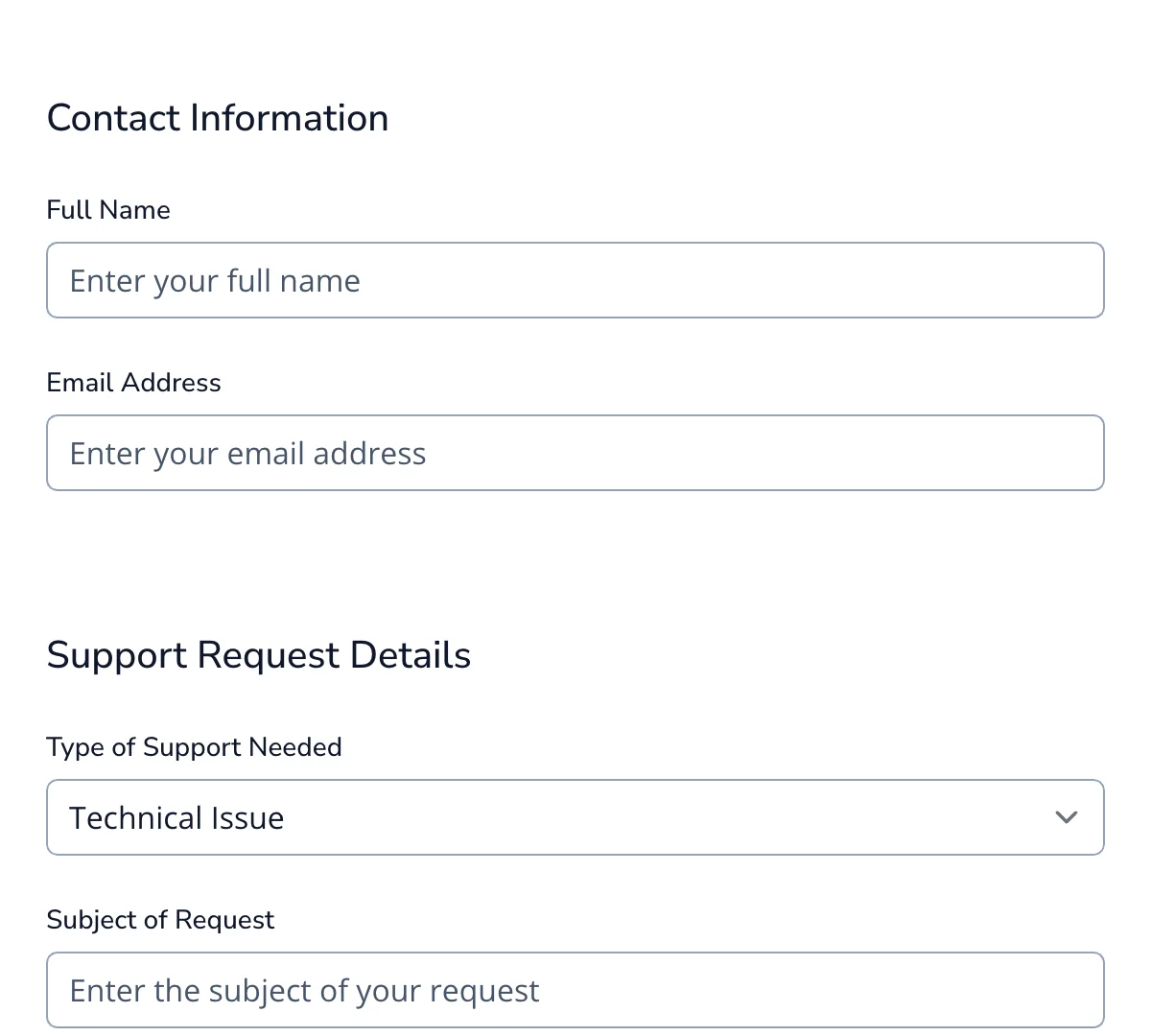
Tailwind Request Forms
Clean, flexible request forms for streamlining customer and internal submissions.
-
Tailwind Signup Forms
Clean, effective signup form for growing your audience or user base.
What are Tailwind forms?
Tailwind CSS has rapidly become a favorite among developers thanks to its utility-first approach to styling. Unlike traditional CSS frameworks that offer pre-built components, Tailwind gives you low-level utility classes to build designs directly in your markup. This results in faster development cycles, greater flexibility, and cleaner separation of concerns between design and logic.
Among the many use cases where Tailwind shines, form design stands out. Forms are a crucial component of nearly every web application—whether you’re building a contact form, a user signup flow, or a checkout experience. Traditionally, styling forms has been a cumbersome task, requiring a mix of global CSS, custom overrides, and media queries. Tailwind changes that by making it possible to craft beautiful, accessible, and responsive forms with minimal effort—often without writing a single line of custom CSS.
In this article, you’ll learn not only the basics but also advanced styling techniques, practical form examples, validation strategies, and accessibility best practices around Tailwind forms.
What Makes Tailwind CSS Ideal for Forms?
A Utility-First Framework That Works for You
Tailwind CSS follows a utility-first paradigm, meaning you use small, reusable classes to control padding, margins, colors, typography, and layout. For forms, this approach is a game-changer. You can quickly style inputs, buttons, and labels directly in your HTML without hopping back and forth between CSS files.
Customization Without Custom CSS
Instead of writing separate CSS rules for form elements, Tailwind lets you use utility classes like rounded-md, bg-gray-100, or focus:ring-2 to customize your design inline. This makes it easier to iterate quickly and keep your styles consistent across the application. Need a form that matches your brand colors? Just extend your tailwind.config.js and use your custom palette everywhere.
Built-in Responsive Design
Tailwind’s responsive utilities (sm:, md:, lg:, etc.) make it simple to design forms that work on all screen sizes. Want a stacked layout on mobile and a grid layout on desktop? No problem—just apply the right responsive classes and Tailwind handles the rest. There’s no need to manually write media queries.
Accessibility Enhancements
Accessibility is baked into the design philosophy of Tailwind. Paired with its official @tailwindcss/forms plugin, form elements get baseline styling that maintains semantic structure and improves keyboard navigation and screen reader support. With utilities like focus:outline-none and aria-* support, creating inclusive forms becomes much easier.
How It Compares to Traditional CSS
In a traditional CSS workflow, form design typically involves:
- Writing custom styles for each input type.
- Maintaining large style sheets that may conflict or become hard to manage.
- Using extra classes or IDs to style elements that share no real semantic differences.
With Tailwind, that complexity is removed. You apply just the classes you need in the HTML, keeping styles modular, composable, and easy to debug. The result is faster prototyping and fewer surprises when styles cascade unintentionally.
Getting Started with Tailwind Forms
Before you can start building and styling forms with Tailwind CSS, you need to set up Tailwind in your project and install the official @tailwindcss/forms plugin.
Step 1: Install Tailwind CSS and the Forms Plugin
If you’re starting from scratch, make sure Node.js is installed, then initialize your project and install the necessary packages:
npm install -D tailwindcss @tailwindcss/forms
You can also generate a Tailwind config file (if you haven’t already):
npx tailwindcss init
Step 2: Configure the Plugin
In your tailwind.config.js file, enable the @tailwindcss/forms plugin like this:
  // tailwind.config.js
  module.exports = {
    content: [
      './src/**/*.{html,js}', // Adjust as needed for your file structure
    ],
    theme: {
      extend: {},
    },
    plugins: [
      require('@tailwindcss/forms'),
    ],
  }
This plugin helps normalize form element styles across browsers and removes default styles that can be difficult to override.
Step 3: Add Tailwind Directives to Your CSS
In your main CSS file (e.g., styles.css), include the Tailwind directives:
  @tailwind base;
  @tailwind components;
  @tailwind utilities;
The @tailwind base layer includes the reset styles provided by the @tailwindcss/forms plugin, ensuring form elements start from a clean and consistent slate.
With setup complete, you’re ready to build forms using Tailwind’s utility classes.
Basic Form Structure
Let’s start with a simple contact form that includes a name, email, message field, and a submit button. Here’s how it looks with Tailwind:
  <form class="max-w-lg mx-auto p-6 bg-white shadow-md rounded-lg space-y-6">
    <div>
      <label for="name" class="block text-sm font-medium text-gray-700">Name</label>
      <input type="text" id="name" name="name" required
            class="mt-1 block w-full rounded-md border-gray-300 shadow-sm focus:border-blue-500 focus:ring focus:ring-blue-200 focus:ring-opacity-50">
    </div>

    <div>
      <label for="email" class="block text-sm font-medium text-gray-700">Email</label>
      <input type="email" id="email" name="email" required
            class="mt-1 block w-full rounded-md border-gray-300 shadow-sm focus:border-blue-500 focus:ring focus:ring-blue-200 focus:ring-opacity-50">
    </div>

    <div>
      <label for="message" class="block text-sm font-medium text-gray-700">Message</label>
      <textarea id="message" name="message" rows="4"
                class="mt-1 block w-full rounded-md border-gray-300 shadow-sm focus:border-blue-500 focus:ring focus:ring-blue-200 focus:ring-opacity-50"></textarea>
    </div>

    <button type="submit"
            class="w-full bg-blue-600 hover:bg-blue-700 text-white font-semibold py-2 px-4 rounded-md transition duration-150 ease-in-out">
      Send Message
    </button>
  </form>
Here are the Tailwind classes that were used:
max-w-lg mx-auto: Centers the form and limits its maximum width.p-6 bg-white shadow-md rounded-lg: Adds padding, background color, shadow, and rounded corners to the form container.block text-sm font-medium text-gray-700: Styles labels for readability and consistency.rounded-md border-gray-300 shadow-sm: Applies soft borders and slight shadows to inputs and textareas.focus:border-blue-500 focus:ring focus:ring-blue-200: Adds focus styling to enhance UX and accessibility.transition duration-150 ease-in-out: Makes the button hover effect smooth and modern.
With just utility classes, you’ve built a polished, accessible, and responsive form—without writing a single line of custom CSS.
Enhancing Form Aesthetics with Tailwind CSS
Once your form is up and running, the next step is to improve its visual appeal and user experience. Tailwind CSS provides a powerful set of utility classes that allow you to style every aspect of your form—from spacing and colors to transitions and responsive behavior.
Styling Techniques
Tailwind’s utility classes give you complete control over the look and feel of your form elements. Here are some common techniques to take your form styling to the next level:
Spacing and Layout
Use spacing utilities to organize your form neatly and prevent clutter.
  <div class="space-y-4">
    <!-- Each child gets vertical spacing -->
  </div>
You can also create horizontal layouts with Flexbox:
  <div class="flex space-x-4">
    <input class="flex-1" type="text" placeholder="First Name">
    <input class="flex-1" type="text" placeholder="Last Name">
  </div>
Borders and Rounded Corners
Rounded corners make inputs feel modern and friendly.
<input class="rounded-lg border border-gray-300" />
You can vary the radius with rounded, rounded-md, rounded-lg, or even rounded-full.
Focus States
You can improve accessibility and usability with clear focus indicators:
<input class="focus:ring-2 focus:ring-blue-500 focus:outline-none" />
This provides a subtle glow or ring effect when users tab through fields.
Buttons
Tailwind makes button design quick and consistent:
  <button class="bg-blue-500 hover:bg-blue-700 text-white font-bold py-2 px-4 rounded">
    Submit
  </button>
You can also enhance interactivity with transitions:
<button class="transition ease-in-out duration-150 ...">Click me</button>
Responsive Design
Tailwind’s responsive design utilities ensure your forms look great on every device. Use screen-size prefixes (sm:, md:, lg:, etc.) to adjust layouts based on viewport width.
  <div class="grid grid-cols-1 md:grid-cols-2 gap-4">
    <div>
      <label>First Name</label>
      <input class="w-full" type="text">
    </div>
    <div>
      <label>Last Name</label>
      <input class="w-full" type="text">
    </div>
  </div>
On small screens, the form stacks vertically. On medium and larger screens, it becomes a two-column layout.
This approach eliminates the need to write custom media queries.
Moving Beyond the Basic Features
Tailwind’s composability makes it easy to introduce refined UI features that enhance user engagement.
Transitions and Hover Effects
Create subtle animations that improve perceived interactivity:
<input class="transition duration-200 ease-in-out focus:ring-2 focus:ring-indigo-500" />
This gently animates the ring when an input gains focus.
Icons Inside Inputs
You can create icon-enhanced inputs using flex utilities and spacing helpers:
  <div class="flex items-center border border-gray-300 rounded-md px-3">
    <svg class="w-5 h-5 text-gray-400" fill="none" stroke="currentColor" stroke-width="2" viewBox="0 0 24 24">
      <path d="M16 4h2a2 2 0 012 2v14a2 2 0 01-2 2h-2M8 4H6a2 2 0 00-2 2v14a2 2 0 002 2h2m8-14H8m8 4H8m8 4H8"></path>
    </svg>
    <input class="ml-2 flex-1 focus:outline-none" type="text" placeholder="With icon">
  </div>
This pattern is useful for search bars, email inputs, and password visibility toggles.
With just a few well-placed utility classes, your forms can go from plain to polished—no external CSS files required. In the next section, we’ll dive into practical, real-world examples of Tailwind-powered forms you can use in your projects.
Advanced Customization Techniques
While Tailwind CSS provides a powerful set of utilities out of the box, one of its greatest strengths lies in how easy it is to extend, customize, and scale your design system. In this section, we’ll explore how to tailor Tailwind to your project’s needs—from branding-specific configurations to plugin-based enhancements that improve form capabilities.
Customizing Tailwind Configuration
Tailwind allows you to fully customize its design system by editing the tailwind.config.js file. This is especially useful when you want to:
- Match your brand’s color palette
- Define consistent spacing and sizing across components
- Add custom fonts or responsive breakpoints
- Create reusable utility classes for forms
Adding Custom Colors
Let’s say your brand uses a specific shade of blue for all buttons and input highlights. Instead of repeating hex values everywhere, you can define a named color once:
  // tailwind.config.js
  module.exports = {
    theme: {
      extend: {
        colors: {
          brand: {
            DEFAULT: '#1e3a8a',
            light: '#3b82f6',
            dark: '#1e40af',
          },
        },
      },
    },
  }
Now you can use bg-brand, bg-brand-light, text-brand-dark, etc., throughout your forms. This makes your design system consistent and easy to update.
Customizing Spacing and Border Radius
Want to use a tighter or looser layout than Tailwind’s defaults? Just extend the spacing scale:
  extend: {
    spacing: {
      '72': '18rem',
      '84': '21rem',
      '96': '24rem',
    },
    borderRadius: {
      'xl': '1rem',
      '2xl': '1.5rem',
    },
  }
With these custom sizes, you can style form containers, textareas, or large buttons more precisely:
<form class="p-84 rounded-2xl bg-white shadow-lg">...</form>
Adding Custom Fonts
Tailwind makes it simple to integrate your brand’s typography. Just define your font family:
  extend: {
    fontFamily: {
      body: ['Inter', 'sans-serif'],
      heading: ['Poppins', 'sans-serif'],
    },
  }
Then use it in your forms:
  <label class="font-heading text-lg">Email Address</label>
  <input class="font-body ..." />
This approach improves visual consistency while giving you total control over your typography.
Using Plugins and Extensions
Tailwind has a growing ecosystem of official and community plugins designed to extend functionality while staying true to the utility-first philosophy. Here are a few especially relevant for form design:
@tailwindcss/forms (Essential for Form Resets)
This official plugin is a must-have for form styling. It removes default browser styles from form elements like <input>, <select>, and <textarea>, giving you a clean slate to work from. It also ensures basic accessibility and visual consistency across different browsers.
npm install @tailwindcss/forms
Add it to your config:
plugins: [require('@tailwindcss/forms')],
@tailwindcss/typography (For Styled Form Instructions and Feedback)
This plugin adds utilities for rich text formatting—ideal for styling error messages, form descriptions, and success confirmations.
npm install @tailwindcss/typography
You will also need to add it in your main style.css file:
@plugin "@tailwindcss/typography";
Now you can use the prose class to add reliable typography styles to any HTML element:
  <div class="prose prose-sm text-gray-600">
    <p>Your password must be at least 8 characters and contain a number.</p>
  </div>
The typography plugin ensures long-form content is readable, consistent, and accessible.
@tailwindcss/aspect-ratio
Sometimes you might embed media in your forms—like instructional videos or preview thumbnails. The aspect ratio plugin ensures they maintain consistent proportions.
For example, here’s how you would set the aspect ratio for a video (assuming it is 16:9):
  <div class="aspect-w-16 aspect-h-9">
    <iframe src="https://www.youtube.com/embed/xyz" allowfullscreen></iframe>
  </div>
This is particularly useful in onboarding forms or survey interfaces where visual content supplements form questions.
Best Practices for Designing Forms with Tailwind CSS
Designing beautiful forms is important—but designing usable, accessible, and responsive forms is essential. Tailwind CSS makes this easier with its utility-first approach, but it’s still important to follow best practices to ensure your forms perform well and provide a great user experience.
Here are some key principles and strategies to follow when building forms with Tailwind.
Focus on Simplicity and Usability
Clarity and ease-of-use should always be your top priorities. Forms should guide the user, not overwhelm them.
Best practices:
- Group related fields using spacing utilities like
space-y-4orgrid gap-4. - Use clear labels above each input (
blocktext-smfont-mediumtext-gray-700). - Avoid unnecessary fields—keep only what’s absolutely needed.
- Provide helper text using small typography (
text-smtext-gray-500mt-1) to explain field requirements.
Ensure Responsiveness
Your forms should look and function well on all devices. Tailwind makes this easy with responsive prefixes (sm:, md:, lg:).
Best practices:
- Use mobile-first design by default.
- Stack inputs vertically on small screens (
flexflex-col), and lay them out in grids or rows for larger screens. - Test your forms across multiple screen sizes using browser dev tools.
Validation and Error Handling
Give users clear and immediate feedback when they make a mistake.
Best practices:
- Use color to indicate field state (
border-red-500,bg-red-100,text-red-600). - Provide short, specific error messages right below the field.
- Highlight errors on submit and during typing, if possible.
Accessibility Considerations
Accessibility is critical for ensuring all users, including those using assistive technologies, can complete your forms.
Best practices:
- Always use
<label for="id">to associate labels with inputs. - Use semantic HTML elements like
<fieldset>,<legend>, and<button>. - Add
aria-*attributes when needed, such asaria-invalid="true"for invalid fields. - Ensure focus styles are visible and obvious using
focus:ring,focus:outline-none, etc.
Also, test your form with just a keyboard (Tab, Shift + Tab, Enter) to ensure proper navigation and interaction.
Keep the Design Consistent
Tailwind makes it easy to go overboard with utility classes. Instead, define reusable patterns for inputs, labels, buttons, and spacing.
Tips:
- Create reusable components in your framework (React, Vue, etc.)
- Use shared utility classes via
@applyin a custom CSS file or Tailwind’s component layer (if using PostCSS) - Stick to your project’s color and spacing scale to maintain consistency
Test for Real-World Use
Finally, always test your forms under real-world conditions:
- Try submitting empty forms, invalid values, and edge cases.
- Test on slow connections or mobile devices.
- Use accessibility checkers (like Lighthouse or axe) to catch common issues.
Resources for Pre-designed Templates
Designing a form from scratch can be time-consuming—especially if you’re trying to get everything right: layout, accessibility, styling, interactivity, and backend integration. If you’re using Tailwind CSS and want a fast, reliable starting point, the Formspree Forms Library is one of the best resources available.
Formspree’s Forms Library is a curated collection of pre-built, open-source form templates designed to work out-of-the-box with Tailwind CSS. These aren’t generic forms—they’re thoughtfully designed, production-ready components that cover common use cases like contact forms, registration forms, feedback forms, and more.
Each template includes accessible HTML markup and semantic Tailwind utility classes that make it easy to drop into your project and customize.
Tailwind-Ready Styling
Unlike many form template libraries that use bloated or opinionated styles, every Formspree template:
- Uses pure Tailwind utility classes—no external CSS required
- Supports dark mode via Tailwind’s dark: variants
- Is responsive out of the box with sm:, md:, and lg: breakpoints
- Is easy to customize by tweaking utility classes or extending your Tailwind config
You can simply copy-paste a form into your HTML, or integrate it into a framework like React, Vue, or Next.js with minimal adjustment.
Backend-Ready Without the Backend Headache
All templates in the library are built with Formspree’s backend in mind, meaning you can instantly connect any form to a working submission endpoint without writing server code.
Here’s how it works:
- Copy a form template from the library.
- Replace the form’s action with your Formspree endpoint (e.g., https://formspree.io/f/myn3wxyz).
- Done! Submissions will be securely sent to your dashboard or forwarded to your email.
If you need AJAX submission, spam filtering, file uploads, or even email validation with feedback, Formspree supports that too—with no need for extra backend logic.
Built-In Accessibility and Validation Patterns
Accessibility isn’t an afterthought—these templates follow best practices:
- Labels are properly associated using for and id.
- Inputs are grouped semantically using fieldset, legend, and aria-* attributes when appropriate.
- Focus styles and required field indicators (aria-required, aria-invalid) are already included in many templates.
- Tailwind focus rings (focus:outline-none focus:ring) ensure visual feedback on keyboard navigation.
Final Thoughts
Tailwind CSS streamlines form design by giving you full control through utility classes, eliminating the need for custom CSS. It allows you to build responsive, accessible, and polished forms quickly and consistently, whether you’re working on a simple contact form or a complex multi-step workflow.
In this guide, we covered why Tailwind is a great fit for form development, how to set up the forms plugin, and how to style and validate forms using utility-first techniques. We also explored best practices for usability, responsiveness, and accessibility, along with solutions to common challenges.
To save even more time, the Formspree Template Library offers a collection of professionally designed, Tailwind-ready forms you can copy and customize. Combined with Formspree’s backend capabilities, it’s one of the easiest ways to build and launch fully functional forms.
With Tailwind and Formspree, you can spend less time wrestling with CSS and more time delivering a great user experience.