It seems like every website has a chat button. But does every website need a chat button? Most of the time, nobody is online to help. That’s because providing chat support is hard! Few business owners can hang out on chat for several hours a day.
However, chat buttons are cool! They make it easy to for customers to connect with your business because:
- They’re visible and easily clickable.
- They’re ever-present at the bottom of any page. No scrolling or clicking required.
- They’re a persistent reminder that you are standing by to help.
With Formbutton you skip the chat and get a simple button that pops up a contact form.
Getting Started
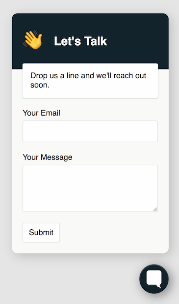
Out of the box, Formbutton provides a basic “contact-us” form:

You can add it to your website with this copy-pasteable snippet:
  <script src="https://formspree.io/js/formbutton-v1.min.js" defer></script>
  <script>
    window.formbutton=window.formbutton||function(){(formbutton.q=formbutton.q||[]).push(arguments)};
    formbutton("create", {action: "https://formspree.io/YOUR_FORM_ID"})
  </script>
You need to replace YOUR_FORM_ID with a Formspree form id. You can easily create a Formspree form that will send you email notifications at https://formspree.io/create. Alternatively, you can use any form endpoint, including your own PHP script. See how to customize your form action below.
The Formbutton script
The current version of Formbutton is 1.0.4. To stay up-to-date without introducing breaking changes, use the latest major version.
<script src="https://formspree.io/js/formbutton-v1.min.js" defer></script>
Formbutton uses semantic versioning. The latest major and minor versions, along with each patch version can be retrieved by linking to the script using on of the following patterns:
  formbutton-v<major>.min.js
  formbutton-v<major>.<minor>.min.js
  formbutton-v<major>.<minor>.<patch>.min.js
Minor and patch versions will be backwards compatible. Major versions may introduce breaking changes.
Here are a few examples of how to load the formspree script:
  <script src="https://formspree.io/js/formbutton-v1.min.js" defer></script>
  <script src="https://formspree.io/js/formbutton-v1.0.min.js" defer></script>
  <script src="https://formspree.io/js/formbutton-v1.0.4.min.js" defer></script>
Accessibility and responsiveness
Formbutton was designed to be accessible and to work well on mobile devices. Specifically we ensure that all form fields can be accessed via keyboard input. We also ensure that, in our default themes, fields use clear outlines when accessed via keyboard, and all fields have matching visible labels.
If you encounter a usability or accessibility problem please let us know by filling in the feedback form below.
Customizing Formbutton
You can customize almost every aspect of Formbutton, including the text, fonts, icon, colors, submit behavior, data, and error handling. To customize Formbutton, pass a config object to the second parameter of the formbutton function. You must always include an action attribute. All other customizations are optional:
  formbutton("create", {
    action: "https://formspree.io/YOUR_FORM_ID",  // an action is required

    // ... add your custom configs here

  });
What follows are examples that illustrate how to perform the most common customizations.
Title and description
You can supply any title and description message by setting the corresponding attributes of the config object.
  formbutton("create", {
    title: "Let's Connect!",
    description: "We'll get back to you as soon as possible.",
    // ...
  });
If you prefer to hide the title or description, set either to null or the empty string.
Changing the form fields
By default Formbutton is configured to provide a simple “Contact Us” form with name and email fields, however you can create any form you like. To do so, set the fields attribute of the config object.
  formbutton("create", {
    fields: [{
      name: "name",
      type: "text",
      label: "Your Name",
      required: true,
    },
    {
      name: "email",
      type: "email",
      label: "Your Email",
      required: true
    },
    {
      name: "Message",
      type: "textarea"
    },
    {
    type: "select",
        label: "How do you feel?",
        name: "mood",
        options: [
            {label: "Great", value: 2},
            {label: "Good", value: 1},
            {label: "OK", value: 0},
            {label: "Not Great", value: -1},
            {label: "Terrible", value: -2},
        ]
    },
    {
      type: "submit"
    }],
    // ...
  });
Field items must contain a name and type attribute. The name attribute sets the input’s name and the label for the field. Optionally a label attribte can be provided separately.
The type attribute sets the type of input that is rendered, and must contain one of the following strings:
  text
  email
  number
  textarea
  select
  checkbox
  radio
  reset
  submit
  hidden
Formbutton also supports the following attributes, which will be passed through to the rendered input HTMLElement.
| attribute | description |
|---|---|
| required | Whether the field is required |
| disabled | Whether the form control is disabled |
| placeholder | Appears in the form control when empty |
| readonly | Boolean. The value is not editable |
| value | Initial value of the form control |
| style | Field style overrides. See below |
| className | Adds a class name. Only relevant if replacing the stylesheet |
Changing the Theme
Formbutton comes with a minimal theme by default. You can override the theme by passing a theme parameter to the create command.
  formbutton("create", {
    theme: "classic",
    // ...
  });
Right now there are only two themes, minimal the default, inspired by a simple chat widget, and classic, a theme that offers a more standard form look-and-feel.
Customizing styles
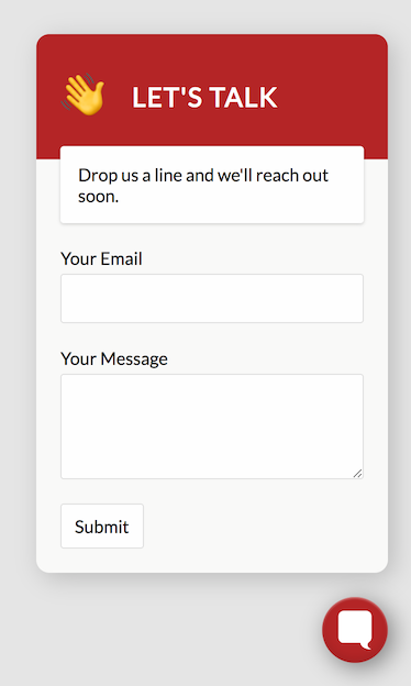
Every part of the Formbutton design is customizable. The easiest way to customize the design is to add a styles object to the config. The styles object may contain global styles at the top level, and keys that contain styles for specific elements. Here’s an example of customizing the global font, and button and title styles.
  formbutton("create", {
    styles: {
      fontFamily:'"Lato", sans-serif',
      button: {
        background: "#C4001A"
      },
      title: {
        background: "#C4001A",
        letterSpacing: "0.05em",
        textTransform: "uppercase"
      }
    },
    // ...
  });
The resulting form looks like this:
Element styles
Style elements, like button and title above, correspond to elements in the Formbutton HTML. Each element has an id of the form formbutton-elementName. When rendering each element, Formbutton looks for a style with the corresponding element name. For example, here’s some of the HTML that Formbutton renders:
  <div id="formbutton-modal">
    <div id="formbutton-title">Contact Us</div>
    <div id="formbutton-description">
      <p>We'll get back to you as soon as possible.</p>
    </div>
    <div id="formbutton-body">
      ...
    </div>
  </div>
To style the above elements, use the corresponding keys in the styles property like so:
  formbutton("create", {
    styles: {
      modal: {},         // add your
      title: {},         // style overrides
      description: {},   // for each
      body: {}           // element here
    },
    // ...
  });
Here’s a list of all the elements that make up the Formbutton UI:
  button             // the button
  iframe             // toplevel full screen iframe
  shim               // full screen background
  modalContainer     // container for modal, sets padding
  modal              // popup modal, sets shadow, border
  title              // "Contact Us" title with background
  description        // below title
  body               // modal content
  formContainer      // wraps the form
  formStatus         // fills form container with status message
  form               // the form itself
  label              // labels that wrap each form field
  input              // all form inputs
  <type>Label        // label styles for the given field type
  <type>Input        // input styles for the given field type
Form field styles
Every Formbutton field has a type, such as text, email, or textarea, which determines how it’s rendered. Every field is wrapped in a label tag by default. The corresponding style elements are named <type>Input and <type>Label. To style all checkbox fields, for example, you can use the checkboxInput and checkboxLabel style attributes.
  formbutton("create", {
    styles: {
      checkboxLabel: {
        display: "flex",
        flexDirection: "row-reverse"
      },
      checkboxInput: {
        margin: "0 0 0 11px"
      }
    }
    // ...
  });
You can also provide styles for a specific field when setting up the form. To do so, add a style object to the field definition, containing label and/or input properties. For example, in order to create two half-width inputs on a single line, you could add styles like this:
  formbutton("create", {
    fields: [{
      name: "First Name",
      type: "text",
      style: {
        label: {
          width: "45%",
          marginRight: "5%"
        }
      }
    }, {
      name: "Last Name",
      type: "text",
      style: {
        label: {
          width: "50%",
        }
      }
    }],
    // ...
  });
Fonts
By default, Formbutton supports the Google font library. If it detects a non-system font in any fontFamily style, it will automatically add a link to the appropriate Google font CSS. As a result, you can freely add any Google font family to your styles, and it will just work.
Here’s an example of setting different Google fonts for the form title and body:
  formbutton("create", {
    styles: {
      fontFamily:'"Open Sans", sans-serif',
      title: {
        fontFamily:'"Calistoga", sans-serif',
        fontSize: "2em"
      }
    },
    // ...
  });
To disable this behavior, set loadGoogleFonts: false in the config. If you want to use an alternative font library, like typekit, you’ll need to override the stylesheet.
The button icon
By default, Formbutton uses a custom icon. However, you can replace it with your own by supplying an HTMLElement, or html text, in the buttonImg config attribute.
Here’s an example that demonstrates replacing the button image with an icon from the free FontAwesome library.
  // load cloudflare icons
  <link rel="stylesheet" href="https://cdnjs.cloudflare.com/ajax/libs/font-awesome/5.11.2/css/all.css" />

  <script src="https://formspree.io/js/formbutton-v0.min.js" defer></script>
  <script>
    window.formbutton=window.formbutton||function(){(formbutton.q=formbutton.q||[]).push(arguments)};
    formbutton("create", {
      action: "https://formspree.io/YOUR_FORM_ID",
      buttonImg: "<i class='fas fa-comment' style='font-size:24px'/>"  // <-- new button icon
    });
  </script>
The above example results in the following Formbutton icon:
Use your own stylesheet
Overriding styles with the styles config is fast if you want to make a few tweaks. Alternatively, if you wish to take full control of the iframe, shim, modal and form, you can provide a CSS stylesheet of your own. To do so, set the stylesheet config attribute with a path to your hosted stylesheet.
  formbutton("create", {
    action: "https://formspree.io/YOUR_FORM_ID",
    stylesheet: "mystyles.css"
  });
You can copy and modify the default stylesheet by using this gist as a starting point.
The stylesheet only applies to elements within the Formbutton iframe. Overriding the stylesheet will not affect button styles, because the button exists outside the Formbutton iframe.
Customizing Submit Behavior
Formbutton can be configured to submit to any endpoint or api. That includes form services like Formspree or your own PHP script. By default, Formbutton submits data with Content-Type application/json. You can change that by setting json to false. Here’s an example of submitting to a PHP script using Content-Type application/x-www-form-urlencoded:
formbutton("create", {action: "myscripts/formsubmit.php", json: false})
Overriding onSubmit
When the form is submitted, before the data is sent, Formbutton calls the onSubmit method which displays the spinner. Here’s the default onSubmit function:
  function defaultOnSubmit(data, setStatus, spinner) {
    setStatus(spinner);
    return data;
  };
You can override this method to intercept the data or change the spinner. Here’s an example that adds a subject to the data, and sets a custom spinner:
  function myOnSubmit(data, setStatus) {

    // set the Formspree email subject field
    data["_subject"] = "Feedback for New Landing Page";

    // setStatus can accept an HTMLElement, plain text, or html text
    setStatus("<img src='static/img/myLoadingSpinner.gif'>");

    return data;
  };

  formbutton("create", {
    action: "https://formspree.io/YOUR_FORM_ID",
    onSubmit: myOnSubmit
  });
Overriding onResponse
When a response is returned, Formbutton calls an onResponse function that takes an ok parameter, a setStatus function used to update the status, and a response object passed from axios. Here is the default behavior, which first checks for a Formspree error before displaying a generic error message:
  function defaultOnResponse(ok, setStatus, response) {
    if (ok) {
      setStatus("Thanks!");
    } else {
      try {
        setStatus(response.data.error);
      } catch {
        setStatus("Oops, there was an error!");
      }
    }
  };
You can override this method to provide your own response handling behavior. Here’s an example that sets custom success and error messages:
  formbutton("create", {
    onResponse: function(ok, setStatus) {
    if (ok) {
      setStatus("Your request was received. We'll be in touch shortly.");
    } else {
      setStatus("<span style='color:red'>There was a problem. We've been notified.</span>");
    },
    //...
  };
The setStatus function can accept a simple text string, an HTML string, or an HTMLElement.