Everything You Need to Know About HTML Radio Buttons
Master the use of radio buttons in web development to create clear, user-friendly forms with accessible and intuitive selection options.
Radio buttons are a fundamental part of web forms, allowing users to select a single option from a predefined set. They provide a simple and intuitive way to collect user preferences, making them ideal for scenarios like surveys, quizzes, and account settings. Unlike checkboxes, which allow multiple selections, radio buttons enforce a single choice, ensuring clarity in user input.
When designed correctly, radio buttons improve form usability, guide user decisions, and streamline data collection. However, poor implementation—such as missing labels, improper grouping, or unclear options—can lead to confusion and frustration for users. Additionally, accessibility concerns must be addressed to ensure that all users, including those relying on screen readers or keyboard navigation, can interact with radio buttons seamlessly.
In this article, you will learn all there is about radio buttons, from their technical workings and best use cases to accessibility, UX design, validation, and implementation in popular frameworks like React, Angular, and Vue. By the end, you’ll have a deep understanding of how to effectively use radio buttons in your web applications while avoiding common pitfalls. Let’s dive in!
Understanding Radio Buttons
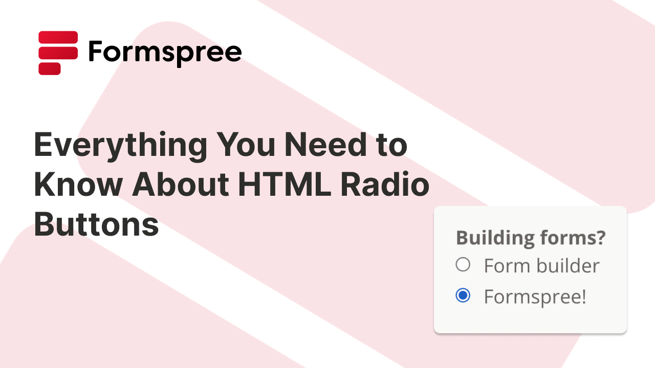
Radio buttons are a type of input element in HTML used when users need to choose one option from a set of predefined choices. They are created using the <input type="radio"> tag and must be grouped using the same name attribute to ensure only one selection is possible at a time.
Here’s a basic example of how radio buttons work:
  <form>
    <label><input type="radio" name="payment" value="credit"> Credit Card</label>
    <label><input type="radio" name="payment" value="debit"> Debit Card</label>
    <label><input type="radio" name="payment" value="paypal"> PayPal</label>
  </form>
In this example, all radio buttons share the name="payment" attribute, so selecting one option automatically deselects the others.
Radio buttons are commonly used in forms where a single answer is required, such as surveys (e.g., “How did you hear about us?”), preference settings, and authentication options (e.g., “Remember me on this device”). Their simplicity makes them a staple in UI design, but they must be used correctly to avoid user confusion.
When to Use Radio Buttons?
You should use radio buttons when:
- The user must choose only one option from a small, predefined list.
- The number of choices is small (typically 2-5).
- Users should see all available choices immediately, rather than after opening a dropdown.
Radio Buttons vs. Checkboxes vs. Dropdowns
Here’s a quick little table to help you decide when to use which input type from radio buttons, checkboxes, and dropdowns:
| Input Type | Use Case |
|---|---|
| Radio Buttons | Select one option from a short list. |
| Dropdowns | Select one option from a long list. |
| Checkboxes | Select multiple options independently. |
For example, radio buttons work well for gender selection, while a dropdown is better for selecting a country from a long list. Understanding these differences can help you build a smoother user experience.
Accessibility Best Practices
Ensuring that radio buttons are accessible is crucial for users who rely on screen readers, keyboard navigation, or assistive technologies. Here are some best practices to follow:
- Use
<label>Elements: Each radio button should have a clear, associated label to help users understand their choices. The correct way to do this is:
  <label><input type="radio" name="contact" value="email"> Email</label>
  <label><input type="radio" name="contact" value="phone"> Phone</label>
Alternatively, you can use the for attribute:
  <input type="radio" id="email" name="contact" value="email">
  <label for="email">Email</label>
- Use
<fieldset>and<legend>for Grouping: When multiple radio buttons belong to a category, group them using a<fieldset>with a<legend>to provide context:
  <fieldset>
    <legend>Preferred Contact Method</legend>
    <label><input type="radio" name="contact" value="email"> Email</label>
    <label><input type="radio" name="contact" value="phone"> Phone</label>
  </fieldset>
- Ensure Keyboard Navigability: Users should be able to navigate through radio buttons using the Tab key and select options using Spacebar.
- Use ARIA Attributes for Advanced Use Cases: If you need to display additional information, use
aria-describedbyoraria-labelledbyto enhance accessibility.
Design and UX Best Practices
A well-designed radio button improves clarity and usability. Follow these best practices for a better user experience:
- Use Clear Labels: Avoid ambiguous options like “Option 1” and “Option 2.” Labels should be descriptive and contextually meaningful.
- Provide Enough Spacing: Ensure adequate spacing between radio buttons to prevent misclicks, especially on mobile.
- Use a Logical Order: Arrange options in a natural or expected order. For example, in a Yes/No question, “Yes” should appear before “No”.
- Indicate Selection Clearly: The selected radio button should be visibly distinct, with a clear contrast between selected and unselected states.
- Avoid Too Many Options: If more than 5 options are available, consider a dropdown instead. Too many radio buttons can overwhelm users.
- Labels should be clickable: Placing the
<input>inside a<label>, or using theforattribute, ensures users can click anywhere on the label to select an option. - Keep labels short and intuitive: Avoid unnecessary text that clutters the UI.
Inline or Vertical Alignment?
When designing forms with radio buttons, you might need to choose between inline (horizontal) and vertical layouts. Your choice can significantly impact the usability and accessibility of your web page.
- Vertical Alignment:
- Clarity and Readability: Stacking radio buttons vertically enhances readability and ensures users can easily distinguish between options. This layout is particularly beneficial when options have longer labels or when there are more than two choices.
- Consistency: Vertical alignment provides a consistent and predictable structure, aiding users in quickly scanning and making selections.
- Inline (Horizontal) Alignment:
- Space Efficiency: Placing radio buttons horizontally can save vertical space and may be suitable for forms with limited height.
- Use Cases: Inline alignment works best when presenting short, mutually exclusive options that can comfortably fit on a single line, such as “Yes” and “No” or a 1–5 rating scale.
While it’s tempting to use inline radio buttons for Likert or Net Promoter Score (NPS) scales due to their compactness, this approach may not always offer the best user experience. Alternative input methods, such as sliders or custom components, can provide a more intuitive and engaging experience for users when dealing with such scales.
Here are a few tips to help you make the choice:
- Option Length and Number: Opt for vertical alignment when dealing with longer labels or more than two options to maintain clarity.
- Screen Size: Consider the device’s screen size; horizontal layouts may not render well on smaller screens, leading to a compromised user experience.
- Accessibility: Ensure that the chosen alignment supports keyboard navigation and screen readers effectively, providing an inclusive experience for all users.
Should You Preselect a Radio Button?
Preselecting a radio button can help guide users, but it also comes with risks:
- Good for user experience: For common scenarios (e.g., gender selection or payment method), a default selection speeds up form completion.
- Bad if it biases responses: In surveys or critical selections, avoid preselecting an option, as it may influence user choice.
Example of a default Selection:
  <label><input type="radio" name="payment" value="credit" checked> Credit Card</label>
  <label><input type="radio" name="payment" value="paypal"> PayPal</label>
Here, “Credit Card” is preselected using checked, but users can still change their selection.
Validating Radio Button Inputs
Since radio buttons require one selection, validation ensures users don’t skip required choices.
HTML5 Validation
To enforce selection, use the required attribute:
  <form>
    <fieldset>
      <legend>Choose your subscription plan:</legend>
      <label><input type="radio" name="plan" value="basic" required> Basic</label>
      <label><input type="radio" name="plan" value="premium"> Premium</label>
    </fieldset>
    <button type="submit">Submit</button>
  </form>
If the user tries to submit without selecting an option, the browser will show a validation error.
JavaScript Validation (For Custom Error Messages)
For custom error handling:
  <script>
    document.querySelector("form").addEventListener("submit", function(event) {
      if (!document.querySelector('input[name="plan"]:checked')) {
        alert("Please select a subscription plan.");
        event.preventDefault();
      }
    });
  </script>
This can provide better user guidance when required fields are missing.
Radio Buttons in Popular Frameworks
Modern frontend frameworks, like React, Angular, Vue, etc., offer built-in methods to handle radio buttons efficiently.
Radio Buttons in React
In React, radio buttons are typically controlled components, meaning the selected value is stored in a state variable and updated using an event handler. This allows developers to track user input and control form behavior dynamically.
What’s unique in React?
- Uses state management to handle form inputs.
- Requires an
onChangehandler to update the selected value. - Works well for applications where form data needs to be controlled centrally.
Radio Buttons in Angular
Angular provides two-way data binding using ngModel, which keeps the UI and the component’s data synchronized automatically. For more complex forms, Angular also supports Reactive Forms, which provide additional validation and form control options.
What’s unique in Angular?
- Uses ngModel for two-way data binding in Template-driven Forms.
- Supports Reactive Forms for structured form management.
- Works well for large-scale applications with extensive form requirements.
Radio Buttons in Vue.js
Vue simplifies form handling with v-model, which binds the selected radio button to a variable in the component’s data. This makes form interactions reactive without requiring extra event handlers.
What’s unique in Vue?
- Uses
v-modelfor automatic data binding with minimal code. - Provides a reactive form experience without extra event handling.
- Suitable for both simple and complex form structures.
Common Mistakes and How to Avoid Them
When using radio buttons, certain mistakes can lead to poor user experience and accessibility issues. Here are some common pitfalls and how to avoid them:
- Not Grouping Related Radio Buttons
Mistake: Placing radio buttons outside of a
<fieldset>makes it difficult for users to understand the context. Solution: Always use a<fieldset>and<legend>to group related radio buttons. - Missing or Incorrect Labels
Mistake: Using radio buttons without
<label>elements forces users to click on small targets. Solution: Wrap the radio button inside a<label>or use the for attribute to improve accessibility. - Using Checkboxes Instead of Radio Buttons Mistake: Using checkboxes when only one selection is allowed confuses users. Solution: Use radio buttons when users must pick only one option from a list.
- Failing to Provide a Default Selection Mistake: Not preselecting a default option can slow down form completion. Solution: If one option is more common, preselect it using the checked attribute.
- Ignoring Keyboard Navigation Mistake: Radio buttons that cannot be selected using the keyboard exclude users who rely on keyboard navigation. Solution: Ensure users can navigate between options using the Tab key and select with the Spacebar.
Conclusion
Radio buttons are a simple yet powerful input type that helps users select one option from a predefined list. When used correctly, they enhance form usability, accessibility, and user experience.
This article covered the basics of how radio buttons work and when to use them, best practices for grouping, labeling, and styling radio buttons, how popular frameworks like React, Angular, and Vue handle radio buttons, and some common mistakes to avoid when implementing radio buttons in forms.
By focusing on clear labeling, accessibility, and correct form validation, you can create intuitive and efficient forms that work well for all users. Whether you’re building simple preference selectors or complex web forms, understanding how to use radio buttons correctly ensures a better experience for everyone.