The Essential Guide to HTML Input Fields
Explore the full range of HTML input fields, from basic text boxes to advanced interactive elements, and learn best practices for form design.

Forms are an essential part of web development. They enable seamless user interaction and data collection across login pages, contact form, e-commerce checkouts, etc. At the core of these forms lies the versatile <input> tag, one of the most fundamental elements of HTML.
The <input> tag allows users to enter various types of data, from simple text fields to passwords, file uploads, and date selectors. Understanding how it works, the different input types available, and when to use them can help developers create more effective and accessible web forms. In this guide, we’ll explore the HTML <input> tag, its attributes, and how it functions across different use cases.
What is the HTML Input Tag?
The HTML <input> tag is a fundamental HTML form element that allows users to provide information in a structured and interactive way. It is typically used within a <form> element to collect data such as text input, email addresses, passwords, or even file uploads. The data entered into an input field can then be processed using client-side scripts or submitted to a server for further handling.
The HTML input tag supports a variety of attributes that define its behavior and appearance. One of the most critical attributes is type, which determines the kind of data a field can accept. For example, input type="text" creates a simple text input field, while input type="email" ensures that the user enters a valid email address.
How the HTML Input Tag Works
The <input> tag relies on the type attribute to define its behavior and the kind of user input it accepts. Different input types enable diverse functionalities, making web forms more interactive and user-friendly across mobile devices and desktops.
Some of the common HTML input types are:
- Text Input (
input type="text"): Creates a simple line text input field for general user input. - Password Input (
input type="password"): Masks characters for secure entry. - Email Input (
input type="email"): Ensures users enter a valid email address. - Checkbox Input (
input type="checkbox"): Allows multiple selections in a web form. - Radio Buttons (
input type="radio"): Enables users to select only one option from a set. - Submit Buttons (
input type="submit"): Triggers form submission to theform actionURL. - File Upload (
input type="file"): Lets users upload files of different file types. - URL Input (
input type="url"): Ensures valid web addresses. - Number Input (
input type="number"): Accepts numeric values like a point number. - Date and Time Inputs (
input type="date",input type="time",input type="week"): Allows users to pick specific dates and times. - Button Input (
input type="button"): Custom interactive control for JavaScript actions. - Color Picker (
input type="color"): A niche input type used for selecting colors. While not frequently used in standard forms, it can be helpful in design or customization interfaces.
Each input element uses attributes like value, placeholder, and default value to define its behavior. Accessibility features such as <label for="lname">Last Name:</label> improve usability, especially for screen readers.
When a form is submitted, form data is sent to the form action URL, allowing server-side processing. Using input types properly enhances interactive control, improves default behavior, and ensures seamless form submission.
When to Use the HTML Input Tag
The HTML input tag is essential for collecting user input in a web form. It enables users to enter and submit data efficiently using different input types, making it a fundamental component of form-based interactions.
When to Use the Input Tag
- User Data Collection: Use form input fields like
input type="text",input type="email", andinput type="password"for capturing user details such as names, email addresses, and login credentials. - Form Submission: The input type=“submit” button triggers form submission, sending form data to the form action URL for processing.
- Interactive Control Elements: Radio buttons (
input type="radio") and checkboxes (input type="checkbox") allow users to make selections. - Specialized Data Entry: Inputs like input type=“url”,
input type="week", andinput type="number"ensure valid default behavior for specific data types. - File Uploads: Use
input type="file"to allow users to submit different input types of documents and media. - Date and Time Inputs: Inputs like time picker (
input type="time") and date fields streamline scheduling and date selection.
When Not to Use the Input Tag
If you’re working with JavaScript frameworks like React or Vue (and specially if you’re using component libraries like Material or Tailwind), you might be better off with the input elements offered by the framework (or the component library). This is because they often come with additional validation options and ease of use.
Moreover, if you are trying to build complex data entry use-cases, with features like drag-and-drop data entry and large scale data manipulation, the HTML input element might be cumbersome to use.
Popular Implementations of HTML Input Across Styling Libraries
While raw HTML input elements provide essential functionality, styling frameworks enhance form input fields for a better user input experience. Modern libraries like Bootstrap, Tailwind UI, and Shadcn offer pre-styled components that improve accessibility, consistency, and form submission usability across mobile devices and desktops. Below are some of the most popular implementations of HTML input types across different frameworks.
Bootstrap Input Groups
Bootstrap extends HTML form elements with input groups, adding buttons, icons, and labels for a more interactive form input experience.
Key Features:
- Supports a variety of input fields.
- Allows buttons or action icons inside input field types.
- Provides floating labels, ensuring proper interactive control for screen readers.
Here’s a quick little example of a username input field made using Bootstrap:
  <div class="input-group mb-3">
    <span class="input-group-text">@</span>
    <div class="form-floating">
      <input type="text" class="form-control" id="floatingInputGroup1" placeholder="Username">
      <label for="floatingInputGroup1">Username</label>
    </div>
  </div>
Here’s how it will look:

Tailwind UI Input Groups
Tailwind offers highly customizable form input styles using utility classes, making HTML form elements responsive and visually appealing.
Key Features:
- Supports a wide range of input field types.
- Provides full control over spacing, borders, and shadows for different input types.
- Works seamlessly with submit buttons for form submission.
Tailwind UI is a paid offering by Tailwind Labs. You can check out some of their input components on their preview page. All of their components are fully responsive and optimised for mobile devices. Based on your use-case (marketing, e-commerce, or app UI), you can get a dedicated package of components from them.
Shadcn Input Elements
Shadcn offers form input components with minimal, customizable styling, making them perfect for modern applications.
Key Features:
- Supports a wide range of input field types, including advanced use cases like command palette, autocomplete input, and comboboxes with suggestions.
- Provides a flexible API for styling form input fields.
- Ensures accessibility with ARIA attributes and labels
Shadcn is specifically built for React. It can also be used with Next.js, but it does not work with vanilla JS and HTML. Here’s how a typical input field from Shadcn will look like:

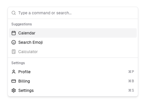
Shadcn offers some advanced input components out of the box, such as this command menu that looks similar to Apple’s Spotlight search:

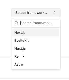
Here’s another cool component from Shadcn, the combobox that allows you to build searchable dropdowns (or offer suggestions while users enter data) easily:

Shadcn is great if you’re looking to build minimal but detailed interfaces. It is built with Tailwind CSS and is completely open source.
Conclusion
So, as you’ve seen, the HTML input tag is a very fundamental components of almost every web form. Whether it’s a text input, password field, or specialized data types like email addresses, URLs, or boolean values, choosing the right input element can greatly enahnce form data accuracy and improve the overall user experience.
By understanding the different input types, you can build interactive and accessible forms that work smoothly across mobile devices and desktops. Additionally, styling libraries like Bootstrap, Tailwind UI, and Shadcn provide pre-designed form input elements that improve readability, accessibility, and consistency across applications. Using these, you can optimize form submission and ensure that your app’s data validation and collection are both efficient and user-friendly.
To simplify form submission and form action handling, Formspree offers an easy way to collect data without complex back-end setups. Instead of manually processing form input, you can set the form action to a Formspree endpoint, allowing effortless input field data collection. Whether handling email addresses, radio buttons, or file uploads, Formspree streamlines the process, making it easier to manage large-scale form submission tasks.