The HTML Button: Usability and Alternatives
Understand HTML button usability, explore best practices for accessible design, and discover effective alternatives for user-friendly interactions.
The HTML <button> element is a cornerstone of modern web design, enabling user interaction with websites. Whether it’s submitting a form, triggering a JavaScript function, or navigating to another page, buttons serve as intuitive, clickable elements that guide users through web applications. They are help create interactive and accessible web pages, making them a staple for developers and web designers.
Buttons solve key problems in HTML by providing a standardized way to execute actions and collect user inputs. However, with multiple options like <button>, <input type="button">, and <input type="submit">, confusion often arises about which to use in various scenarios. Each has unique capabilities, strengths, and limitations, influencing their usability in different contexts.
In this article, you’ll explore the HTML button element in depth, its attributes and use cases, the key differences between buttons and inputs, and advanced techniques for styling and functionality. Whether you’re a beginner or an experienced developer, this guide will help you unlock the full potential of buttons in your web projects.
What Is the HTML Button Element?
The <button> element is an interactive HTML tag designed to enable user actions on a web page. It is a versatile element that can handle tasks like submitting forms, triggering JavaScript functions, or even acting as part of a complex user interface.
Basic Syntax and Examples
The <button> tag is simple to implement:
<button type="button">Click Me</button>
This basic example creates a clickable button labeled “Click Me.” You can customize it with various attributes to control its behavior and appearance.
Key Attributes of the Button Element
type: Defines the button’s behavior, such asbutton(default),submit, orreset. The submit and the reset buttons have dedicated functions inside forms. The general “button” type can be used as needed across the application.value: Specifies a value associated with the button when used in forms.disabled: Prevents user interaction, often used for loading states or restricted actions.autofocus: Automatically focuses the button when the page loads.
Button vs Input: Key Differences
When building interactive elements for a web page, developers often wonder whether to use the <button> element or <input> elements like <input type="button"> or <input type="submit">. While these elements share similar functionality, understanding their differences is crucial for creating effective and accessible HTML content.
Flexibility and Content
The <button> element is highly versatile, allowing developers to include plain text, images, SVG icons, or even other HTML elements within its content. For example:
<button type="button"><img src="icon.png" alt="Icon"> Click Me</button>
In contrast, <input> elements are self-closing HTML tags that cannot contain nested content. Their value attribute defines the button text, limiting their design possibilities:
<input type="button" value="Click Me">
Types and Default Behavior
These differences make <button> more adaptable for complex interactive elements and <input> better suited for basic form buttons.
<button>: Supports multipletypeattributes (button,submit,reset), with the default beingsubmitwhen used inside a form.<input type="button">: Has no default behavior and is primarily used for triggering JavaScript code.<input type="submit">: Automatically submits form data, making it ideal for simple forms.
Styling and Design
The <button> element is easier to style using CSS. Developers can target button states (hover, active, focus, disabled) to create interactive elements like ghost buttons or floating action buttons.
On the other hand, <input> elements are more restrictive and often require additional CSS overrides for customization.
When to Use Button vs Input
You should use <button> when you need rich content or require flexibility to include icons and formatted text in clickable buttons. It’s ideal for JavaScript functions, dynamic web applications, or modern CSS buttons with interactive states.
On the other hand, you can use <input type="submit"> for simple form submissions where minimal design and functionality suffice.
Common Use Cases of Buttons
Buttons are versatile HTML elements that serve various roles in interactive web design. Below are some common use cases, along with examples and their outputs.
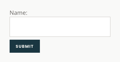
Form Submission
The <button type="submit"> is the default way to submit form data in HTML forms. It triggers the form’s action attribute and submits the data to the server.
  <form action="/submit-form" method="POST">
    <label for="name">Name:</label>
    <input type="text" id="name" name="name">
    <button type="submit">Submit</button>
  </form>
Here’s what this form would look like:
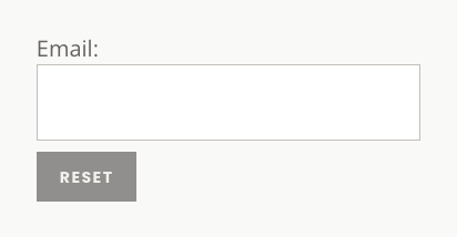
Reset Form Fields
The <button type="reset"> clears all input fields in a form to their initial values.
  <form>
    <label for="email">Email:</label>
    <input type="email" id="email" name="email">
    <button type="reset">Reset</button>
  </form>
Here’s what the reset button would look like:
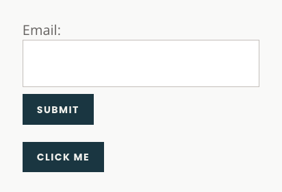
Triggering JavaScript Actions
Buttons can execute JavaScript functions using the onclick attribute or event listeners.
<button type="button" onclick="alert('Button clicked!')">Click Me</button>
Here’s what a simple button would look like below a form:
Advanced Use Cases of Buttons
Buttons can go beyond basic interactions to power advanced features and enhance the user experience. Below are examples of more sophisticated use cases.
Custom Buttons With Icons
Use the <button> element to include SVG icons or other HTML elements for a polished design.
  <button type="button" style="display: flex;">
    <svg style="margin-right: 8px;" width="16" height="16" viewBox="0 0 16 16" fill="none">
      <circle cx="8" cy="8" r="7" stroke="white" stroke-width="2"></circle>
    </svg>
    Click Me
  </button>
Here’s what this button with an icon would look like:
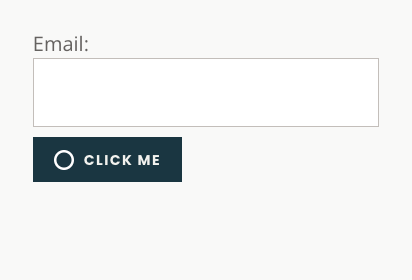
Styled Buttons With Hover Effects
You can enhance buttons with CSS to create modern, interactive designs like ghost buttons.
  <style>
    button {
      border: 2px solid #007BFF;
      background-color: transparent;
      color: #007BFF;
      padding: 10px 20px;
      border-radius: 5px;
      cursor: pointer;
      transition: all 0.3s;
    }
    button:hover {
      background-color: #007BFF;
      color: #fff;
    }
  </style>
  <button type="button">Hover Me</button>

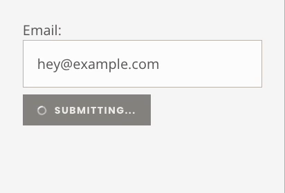
Loading States and Feedback
You can disable buttons during actions to prevent duplicate submissions and show a loading spinner.
  <button type="button" disabled>
    <span class="spinner"></span> Submitting...
  </button>
  <style>
    button {
      display: flex;
      flex-direction: row;
      align-items: center;
      gap: 10px;
    }
    .spinner {
      display: inline-block;
      width: 10px;
      height: 10px;
      border: 2px solid #ccc;
      border-top: 2px solid #fff;
      border-radius: 50%;
      animation: spin 1s linear infinite;
    }
    @keyframes spin {
      to { transform: rotate(360deg); }
    }
  </style>
Here’s what the submitting spinner would look like
Conclusion
As you’ve seen, the HTML <button> element is a vital building block for creating interactive and accessible web forms. Its flexibility and support for attributes like type, disabled, and autofocus make it ideal for various use cases, from form submission and JavaScript triggers to advanced designs like button groups and loading states. Unlike <input type="button"> or <input type="submit">, the <button> element allows for rich content and styling, enabling developers to include text, icons, or even animations for more dynamic user interfaces.
By using CSS for styling and JavaScript for functionality, buttons can transform from simple clickable elements to highly interactive components. Whether you’re adding ghost buttons, hover effects, or feedback mechanisms like spinners, the <button> element offers endless possibilities for improving usability and user experience on your web pages.
To simplify form submissions, tools like Formspree provide an easy way to handle form data, enabling seamless collection and responses without complex backend setups. Make sure to give Formspree a try today!