HTML All Float Options: A Beginner-Friendly Guide
Master all HTML float options to control element positioning and create responsive, well-structured web layouts with ease.
When designing web pages, positioning elements correctly helps to create visually appealing and user-friendly layouts. One of the most frequently used techniques for achieving this is the CSS float property. Initially introduced for simple text wrapping, the float property has since been used extensively for structuring layouts and positioning elements.
While modern CSS tools like Flexbox and Grid have largely replaced floats for layout purposes, the float property is still used in some particular use cases. In this guide, we’ll explore all float options in detail, discuss how floated elements behave, and highlight modern alternatives to help you decide when and how to use this CSS property effectively.
What is the Float Property?
The float property in CSS controls the positioning of an HTML element within its container. By “floating” an element, you can move it to one side of its parent container—left or right—allowing text or other inline elements to wrap around it.
Here’s the basic syntax:
  .element {
    float: value;
  }
The float property works with the box model and influences how the content interacts within the available space. For example, floated elements are removed from the normal document flow but still affect the placement of surrounding inline content.
Some common property values include:
none(default value): The element does not float.left: Floats the element to the left of its container.right: Floats the element to the right of its container.
These options can help with tasks like text wrapping, creating simple layouts, or positioning elements dynamically. As we dive deeper into the available float options and their behavior, you’ll gain insights into when to use this property and how it integrates into modern web design.
All Float Options
There are several possible values to control how an HTML element is positioned within its parent element. Here’s a breakdown of all property values:
none: The default value where the element does not float and remains in the normal flow of the document.left: Moves the element to the left side of its container, allowing inline elements like text to wrap around on the right. This is commonly referred to as “left float” or “float left.”right: Positions the element on the right side of the container, with inline elements wrapping around on the left.inline-start: A logical property for floating an element to the start of the inline axis, which adapts to right-to-left layouts.inline-end: Floats the element to the end of the inline axis, also useful for right-to-left designs.
Here’s an example of the float property in action:
<img src="image.jpg" style="float: left; margin-right: 10px;" alt="Example">
<p>This text wraps around the image, demonstrating the float property.</p>
Each float value allows you to create versatile designs, from aligning images to building multi-column layouts.
How Floated Elements Behave
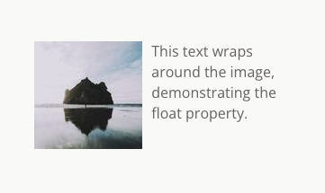
Floated elements are removed from the normal flow of the document, affecting how other elements like text or inline elements are displayed. For example, when an image is floated with float: left;, the text wraps around it on the right:
  <img src="https://picsum.photos/120"
      style="float: left; margin-right: 10px;"
      alt="Example">
  <p>
    This text wraps around the image, demonstrating the float property
  </p>
Here’s how it will look:
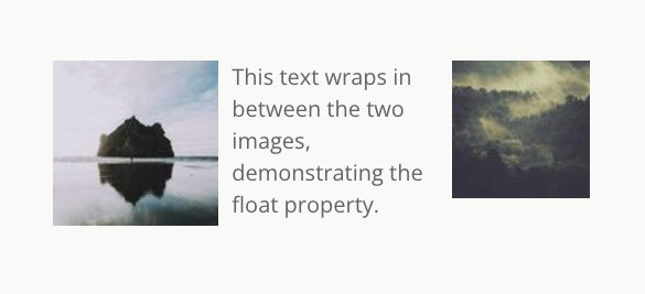
If a parent container contains multiple floated elements, they are arranged first, and then the remaining elements are fit in, such as in this example:
  <div style="width: 400px">
    <img src="https://picsum.photos/120"
      style="float: left; margin-right: 10px;">
    <img src="https://picsum.photos/120"
      style="float: right; margin-right: 10px">
    <p style="clear: none">
      This text wraps in between the two images, demonstrating the float property.
    </p>
  </div>
Here’s what it will look like:
Floating elements can sometimes create issues with parent elements. If the parent container doesn’t account for floated child elements, it might collapse. Using the clear property (clear: left;, clear: right;, or clear: both;) helps manage this behavior.
Additionally, floated elements can cause layout shifts when block-level elements, such as a div or li element, are placed alongside them. Understanding how floated elements interact ensures smoother designs while minimizing layout issues.
Clearing Floats
Floated elements can disrupt layouts by causing their parent elements to collapse, as they are removed from the normal flow. To counter this, the clear property is used to restore balance in the layout. The clear property specifies that an element should not appear next to floated elements.
Common property values for clear include:
clear: left;: Prevents the element from sitting beside left-floated elements.clear: right;: Avoids overlap with right-floated elements.clear: both;: Ensures no floating elements affect the layout.
Here’s an example:
  <img src="https://picsum.photos/100"
        style="float: right; margin-right: 10px;">
  <p style="clear: right">
    This text is cleared below the right floated element.
  </p>
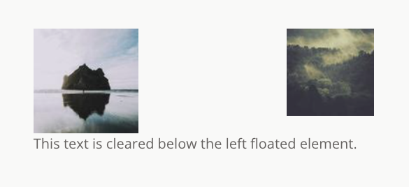
Here’s how clearing below left float would work among multiple floated elements:
  <div style="width: 400px">
    <img src="https://picsum.photos/120"
          style="float: left; margin-right: 10px;">
    <img src="https://picsum.photos/120"
          style="float: right; margin-right: 10px;">
    <p style="clear: left">
      This text is cleared below the left floated element.
    </p>
  </div>
Here’s how it will look:
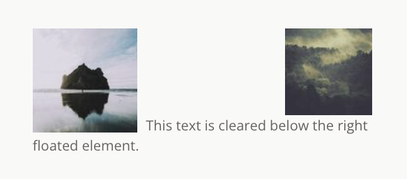
In the same example, here’s how clearing below right float would work:
  <div style="width: 400px">
    <img src="https://picsum.photos/120"
          style="float: left; margin-right: 10px;">
    <img src="https://picsum.photos/120"
          style="float: right; margin-right: 10px;">
    <p style="clear: right">
      This text is cleared below the right floated element.
    </p>
  </div>
Here’s how it will look:
Another effective technique is the clearfix hack. By adding a utility class like .clearfix to a parent element, you can automatically clear its floated children:
  .clearfix::after {
    content: "";
    display: block;
    clear: both;
  }
This removes the need to clear each element one by one by updating its styles. It was a popularly used in the old HTML days when people used float heavily in their web designs.
Common Use Cases of HTML Float
The float property has been widely used for designing layouts and positioning elements in web design. Some key use cases include:
- Text Wrapping: Floated images are ideal for wrapping text around inline elements or adding visual flair to main content.
- Multi-Column Layouts: Before modern CSS tools, developers used floats to create two-column or multi-column designs by setting
float: left;for one block element andfloat: right;for the other. - Buttons and Icons: Floated elements like buttons or icons in headers and footers help create clean designs while maintaining flexibility.
Modern Alternatives to Float
While the float property is still valuable for specific use cases, modern CSS layout tools have largely replaced it for structuring complex designs. These alternatives provide more robust and flexible solutions without many of the issues associated with clearing floats or disrupted normal flow.
Flexbox
Ideal for designing single-axis layouts, Flexbox simplifies alignment and spacing. It eliminates the need for float left or float right hacks to create side-by-side elements. For example:
  .container {
    display: flex;
    justify-content: space-between;
  }
CSS Grid
Perfect for grid-based layouts, CSS Grid enables precise control over rows and columns. Unlike floats, Grid doesn’t require clearing or manual positioning:
  .container {
    display: grid;
    grid-template-columns: repeat(3, 1fr);
  }
Positioning Properties
You can also useposition: absolute; for fixed element placement without relying on block elements or parent elements to wrap around content.
Logical Properties
CSS properties like margin-inline-start and margin-inline-end align elements in right-to-left and left-to-right layouts, making floats like inline-start and inline-end less necessary.
These modern alternatives are better suited for most HTML element layouts and allow developers to avoid common float-related pitfalls, like collapsed parent elements or clearing issues. However, floats remain relevant for tasks like text wrapping and small visual adjustments.
Conclusion
The float property has played a significant role in the starting phases of web design, offering a simple way to position HTML elements and wrap content around images. While it’s no longer the go-to solution for layout structuring, it remains valuable for tasks like wrapping text or positioning smaller elements.
Modern CSS tools like Flexbox, Grid, and logical properties provide more reliable and versatile options for building layouts. These tools address many of the challenges associated with floats, such as the need for clear property hacks or adjustments to maintain normal flow.
When working with floats, it’s essential to understand their limitations and use them selectively. For most layouts, consider adopting Flexbox or Grid to create scalable and maintainable designs.