Complete Guide to Bootstrap Forms with Formspree
Learn how to build responsive, accessible Bootstrap forms and connect them with Formspree for seamless handling.

Forms are the heart of user interaction on the web. Whether it’s a simple contact form, a newsletter signup, or a multi-step checkout process, well-designed forms play a critical role in capturing data and driving engagement. But building forms that are responsive, accessible, and easy to manage can be a time-consuming challenge, especially when you’re balancing both front-end design and back-end handling.
That’s where Bootstrap and Formspree can help.
Bootstrap is one of the most widely used front-end frameworks for building modern, responsive websites. It offers a robust set of form components, layout tools, and accessibility features out of the box. On the other hand, Formspree is a developer-friendly form backend that lets you handle submissions, send notifications, and integrate with other services; without writing any server-side code.
When combined, Bootstrap and Formspree enable developers, designers, and site owners to create polished, production-ready forms in minutes, not hours.
What Are Bootstrap Forms?
Bootstrap forms are built using HTML and styled with Bootstrap’s pre-defined CSS classes. They follow the principles of responsive design, meaning they automatically adjust to different screen sizes and device types. With just a few class names, you can make forms that look polished and function well across desktops, tablets, and smartphones.
Key Features of Bootstrap Forms
- Responsive Design: Forms automatically adapt to various screen sizes using Bootstrap’s grid system and responsive utilities.
- Built-in Styling: Inputs, buttons, labels, and other form controls are styled with a consistent, modern look.
- Form Validation Support: Easily display success and error states with Bootstrap’s validation classes.
- Accessibility: Bootstrap encourages semantic HTML and ARIA practices, making your forms usable with screen readers and assistive technologies.
- Custom Controls: Bootstrap offers enhanced styling for checkboxes, radios, switches, and file inputs, plus support for grouped elements and helper text.
Overview of Bootstrap Form Components
Here’s a quick breakdown of the core components you’ll come across:
Text Inputs: For fields like name, email, or address.
<input type="text" class="form-control" placeholder="Your Name">
Select Menus:
  <select class="form-select">
    <option>Choose one...</option>
    <option>Option A</option>
    <option>Option B</option>
  </select>
Checkboxes & Radio Buttons:
  <div class="form-check">
    <input class="form-check-input" type="checkbox" value="" id="flexCheckDefault">
    <label class="form-check-label" for="flexCheckDefault">
      I agree to the terms
    </label>
  </div>
File Uploads:
<input class="form-control" type="file" id="formFile">
Buttons:
<button type="submit" class="btn btn-primary">Submit</button>
Each of these components can be customized with classes for spacing, sizing, states, and accessibility, all of which we’ll explore throughout this guide.
Essential Form Layouts in Bootstrap
One of Bootstrap’s greatest strengths lies in its flexible layout system, which lets you design forms that adapt perfectly to different screen sizes and use cases. Whether you need a basic contact form, a registration panel, or a compact form in a navbar, Bootstrap has a layout pattern that fits.
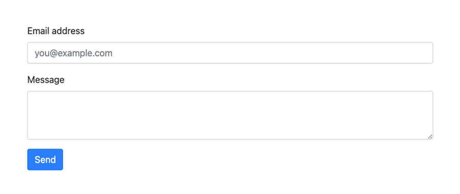
Vertical Forms (Default Layout)
Vertical forms are the most common and straightforward layout: each input is stacked vertically with its corresponding label.
Use case: Contact forms, login pages, newsletter signups.
Example:
  <form>
    <div class="mb-3">
      <label for="email" class="form-label">Email address</label>
      <input type="email" class="form-control" id="email" placeholder="you@example.com">
    </div>
    <div class="mb-3">
      <label for="message" class="form-label">Message</label>
      <textarea class="form-control" id="message" rows="3"></textarea>
    </div>
    <button type="submit" class="btn btn-primary">Send</button>
  </form>
Here’s what it will look like:
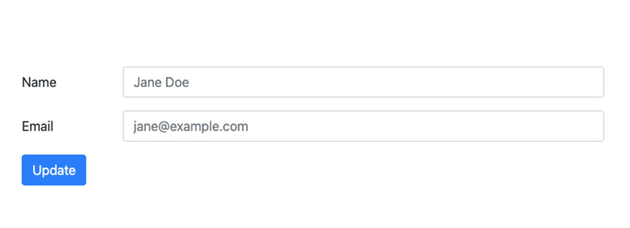
Horizontal Forms
Horizontal forms place labels and inputs side by side using Bootstrap’s grid system. This layout is space-efficient, especially for forms with fewer fields or wider containers.
Use case: Admin dashboards, profile settings pages.
Example:
  <form>
    <div class="row mb-3">
      <label for="inputName" class="col-sm-2 col-form-label">Name</label>
      <div class="col-sm-10">
        <input type="text" class="form-control" id="inputName" placeholder="Jane Doe">
      </div>
    </div>
    <div class="row mb-3">
      <label for="inputEmail" class="col-sm-2 col-form-label">Email</label>
      <div class="col-sm-10">
        <input type="email" class="form-control" id="inputEmail" placeholder="jane@example.com">
      </div>
    </div>
    <button type="submit" class="btn btn-primary">Update</button>
  </form>
Here’s what it will look like:
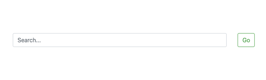
Inline Forms
Inline forms are compact and designed to fit inside navigation bars or toolbars. Inputs and buttons are aligned on a single line, making them ideal for quick actions like search or login.
Use case: Search bars, login boxes in headers.
Example:
  <form class="row row-cols-lg-auto g-3 align-items-center">
    <div class="col-10">
      <input type="text" class="form-control" placeholder="Search...">
    </div>
    <div class="col-1">
      <button type="submit" class="btn btn-outline-success">Go</button>
    </div>
  </form>
Here’s what it will look like:
Each of these layouts can be customized further with spacing utilities (mb-3, me-2, etc.), responsive classes (col-md-*, d-lg-block), and alignment helpers (align-items-center, text-end). As we move forward, you’ll learn how to combine these layouts with custom controls and backend handling using Formspree.
Custom Controls and Layout Techniques
Once you’re familiar with Bootstrap’s basic layouts, you can start enhancing your forms with more advanced components and layout strategies. Bootstrap gives you the tools to create dynamic, visually polished, and user-friendly form interfaces, without having to write custom CSS from scratch.
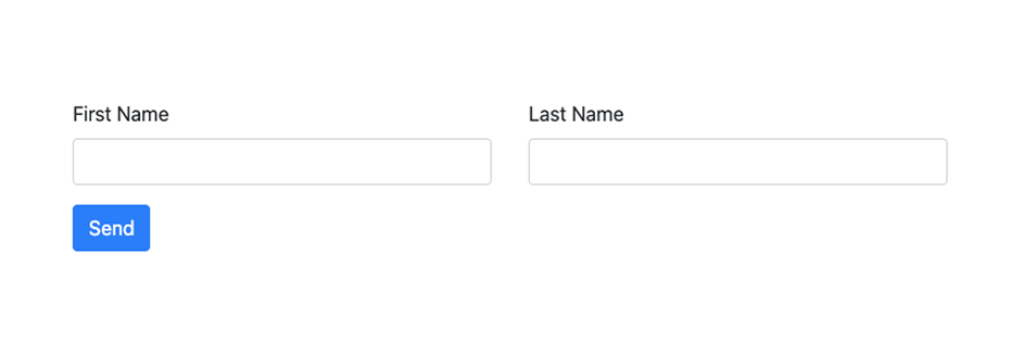
Form Groups and the Grid System
For more complex forms, especially ones with multiple fields on the same row, you can use Bootstrap’s grid system to control spacing and alignment. Wrap your inputs inside .row and .col-* classes to place them side by side.
Example: Name and Email side-by-side
  <form>
    <div class="row mb-3">
      <div class="col">
        <label for="firstName" class="form-label">First Name</label>
        <input type="text" class="form-control" id="firstName">
      </div>
      <div class="col">
        <label for="lastName" class="form-label">Last Name</label>
        <input type="text" class="form-control" id="lastName">
      </div>
    </div>
    <button type="submit" class="btn btn-primary">Send</button>
  </form>
Here’s what it will look like:
Custom Inputs
Bootstrap also supports enhanced versions of form controls like switches, ranges, and custom-styled selects. These help you build more interactive interfaces while maintaining consistent design.
Custom Switches (styled checkboxes)
  <div class="form-check form-switch">
    <input class="form-check-input" type="checkbox" id="flexSwitchCheckDefault">
    <label class="form-check-label" for="flexSwitchCheckDefault">Enable Notifications</label>
  </div>
Custom Range Slider
  <label for="customRange1" class="form-label">Satisfaction Level</label>
  <input type="range" class="form-range" id="customRange1">
Custom Select
  <select class="form-select">
    <option selected>Select a country</option>
    <option value="1">India</option>
    <option value="2">USA</option>
    <option value="3">Germany</option>
  </select>
Input Groups
Input groups let you prepend or append icons, text, or buttons to form controls. This is especially useful for inputs like URLs, email addresses, or price fields.
Example: Email input with icon
  <div class="input-group mb-3">
    <span class="input-group-text">@</span>
    <input type="text" class="form-control" placeholder="username">
  </div>
Example: Price input
  <div class="input-group mb-3">
    <span class="input-group-text">$</span>
    <input type="number" class="form-control" placeholder="Amount">
  </div>
Styled File Uploads
Bootstrap enhances the styling of file inputs, making them more consistent with other form controls. You can even combine them with input groups or helper text.
  <div class="mb-3">
    <label for="formFile" class="form-label">Upload your document</label>
    <input class="form-control" type="file" id="formFile">
  </div>
Adding Form Validation with Bootstrap
A form that looks great but doesn’t handle errors well can frustrate users and lead to incomplete submissions. Fortunately, Bootstrap makes client-side form validation straightforward by combining built-in HTML5 capabilities with styled validation states.
HTML5 Validation: The Foundation
Most modern browsers support built-in form validation using attributes like required, minlength, type, and pattern. When you submit a form that doesn’t meet these constraints, the browser automatically prevents submission and shows a basic error message.
Example:
<input type="email" class="form-control" required placeholder="you@example.com">
This is a great first step, but Bootstrap helps you style these validations to improve user experience.
Bootstrap’s Validation Classes
Bootstrap uses several utility classes to indicate the validation status of form controls:
.is-valid: Adds a green border and optional success message..is-invalid: Adds a red border and optional error message..was-validated: Applied to the<form>element to trigger styling after submission attempt.
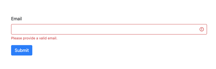
Example:
  <form class="needs-validation" novalidate>
    <div class="mb-3">
      <label for="email" class="form-label">Email</label>
      <input type="email" class="form-control is-invalid" id="email" required>
      <div class="invalid-feedback">
        Please provide a valid email.
      </div>
    </div>
    <button type="submit" class="btn btn-primary">Submit</button>
  </form>
Here’s what the error would look like:
💡 Tip: Use the novalidate attribute on the form to disable the browser’s default validation UI and rely on Bootstrap’s classes instead.
Handling Validation on Submit
You can use a simple JavaScript snippet to trigger validation and apply .was-validated dynamically:
  <script>
    (() => {
      'use strict'
      const forms = document.querySelectorAll('.needs-validation')
      Array.from(forms).forEach(form => {
        form.addEventListener('submit', event => {
          if (!form.checkValidity()) {
            event.preventDefault()
            event.stopPropagation()
          }
          form.classList.add('was-validated')
        }, false)
      })
    })()
  </script>
Displaying Feedback Messages
Pair .invalid-feedback and .valid-feedback elements with each input to provide clear user guidance:
  <input type="text" class="form-control" required>
  <div class="invalid-feedback">
    This field is required.
  </div>
Feedback messages only appear once .was-validated or .is-invalid is applied, so they don’t clutter the UI before interaction.
Accessibility Best Practices for Validation
- Use
aria-describedbyto link inputs to their error/help text. - Ensure that validation messages are clear, concise, and specific.
- Don’t rely solely on color to communicate success/failure. Use icons or text.
- Keep keyboard and screen reader users in mind: focus should return to invalid fields on submit.
Building Accessible Forms
Accessibility is about making sure everyone can use your forms, regardless of their ability, device, or assistive technology. Fortunately, Bootstrap provides a strong foundation for building accessible forms, but it’s up to you to apply a few best practices to ensure your forms are truly usable by all.
Use Semantic HTML
Start by using the right HTML elements for the job. This helps screen readers and assistive tools interpret your form correctly.
- Use
<label>tags for every input. - Use
<fieldset>and<legend>for grouping related controls (like radio buttons). - Use
<button>instead of<div>or<a>for form actions.
Example:
  <label for="email" class="form-label">Email address</label>
  <input type="email" id="email" class="form-control" aria-describedby="emailHelp">
  <small id="emailHelp" class="form-text text-muted">We'll never share your email.</small>
Label Everything Clearly
Every interactive form element must be associated with a visible (or screen-reader-only) label. This ensures users understand what information is expected.
- Match
forattribute on<label>with theidof the corresponding input. - For checkboxes and radios, wrap the input and label inside a
.form-check.
Tip: Use Bootstrap’s .visually-hidden class to create screen-reader-only labels if you’re using icons or placeholders visually.
  <label for="username" class="visually-hidden">Username</label>
  <input type="text" id="username" class="form-control" placeholder="Enter username">
Ensure Color Contrast and Visual Cues
Bootstrap’s default colors usually meet WCAG contrast requirements, but if you override them, double-check:
- Use tools like WebAIM’s Contrast Checker.
- Don’t rely solely on color to indicate error states. Pair red borders with icons or clear text.
- Bootstrap’s
.is-invalidand.is-validclasses already include both color and textual cues.
Support Keyboard Navigation
All form controls should be navigable using only the keyboard. Avoid:
- Custom dropdowns that don’t support arrow key navigation.
- Click-only elements without a keyboard equivalent.
If you’re using custom inputs (like a toggle switch), make sure they are:
- Focusable with
tabindex="0"(if not already focusable). - Operable with keyboard events (
EnterorSpace). - Announced correctly using
aria-checked,role="switch", oraria-label.
Use ARIA Attributes for Clarity
When needed, use ARIA attributes to enhance understanding:
aria-required="true"to indicate required fields.aria-invalid="true"for error states.aria-describedbyto link inputs to instructions or validation messages.
Example with error message:
  <input type="email" class="form-control" id="email" aria-describedby="emailError" aria-invalid="true">
  <div id="emailError" class="invalid-feedback">
    Please enter a valid email.
  </div>
Connecting Bootstrap Forms to Formspree
Now that you’ve designed a responsive and accessible form with Bootstrap, it’s time to make it functional, by connecting it to Formspree. Formspree handles the backend for your form submissions so you don’t have to worry about setting up a server, handling form data, or dealing with spam.
1. Create a Formspree Form
Head over to Formspree.io, sign up for a free account (if you haven’t already), and create a new form. Once created, you’ll receive a unique form endpoint URL, something like:
https://formspree.io/f/yourformid
2. Add the Form Action
In your Bootstrap form, set the action attribute to your Formspree endpoint, and the method to "POST":
<form action="https://formspree.io/f/yourformid" method="POST">
That’s it! That’s all you need to do to start using Formspree in your Bootstrap forms!
Optional: Adding Formspree Workflows
You can extend functionality by adding workflows in your Formspree dashboard: send confirmation emails, push data to Airtable, post to a Slack channel, or trigger a webhook.
With just a few lines of HTML, your Bootstrap form becomes a fully functional, secure, and scalable contact or registration system powered by Formspree; no backend setup required.
Resources and Further Reading
If you’re serious about building great forms with Bootstrap and Formspree, the good news is you don’t have to figure everything out on your own. There’s a wide ecosystem of official documentation, community templates, and learning resources to help you go further, faster.
You can start with the Bootstrap docs: the canonical reference for Bootstrap form components, layouts, and utilities. It includes detailed examples and accessibility notes. You should also checkout the Formspree Docs to learn how to use Formspree’s backend with HTML forms, AJAX submissions, file uploads, spam protection, and third-party integrations.
Furthermore, tools like LayoutIt or Bootstrap Studio let you visually design Bootstrap forms, then export clean HTML. For custom JS validation, you can explore libraries like JustValidate and Parsley.js