Tailwind Contact Forms
Design a Tailwind contact form with Formspree's templates. Easily gather messages, inquiries, and customer contact information.
-
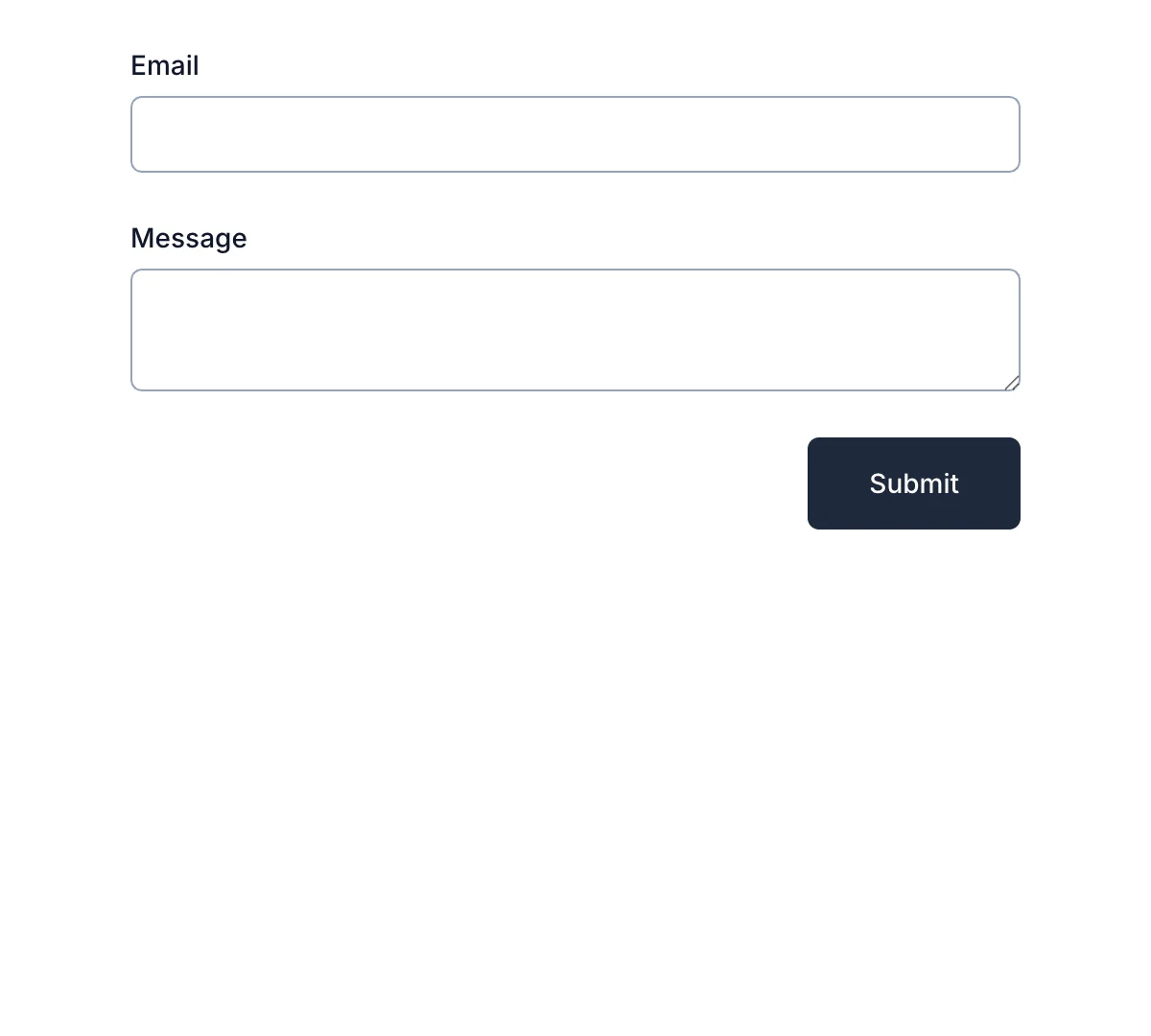
Simple Contact Form
Professional contact form for straightforward, efficient business communication
Get code -
Contact Me Form
Simple 'Contact Me' form for direct, personal connections made easy
Get code -
Contact Us Form
Professional contact form for easy communication with your customers
Get code -
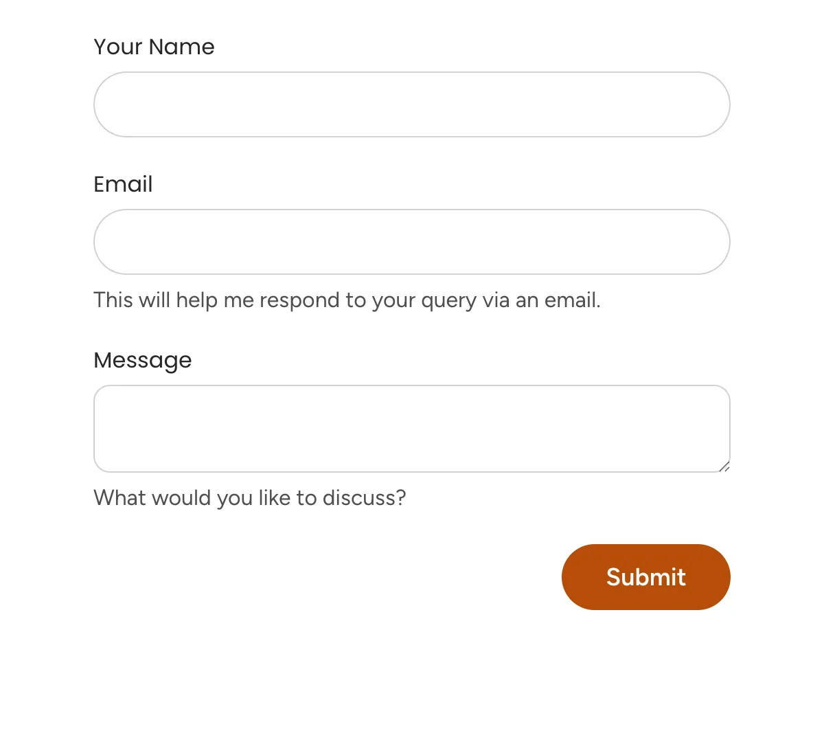
Inquiry Form
Clean, minimal inquiry form for general questions and quick responses
Get code -
Contact Sales Form
Streamlined sales contact form for quick customer connections and quotes
Get code -
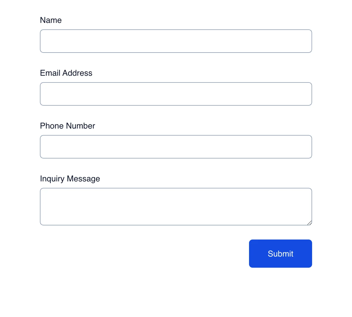
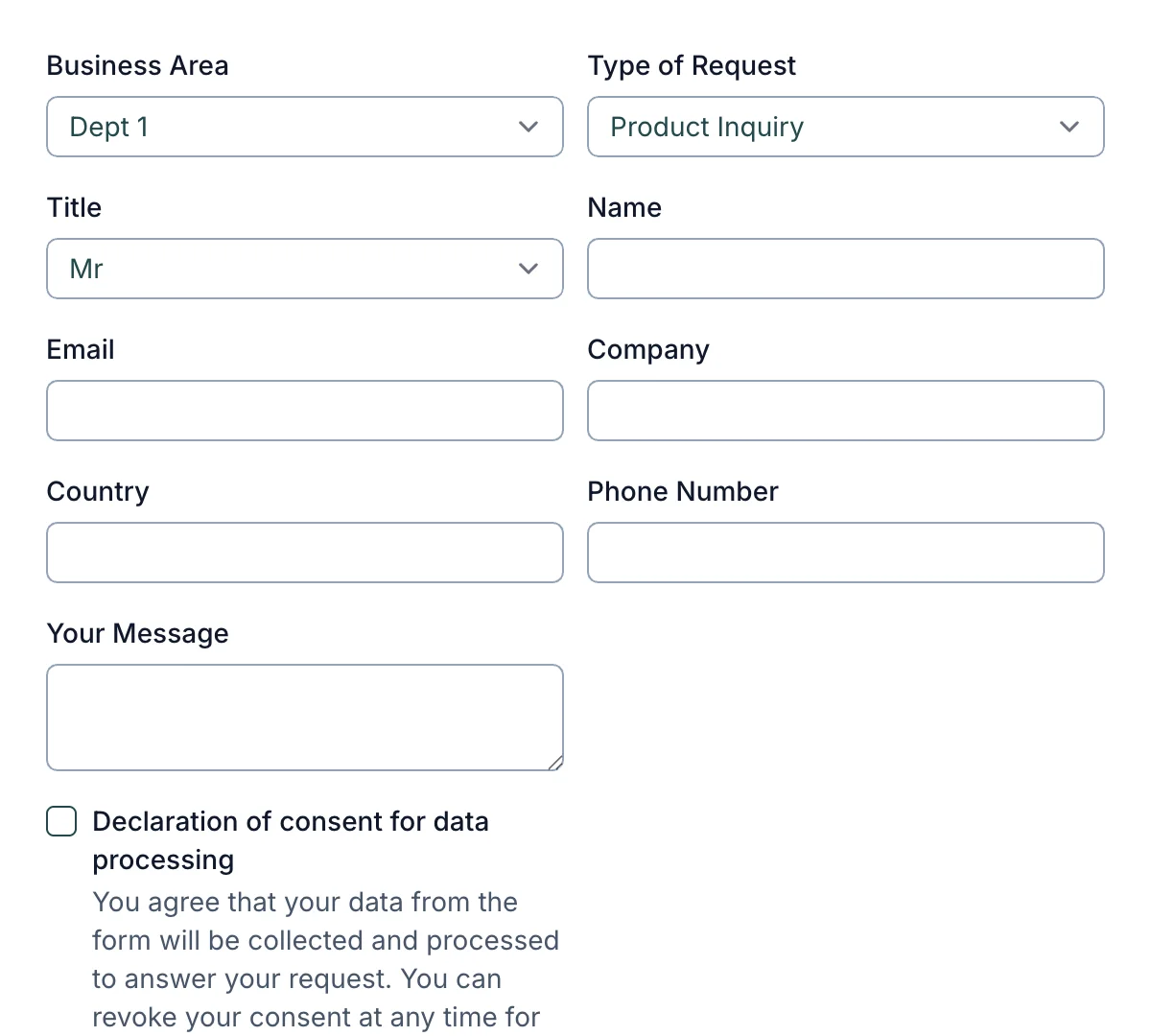
Media Inquiry Form
Simple media inquiry form for journalists to request info quickly
Get code
What Is a Tailwind Contact Form?
Contact forms are more than just a means of communication—they’re critical touchpoints between businesses and users. Whether you’re capturing leads, providing support, or collecting feedback, a well-designed contact form can significantly enhance user experience and boost conversions.
Enter Tailwind CSS, a utility-first CSS framework that gives developers and designers the flexibility to craft responsive, visually appealing, and accessible forms with minimal effort. Tailwind’s composable nature lets you style forms directly in your markup using small, reusable utility classes—no need to write custom CSS or manage separate stylesheets.
In this guide, we’ll explore everything you need to know about building powerful Tailwind contact forms. You’ll learn how to get started, design beautiful forms, add interactivity, customize templates, and avoid common pitfalls
Why Use Tailwind CSS for Contact Forms?
Utility-First Framework
Tailwind’s utility-first approach lets you build custom designs using low-level utility classes like px-4, bg-white, text-sm, or rounded-md. Instead of writing separate CSS rules, you apply styles directly in the HTML, allowing for rapid development and highly maintainable code.
This approach is particularly powerful for form design. Want to change the padding of an input field? Just adjust py-2 to py-3. Want a hover effect on a button? Add hover:bg-blue-600. These changes are intuitive and immediate, speeding up the development cycle.
Responsive Design
Tailwind has responsive design baked in. With its intuitive sm:, md:, lg: prefixes, you can quickly adapt your forms for various screen sizes.
For instance, you can use a one-column layout on mobile (grid-cols-1) and switch to two columns on larger screens (md:grid-cols-2). This ensures your contact form is always user-friendly, regardless of the device.
Ease of Customization
One of the biggest advantages of Tailwind is that it allows complete customization without writing custom CSS. Need to match your brand’s colors? Just extend your tailwind.config.js file. Want larger buttons or a unique font? Tailwind makes it easy to apply these changes globally or locally.
Tailwind also supports plugin extensions like @tailwindcss/forms, which smooths out cross-browser inconsistencies and makes form elements look good with minimal effort.
Getting Started with Tailwind Contact Forms
Step 1: Installation
To build a Tailwind-powered contact form, first set up Tailwind CSS in your project. If you’re starting from scratch, you can install it via npm:
npm install -D tailwindcss @tailwindcss/forms
You can also generate a Tailwind config file (if you haven’t already):
npx tailwindcss init
Step 2: Configure the Plugin
In your tailwind.config.js file, enable the @tailwindcss/forms plugin like this:
  // tailwind.config.js
  module.exports = {
    content: [
      './src/**/*.{html,js}', // Adjust as needed for your file structure
    ],
    theme: {
      extend: {},
    },
    plugins: [
      require('@tailwindcss/forms'),
    ],
  }
This plugin helps normalize form element styles across browsers and removes default styles that can be difficult to override.
Step 3: Add Tailwind Directives to Your CSS
In your main CSS file (e.g., styles.css), include the Tailwind directives:
  @tailwind base;
  @tailwind components;
  @tailwind utilities;
The @tailwind base layer includes the reset styles provided by the @tailwindcss/forms plugin, ensuring form elements start from a clean and consistent slate.
With setup complete, you’re ready to build forms using Tailwind’s utility classes.
Basic Form Structure
Let’s start with a simple contact form that includes a name, email, message field, and a submit button. Here’s how it looks with Tailwind:
  <form class="max-w-xl mx-auto p-6 bg-white rounded-lg shadow space-y-6">
    <div>
        <label for="name" class="block text-sm font-medium text-gray-700">Name</label>
        <input type="text" id="name" name="name" required class="mt-1 block w-full rounded-md border-gray-300 shadow-sm focus:ring focus:ring-blue-200 focus:border-blue-500">
    </div>
    <div>
        <label for="email" class="block text-sm font-medium text-gray-700">Email</label>
        <input type="email" id="email" name="email" required class="mt-1 block w-full rounded-md border-gray-300 shadow-sm focus:ring focus:ring-blue-200 focus:border-blue-500">
    </div>
    <div>
        <label for="subject" class="block text-sm font-medium text-gray-700">Subject</label>
        <input type="text" id="subject" name="subject" class="mt-1 block w-full rounded-md border-gray-300 shadow-sm">
    </div>
    <div>
        <label for="message" class="block text-sm font-medium text-gray-700">Message</label>
        <textarea id="message" name="message" rows="4" class="mt-1 block w-full rounded-md border-gray-300 shadow-sm"></textarea>
    </div>
    <button type="submit" class="w-full bg-blue-600 text-white font-semibold py-2 px-4 rounded hover:bg-blue-700 transition">Send Message</button>
  </form>
Working with Tailwind Contact Form Templates
There are many platforms offering ready-to-use Tailwind contact form templates. One of the best is the Formspree Forms Library (where you’re reading this right now!), which includes:
- Contact forms
- Registration forms
- Order forms
and more!
These templates are already styled with Tailwind and include semantic markup and accessibility best practices. You can easily:
- Change color themes by replacing Tailwind color classes (bg-blue-500 → bg-green-600)
- Swap fonts by updating the font-family in tailwind.config.js
- Adjust spacing, layout, or add/remove fields as needed
Pre-built templates save hours of development time while giving you full creative control.
Troubleshooting Common Issues
Debugging Styling Conflicts
If your styles aren’t applying, check that:
- Tailwind is properly installed and compiled
- Your content paths in
tailwind.config.jsinclude all relevant files - Plugins like
@tailwindcss/formsare enabled
Addressing Validation Errors
If browser validation isn’t working as expected:
- Ensure required fields have
required,type, andpatternattributes - Use Tailwind’s
peer-invalidor:invalidclasses to style errors dynamically
Optimizing Responsiveness
Test your forms across screen sizes. If layout breaks:
- Use
grid-cols-1,md:grid-cols-2, etc. - Avoid fixed widths (
w-[400px]) in favor of responsive widths (w-full,max-w-xl)
Final Thoughts
Tailwind CSS is one of the most effective tools for building modern, responsive, and accessible contact forms. Its utility-first approach gives you complete control over form styling and behavior, all within your HTML markup.
We’ve covered how to set up Tailwind for form development, build beautiful layouts, integrate interactivity, validate inputs, and work with templates like those from the Formspree library. You now have the tools to create fast, user-friendly, and highly customized contact forms that work on any device.
The best part? You can scale and adapt these forms with minimal effort as your project grows. Explore more templates, experiment with design ideas, and bring your contact forms to life with Tailwind CSS.