5 Creative Form Designs to Inspire Your Next Form (+11 Examples)
Part of the
Getting Started with Formspree
Series
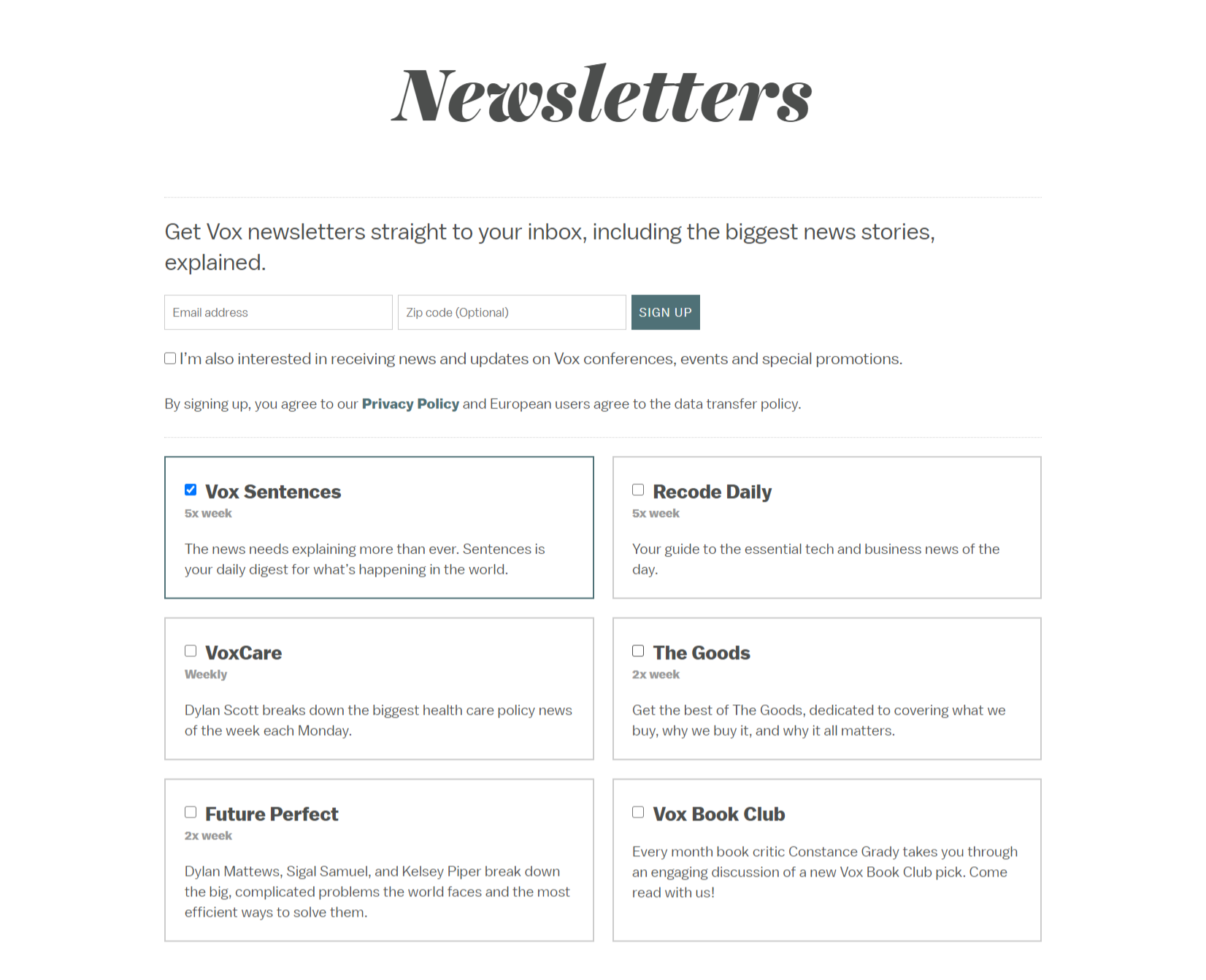
Content (and politics) aside, which of these two forms would you rather fill out?
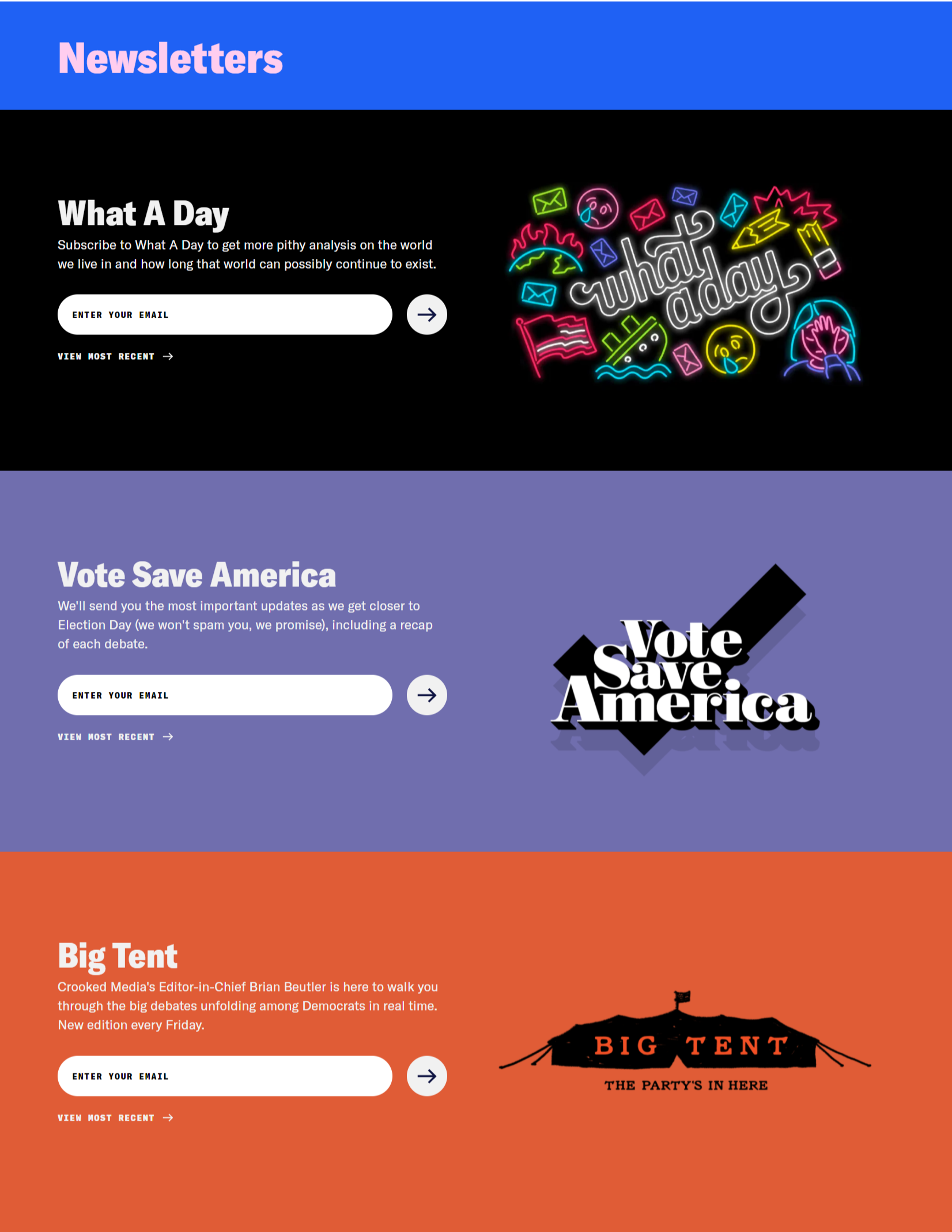
Or Crooked Media’s newsletters:
There’s nothing wrong with Vox’s newsletter form; it gives people the details they need to choose the options they want to sign up for. But it doesn’t necessarily attract people to subscribe beyond the copy, which feels a bit dense.
The Crooked Media newsletter forms, on the other hand, use bold colors and playful graphics to catch people’s attention. They give you a feel for the publication’s personality (irreverent, straight-talking) that resonates with their target audience.
If you knew nothing about either publication, chances are you would be drawn to the Crooked newsletters.
Forms are primarily functional, but that doesn’t mean they have to be boring. Forms are a connection point between you and your website visitors, making them the perfect place to express your brand. Using creative design elements and formats can take your form from being a mere tool to an engaging experience—and engaged users are more likely to get in touch.
Here are a few ways you can catch people’s attention with your forms and improve the user experience.
1. Multi-step Forms
Putting your form on multiple pages helps make it feel shorter. By breaking the form into several steps, users aren’t confronted with a lot of fields all at once.
Use a scrolling effect to animate the transition between pages to make it feel seamless.
Avo, a data management platform, uses this technique with a horizontal scroll. It flips between brand colors in aesthetically pleasing transition.
Notice how the form starts and ends with Avo’s primary hot pink. This bookends the form to give the user a sense of completion.
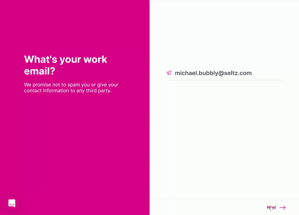
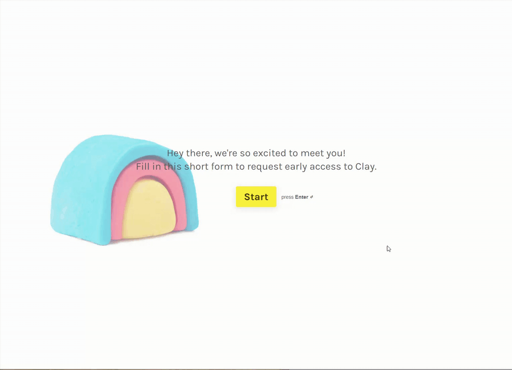
Typeform offers a code-free way to achieve a dynamic scroll, as seen in this example from flow-engine tool Clay:
The background remains static while the form questions scroll vertically. The progress bar in the lower right tells you how many questions remain.
One downside of Typeform is that it’s not white-labeled. Typeform’s name appears in the lower right and in the URL until you upgrade to their Platinum plan. With Formspree, your forms don’t have our logo. Plus, you can customize the landing page and confirmation email for much less. If you’d like to code your own form with a similar effect, here is a resource on Github.
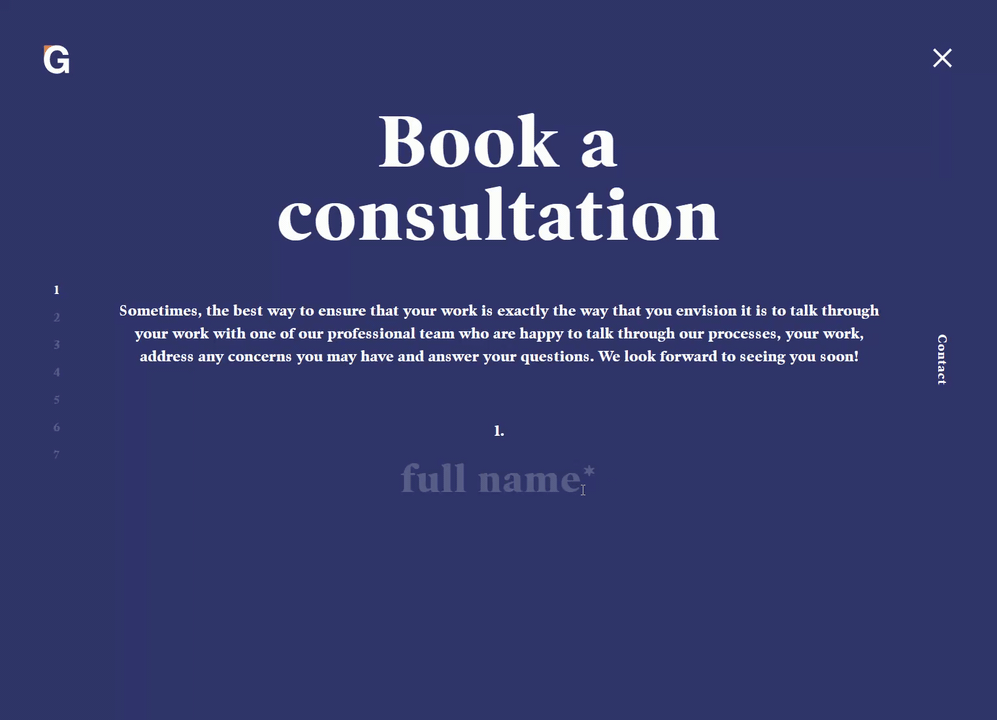
Art exhibition service Genesis Framing has another take on the dynamic scroll. Each field is centered as you scroll through the form. You can skip between questions by clicking the question number on the left.
Make sure you keep accessibility in mind while designing your form. Breaking keyboard navigation, for instance, can cause problems for people who use a keyboard or a screen reader to surf the internet.
Creative design and accessibility don’t have to be in conflict. But if you can’t find a way to make your design work while keeping it accessible, we recommend you prioritize accessibility. Otherwise, you could be missing out on up to 15% of potential form submissions.
2. Quiz Forms
People love quizzes. Just ask the Audubon Society, celeb gossip magazines, and the New York Times. Publishers of all stripes use quizzes to engage their readers, and businesses can use the same tactic to generate leads.
Wine-subscription service Winc uses a quiz to introduce new members to their business. Winc generates a set of personalized wine recommendations by asking about potential customers’ tastes in food and drink. Users get their results after submitting their email address.

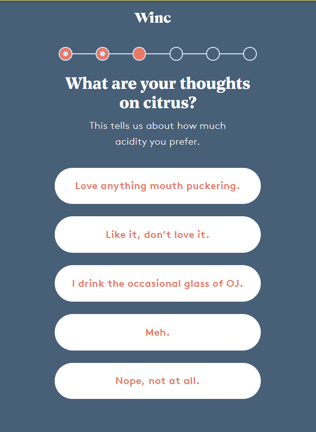
Notice the progress bar at the top of Winc’s form. Telling people how many questions are ahead anchors the user. It also gives people a sense of satisfaction from completing the form, just like you’d feel good about crossing items off of a to-do list.
Winc’s form uses sophisticated colors (merlot red, faded navy blue, crisp white) suited to a fancy wine club. The modern typography and casual copy counterbalance this to keep the brand feeling young.
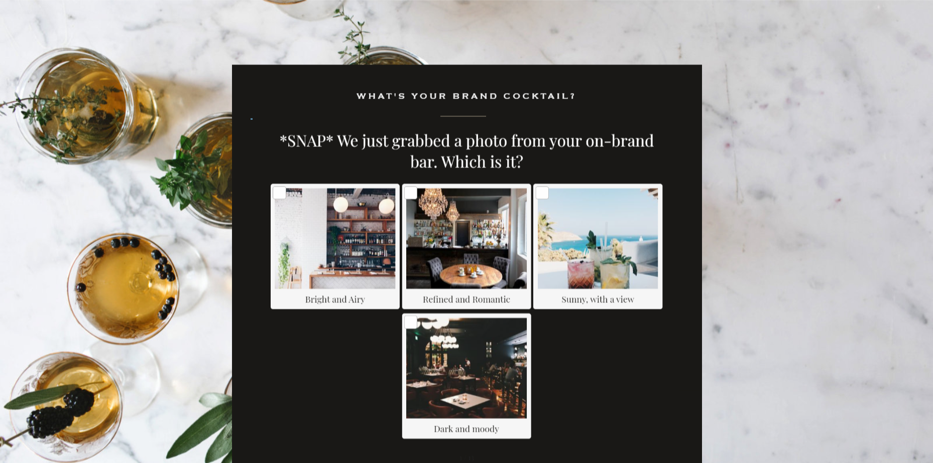
We found another creative quiz form on Tonic Site Shop, a website branding and design agency. They start their quiz by asking, “What’s your brand cocktail?” Keeping with the bar theme, Tonic uses plenty of puns to convey their personality. And instead of text-only, multiple-choice questions, they also use inspiration photos.
The final results are behind an email capture.
Some businesses, such as consultants Kelly Trach and Lindsay Sholz, have seen their leads double or triple with quiz forms. It’s a promising tactic with plenty of opportunity to get creative.
3. Calculators
Calculators, like quizzes, are interactive forms that offer people a new insight. But, unlike quizzes, calculator results are rarely gated. The extra step of submitting an email address is usually too much of a deterrent for calculator users.
Accounting software TurboTax created a calculator form to help people find out how much they might receive in a stimulus check. The design elements are simple: radio buttons and a few empty fields. That works in TurboTax’s favor—most people don’t want their tax tool to be fancy; they want it to be helpful.
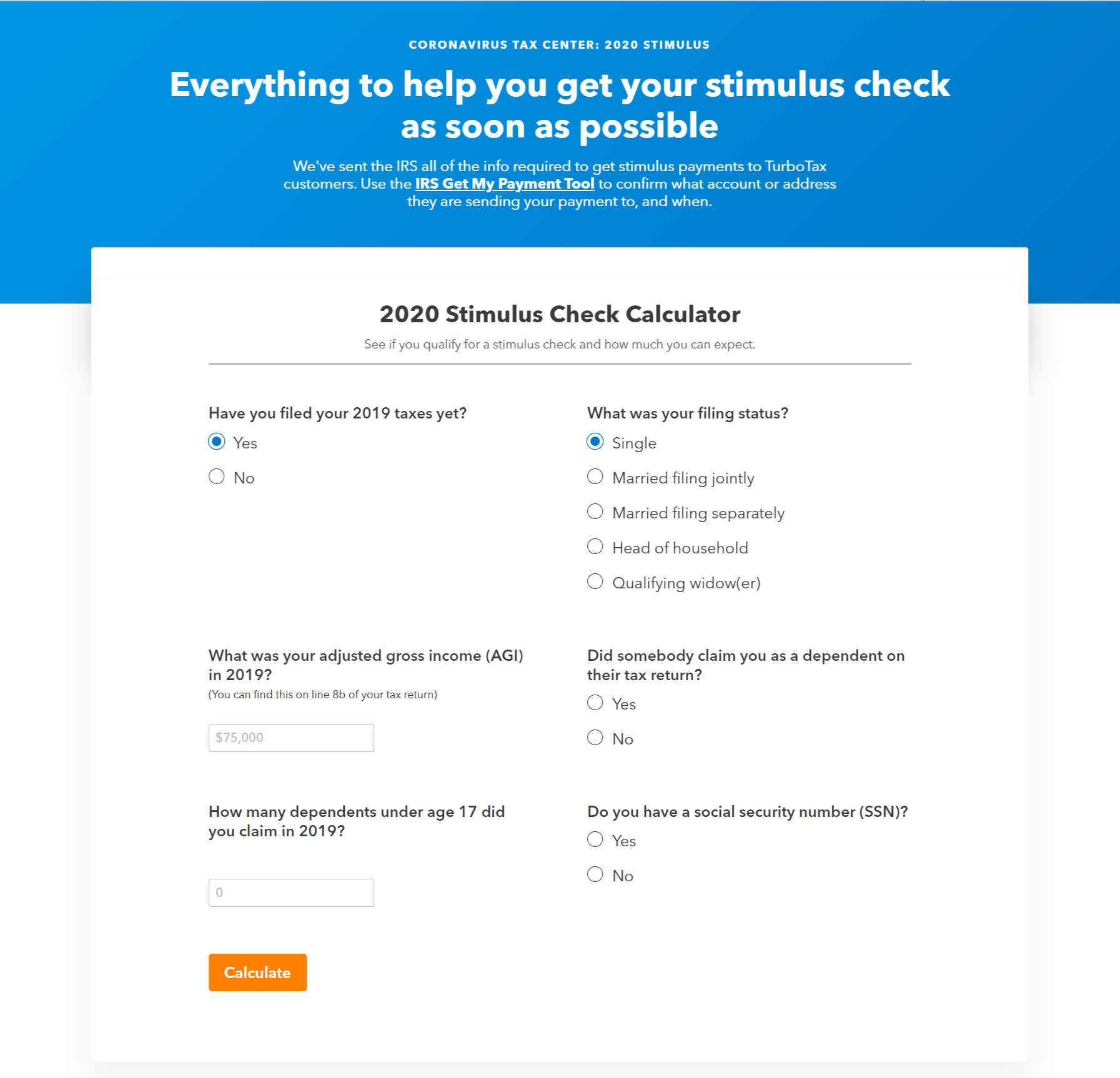
TurboTax could have posted a landing page with some paragraphs spelling out the eligibility requirements for the CARES Act stimulus payments. But by using a calculator form, they’ve taken an interactive approach that makes the user feel like TurboTax is doing the heavy lifting.
SimpleLegal, a legal-ops platform, uses a calculator to demonstrate how much businesses can save with SimpleLegal’s product.
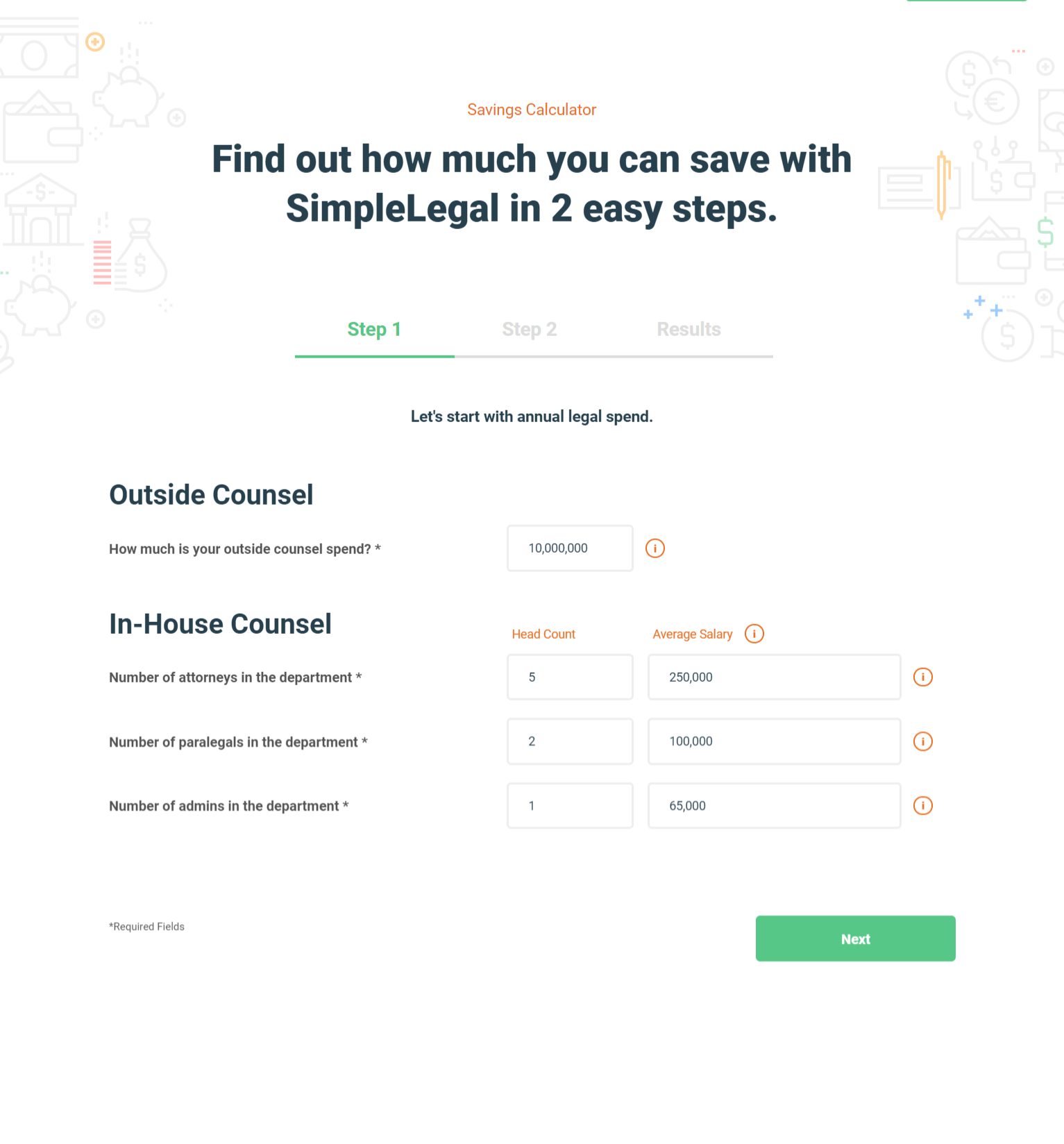
SimpleLegal offers guidance by pre-filling the form fields with estimates based on national averages. They also provide a progress bar. By entering their own numbers, people are more likely to trust SimpleLegal’s savings claim.
Calculator forms are most frequently used by companies offering a financial service (number crunching and all that). The form is inherently collaborative—the website owner and the website visitor are answering a question together. Using a calculator on your website can help you connect with your customers in a more interactive way.
4. Mad Libs–Style Forms
Fill-in-the-blank forms make use of an unconventional format that references the classic Mad Libs game. Finishing the form feels much like choosing a noun, adjective, or verb to complete a sentence. So instead of completing a generic sign-up, people feel more like they are playing a game.
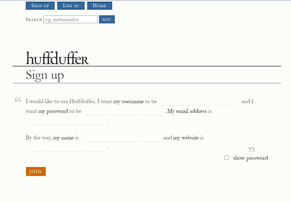
Huffduffer, a tool for easily saving found audio clips, deployed a Mad Libs–style form on their site for account sign-ups.
These forms can be a bit tricky to code, so Formspree cofounder Cole Krumbholz gave a talk on his attempt to build a Mad Libs-style form library. He put together this form for board-game meetups:
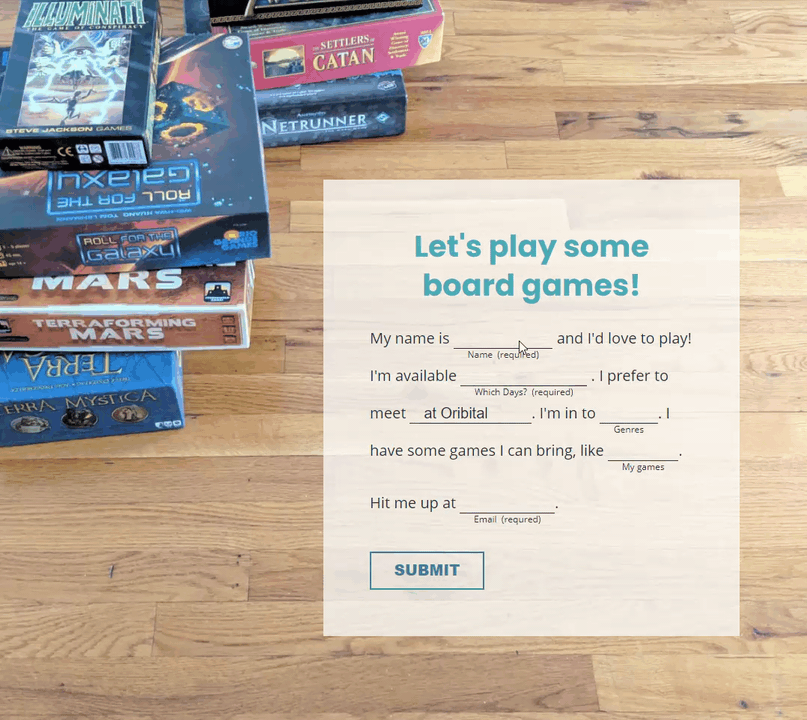
Notice how the form box expands to fit the text as it’s filled in. It also adjusts according to the size of the screen. There are still some kinks to work out, so drop us a line if you give them a try and let us know how you tackled the code.
Mad Libs forms definitely stand out from the crowd. We find that they work best when they provide additional context, maintain or increase legibility, and add a human touch.
5. Pop-Up Forms
Creative doesn’t necessarily mean flashy. Small pop-up forms are a creative way to invite feedback without disrupting the user experience. The user doesn’t need to navigate away from the main content, which keeps the focus on what’s happening on your web page.
Check out Stripe’s tiny but mighty feedback button:
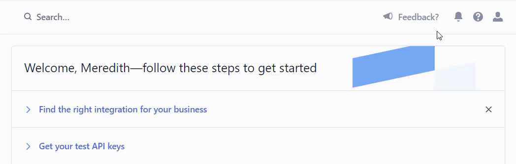
The format is more unconventional than the design itself. Since the form is part of your Stripe dashboard when you are already logged in, they don’t need to collect your email address. The form appears only when you click the feedback icon, so it remains out of sight and out of mind until it’s needed.
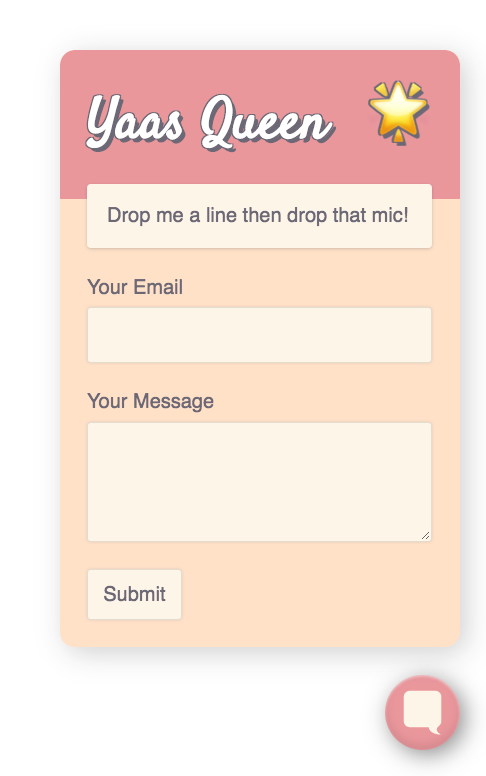
That’s the approach we took with our Formbutton widget. It appears as a small talk bubble in the lower-right corner of your web page. When clicked, a simple contact form pops up.
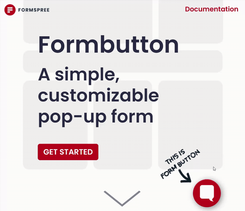
You can add Formbutton to your website and customize the syling, adding as much brand personality as you want.
Find more Formbutton designs on CodePen.
Pop-up forms let your customers know you are there for them without putting tons of time and resources behind a chat feature.
Try an Unconventional Form with Formspree
Forms aren’t just about function—they are also moments where you get up close and personal with your website users. So why not make it a more enjoyable experience? Take an extra moment to consider how to make your form stand out from the crowd. If you delight your users, you just might see those form submissions start to roll in.
Unlike other form services, Formspree doesn’t lock you into a set format with your web forms. You’re free to design it however you like, and we take care of the back end. Check out our CLI, React, and HTML form libraries to get started.